 View review
Logo score
Logo review of
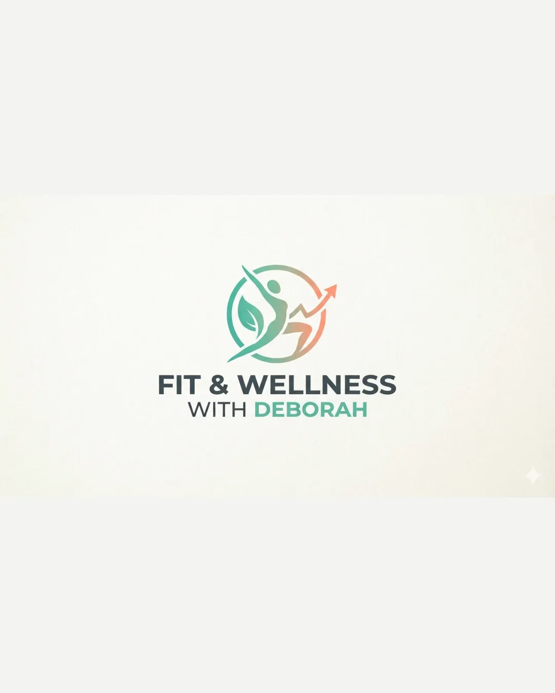
Fit & Wellness With Deborah
A polished, relevant logo with excellent balance and on-brief creativity. Only minor tweaks needed for accessibility and versatility.
Legibility
Originality
Misread
Balance
Scale
Action plan
What to fix first
The most important fixes to handle before polishing the full presentation.
1
Increase 'DEBORAH' contrast against the background slightly for optimal accessibility.
Medium priorityCurrent low contrast could reduce accessibility compliance.
Impact: Improves Text Clarity For All Users, Especially In Low-light Or Small Contexts. · Effort: Low
2
Test mark scalability at micro sizes and consider modestly thickening the arrow tip.
Low prioritySome fine elements may blur at reduced sizes.
Impact: Ensures Mark Doesn’t Lose Meaning Or Break At Small Scales (e.g., Favicons, Embroidery). · Effort: Low
Detailed review
Logo performance breakdown
Legibility
 Text is clear, easy to read, and well-contrasted.
 Minor color contrast drop in 'DEBORAH' against background.
Originality
Combination of leaf, figure, and arrow is unified and on-theme.
Concept is fresh but leans on industry-standard fitness/health metaphors.
Color harmony
Colors evoke wellness and positivity. Palette blends green (health) and brown (organic) effectively.
Gradient style may challenge some print outputs.
Teal
#56bfae
Light Brown
#d3a77d
Dark Teal
#377a70
Light Teal
#65b996
Grey
#8b8b8b
Your palette is close. Refine the color roles and combinations before updating the logo.
Build brand colorsBalance alignment
Mark and wordmark are well-centered and proportionate. Visual hierarchy is disciplined and professional.

Scalability
Mark and text retain clarity at a range of sizes. No excessive detail; strong silhouette.
Very fine arrow tip may be fragile at micro sizes.
200x250 px
100×125 px
50×62 px
Misinterpretations
No plausible negative or confusing interpretations.
Logo structure & brief match
Symbol closely matches name and wellness positioning.
Health And Fitness Brand: Visuals and wording are highly relevant and understandable to the target market.
Try your own review
Review my logo
Wondering how your logo performs?
Get a clear logo score, key risks, and priority fix ideas before your client or audience sees it.
Keep exploring