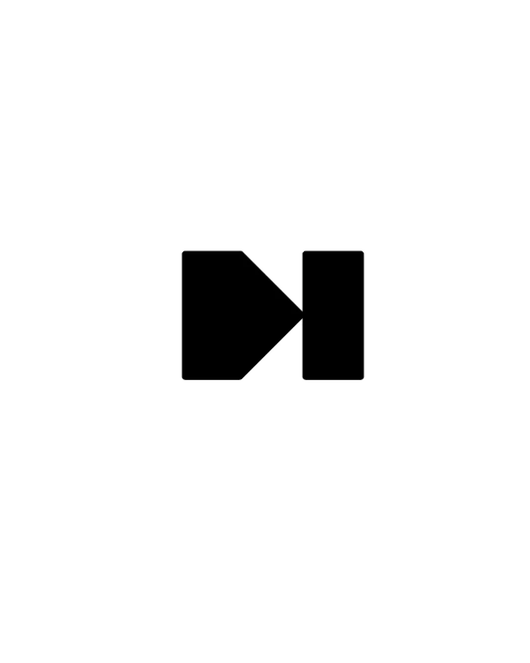
Linkedin Growth Agency logo symbol logo review
3.6/5
Logo score Standalone mark category

Linkedin Growth Agency logo symbol

chackmh Essential logo review

A balanced, bold minimal symbol with a sense of forward direction, but limited uniqueness and no direct tie to LinkedIn or the agency's growth services.

This logomark shows solid execution, supported by clarity at smaller sizes and visual balance; improving distinctiveness is the clearest next step.

Standalone Mark Flat Geometric Minimal Digital Marketing
3/5
Originality
4/5
Balance
4/5
Scale
Your next steps

What to fix first

Focus on the changes that matter. Keep what makes the logo work.

1

Standalone mark

Test for recognizability and differentiation among similar abstract agency/tech marks.

High priority Worth testing Medium effort

The basic geometric form (square, triangle, rectangle) is a familiar motif and may resemble directional buttons or generic navigation icons used broadly in tech, potentially limiting distinctiveness.

How to check

Compare to navigation/media icons and other agency logo marks before launch.

See the category review
Detailed review

Logo performance breakdown

3/5

Brief & logo match

While the abstract symbol suggests direction and growth, it lacks direct reference to LinkedIn or personal branding and may be visually generic for the stated agency focus.

5/5

Misinterpretations

  • No plausible, problematic alternate readings
4/5

Balance alignment

  • Geometric symmetry and even negative space create a stable, centered mark
Uploaded logoAlignment guide overlay

Inspect spacing with the guide. Optical balance may differ from geometric centering.

4/5

Scalability

Available in Advanced logo reviews
3/5

Originality

Available in Advanced logo reviews
Try your own review

Wondering how your logo performs?

Get a clear logo score, key risks, and priority fix ideas before your client or audience sees it.

Review my logo