RozgarSetu logo logo review
4.1/5
Logo score Combination mark category

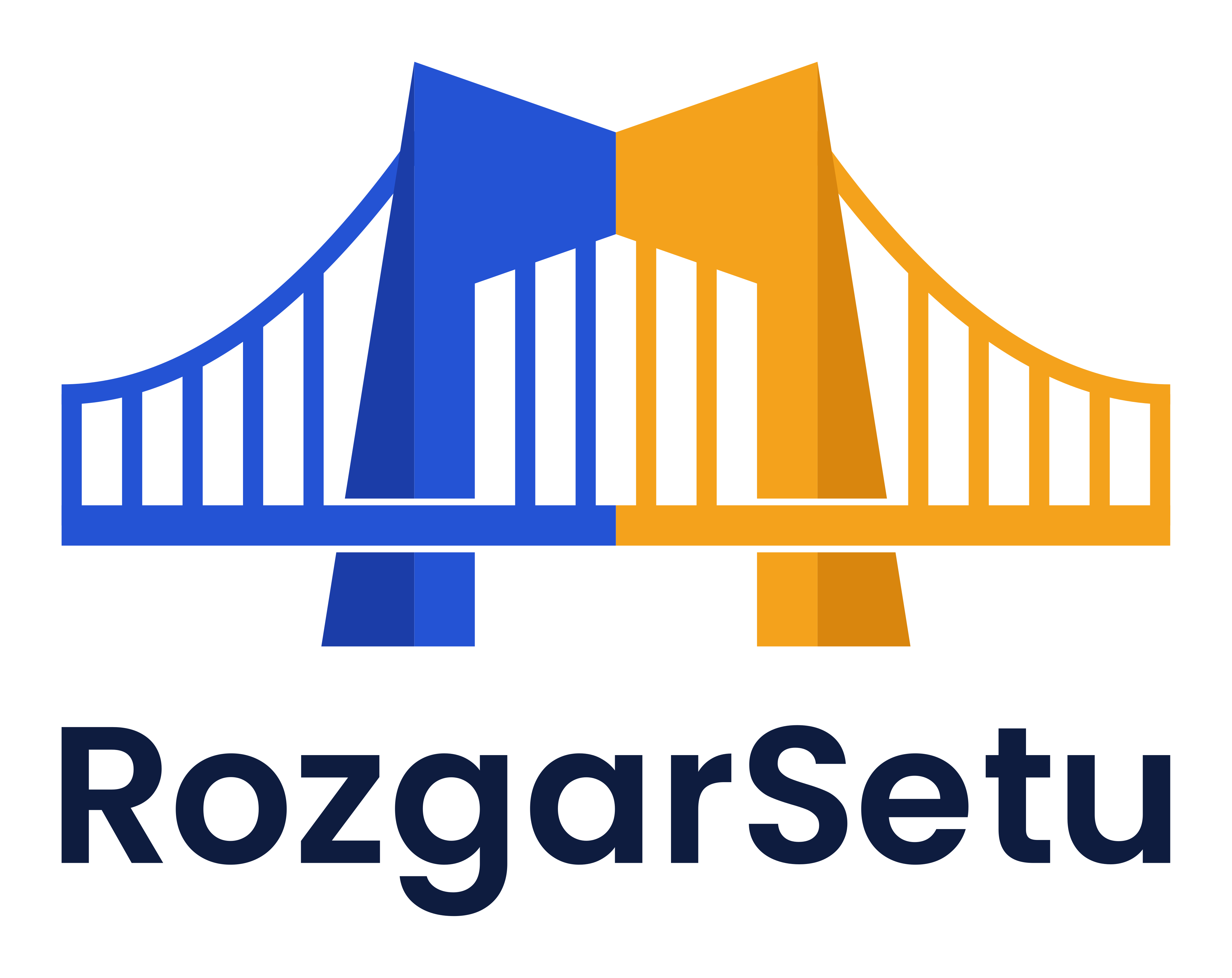
RozgarSetu logo

creative623327 Essential logo review

The logo offers strong conceptual clarity, good harmony, and striking style, with uniqueness in the 'M' bridge, but small details in the mark should be tested for versatility.

This logo lockup shows strong execution, supported by visual balance and text readability; improving distinctiveness is the clearest next step.

Combination Mark Geometric, Modern, Color-blocked Infrastructure / Employment / Government
5/5
Legibility
3.6/5
Originality
4/5
Balance
4/5
Scale
5/5
Color
4/5
Style consistency
Your next steps

What to fix first

Focus on the changes that matter. Keep what makes the logo work.

1

Standalone mark

Test the mark at small sizes to ensure lines remain distinct.

High priority Worth testing Low effort

Thin lines in the bridge could merge or be lost at smaller sizes, risking loss of clarity.

See the category review

Detailed review

Logo performance breakdown

4/5

Brief & logo match

A modern, connected bridge visual effectively suggests the idea of linking or bridging (potentially for employment or infrastructure), though thin mark details should be checked for all-use scalability.

5/5

Legibility

Wordmark 5/5 · Layout 5/5

  • Wordmark is highly legible with clear sans-serif lettering.
5/5

Color harmony

Symbol 5/5 · Wordmark 5/5

  • Distinct blue and orange create striking, modern contrast.
Blue#1854C7
Orange#FAB21E
Navy Black#1C2539

Estimated colors. Use the original design file for exact values.

Create a full color palette using these colors

Create new palette
5/5

Misinterpretations

  • No apparent negative or ambiguous readings.
4/5

Balance alignment

Symbol 4/5 · Wordmark 4/5 · Layout 4/5

  • Good vertical balance between mark and wordmark; minor color split abruptness.
  • The vertical halves of the bridge (blue and orange) are different visual weights, making the split more abrupt and possibly impacting visual harmony.

    Optional refinement Standalone mark
Uploaded logoAlignment guide overlay

Inspect spacing with the guide. Optical balance may differ from geometric centering.

4/5

Scalability

Symbol 3/5 · Wordmark 5/5 · Layout 4/5

  • Mark is bold overall but risks loss of detail in bridge lines at small sizes.
  • Thin lines in the bridge could merge or be lost at smaller sizes, risking loss of clarity.

    Worth testing Standalone mark

    Try: Test the mark at small sizes to ensure lines remain distinct.

4/5

Style consistency

Available in Advanced logo reviews
3.6/5

Originality

Symbol 4/5 · Wordmark 3/5

Available in Advanced logo reviews

Black & white

Does the shape still work without color?

Preparing artwork...

Background contrast

Find the surfaces where your logo stays clear.

Compare the mark and lettering on each surface.

Blur & silhouette

A 3px blur softens fine details so you can check whether the overall shape stays recognizable. If key gaps close or elements merge, the logo may rely too heavily on detail.

Original
3px blur

Look for clear separation between shapes and a distinctive outline.

Try your own review

Wondering how your logo performs?

Get a clear logo score, key risks, and priority fix ideas before your client or audience sees it.

Review my logo