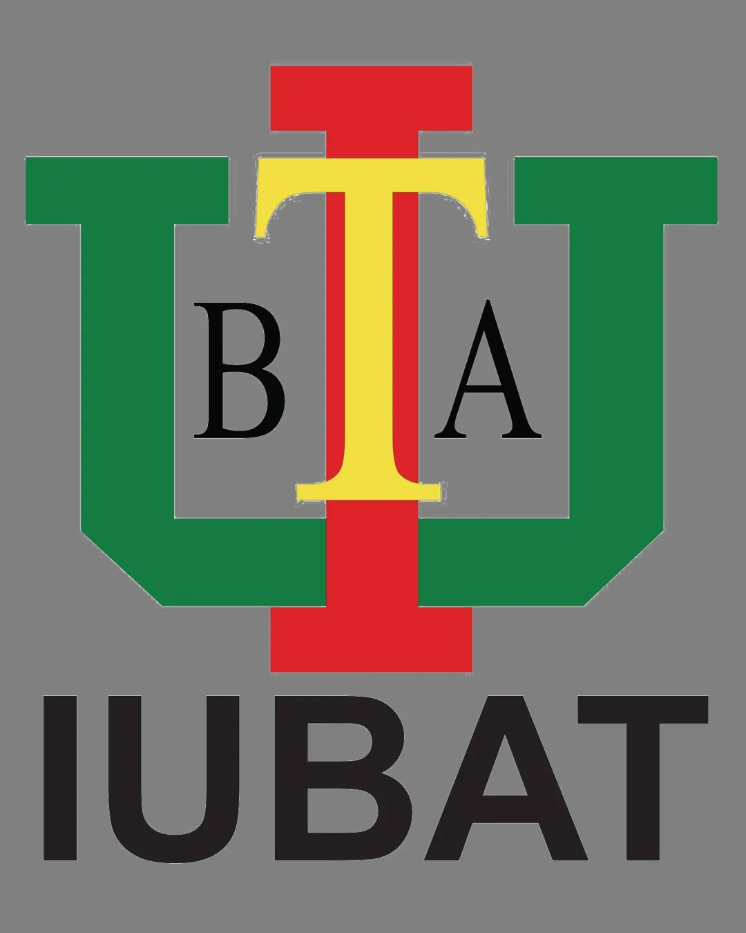
IUBAT University logo logo review
3.2/5
Logo score Combination mark (monogram and wordmark) category

IUBAT University logo

creative181298 Essential logo review

Distinct, functional academic logo that is hindered by crowded letter arrangement and uneven visual weight—improvements needed for balance and clarity.

This logo lockup has a workable foundation; improving distinctiveness is the clearest next step.

Combination Mark (monogram And Wordmark) Multi-color, Stacked Geometric Initials Education
4.3/5
Legibility
2.6/5
Originality
2.8/5
Balance
3.7/5
Scale
3/5
Color
3/5
Style consistency
Your next steps

What to fix first

Focus on the changes that matter. Keep what makes the logo work.

1

monogram (upper/center horizontal band)

Refine the arrangement of overlapping initials to achieve more even spacing and alignment.

High priority Visible issue Medium effort

Letters 'U', 'T', 'B', and 'A' overlap with varying stroke weights and alignment, leading to crowded, uneven geometry and visual imbalance.

See the category review
Detailed review

Logo performance breakdown

3/5

Brief & logo match

The multi-initial arrangement and formal type clearly indicate a university context, but the complexity and imbalance limit instant recognition and professional impact.

5/5

Misinterpretations

  • No unintended shapes or connotations appear in the artwork.
4.3/5

Legibility

Monogram 3/5 · Wordmark 5/5 · Layout 4/5

  • Initials 'B', 'A' partially obscured and merge visually into the multi-color 'T' and 'U', reducing quick letter recognition.

    Visible issue monogram (upper band)
3.7/5

Scalability

Monogram 3/5 · Wordmark 5/5 · Layout 3/5

This review includes a score but no supporting explanation for this category.

3/5

Color harmony

Monogram 3/5 · Wordmark 3/5

  • Red, yellow, and green are distinct but create a slightly jarring contrast; their large, competing blocks can feel visually competitive.

    Optional refinement monogram
Red#E22929
Yellow#F7D73D
Green#209144
Black#121212

Estimated colors. Use the original design file for exact values.

Create a full color palette using these colors

Create new palette
3/5

Style consistency

  • Wordmark and monogram are compatible and both clearly reference the university's acronym.
2.8/5

Balance alignment

Monogram 2/5 · Wordmark 4/5 · Layout 3/5

Available in Advanced logo reviews
2.6/5

Originality

Monogram 3/5 · Wordmark 2/5

Available in Advanced logo reviews
Try your own review

Wondering how your logo performs?

Get a clear logo score, key risks, and priority fix ideas before your client or audience sees it.

Review my logo