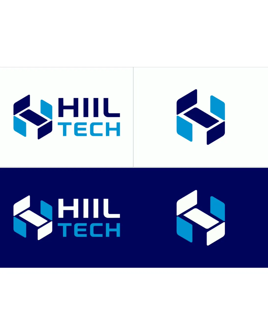
HIIL TECH logo logo review
3.4/5
Logo score Combination mark (symbol + wordmark) category

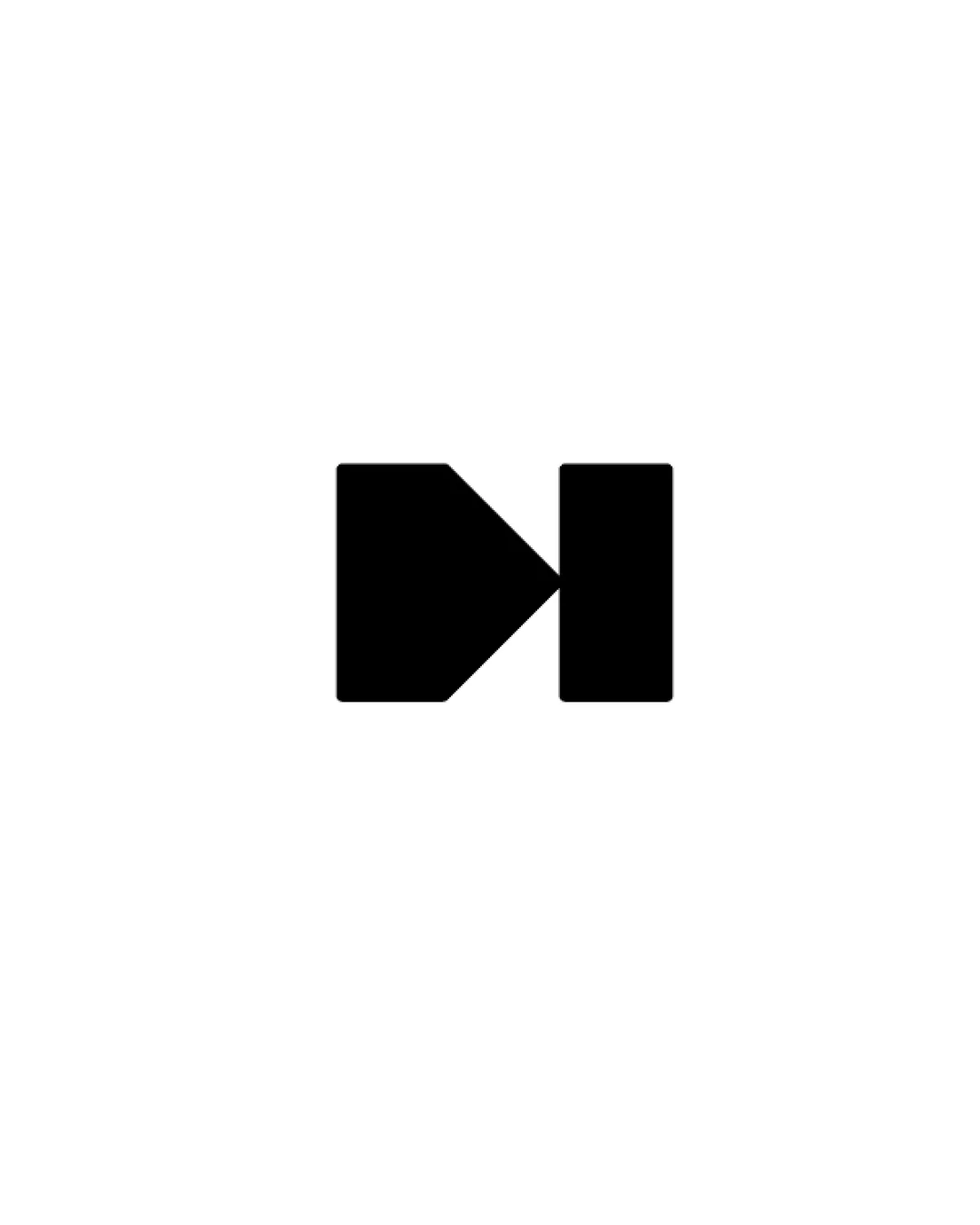
HIIL TECH logo

creative288473 Essential logo review

The logo delivers a clean, modern tech image with strong readability and coherent arrangement, but originality is its main weakness, and the mark may need further developing to ensure distinctiveness.

This logo set needs more distinctive construction to stand out.

Combination Mark (symbol + Wordmark) Modern, Geometric, Flat Technology
5/5
Legibility
2/5
Originality
4/5
Balance
4/5
Scale
4/5
Color
3/5
Style consistency
Your next steps

What to fix first

Focus on the changes that matter. Keep what makes the logo work.

1

Standalone mark

Consider refining the geometric configuration to add a unique twist or accent.

High priority Visible issue Medium effort

The geometric 'H' mark is visually similar to generic tech marks that use modular shapes to form a letter, offering limited distinctiveness.

How to check

Research simple tech-oriented marks for resemblance to enhance originality.

See the category review
Detailed review

Logo performance breakdown

3/5

Brief & logo match

The logo clearly communicates a tech brand through its geometric mark and blue palette, but lacks distinctive originality to stand out in the technology sector.

5/5

Legibility

Wordmark 5/5 · Layout 5/5

  • HIIL TECH is highly legible in all versions.
5/5

Misinterpretations

  • No misleading or unintended associations detected.
4/5

Color harmony

Symbol 4/5 · Wordmark 4/5

  • Blue gradient and white accent show energetic, clean palette.
Vivid Blue#00B6FF
Navy#162354
White#FFFFFF

Estimated colors. Use the original design file for exact values.

Create a full color palette using these colors

Create new palette
4/5

Balance alignment

Symbol 4/5 · Wordmark 4/5 · Layout 4/5

  • Letter and mark spacing is proportional and stable.
  • The spacing between the letters 'H', 'I', 'I', and 'L' in 'HIIL' appears balanced but is rigidly uniform, which may look stiff in certain applications.

    Optional refinement wordmark
Uploaded logoAlignment guide overlay

Inspect spacing with the guide. Optical balance may differ from geometric centering.

4/5

Scalability

Symbol 4/5 · Wordmark 4/5 · Layout 4/5

  • Mark and wordmark remain clear and intact at reduced size.
3/5

Style consistency

Available in Advanced logo reviews
2/5

Originality

Symbol 2/5 · Wordmark 2/5

Available in Advanced logo reviews
Try your own review

Wondering how your logo performs?

Get a clear logo score, key risks, and priority fix ideas before your client or audience sees it.

Review my logo