Flavoured Feast logo review
3.2/5
Logo score
Logo review of

Flavoured Feast

Refined and elegant, but requires more direct bakery cues or plainer text for sharper impact.

Combination Elegant Script Wordmark With Decorative Emblem Bakery/food
3/5
Legibility
3/5
Originality
5/5
Misread
4/5
Balance
3/5
Scale
Your next steps

What to fix first

Focus on the changes that matter. Keep what makes the logo work.

1

Standalone mark

Consider introducing subtle bread, pastry, or wheat references within the mark to support bakery relevance.

Visible issue High priority Medium effort
Area to inspectApproximate location

The emblem reads as a generic floral or decorative motif rather than a distinct bakery or yeast association, reducing category distinctiveness.

How to check

Test revised motif with intended bakery audience for recognizability.

See the category review
2

wordmark

Test script at small sizes and consider simplifying letterforms or offering a plainer alternate.

Visible issue Medium priority Medium effort
Area to inspectApproximate location

The ornate script style, especially on capital letters, may hinder quick readability, especially at smaller sizes or from a distance.

How to check

Assess legibility on packaging and signage mockups.

See the category review
Detailed review

Logo performance breakdown

3/5

Brief & logo match

Based on your brief
Compared with

bakary business

Provides an elegant, quality impression but under-communicates bakery category; needs more direct baking cues.

  • Bakery Business Relevance

    The design's elegant style fits premium baked goods, but no direct baking motif may under-communicate the product category.

  • Sophistication And Quality Cues

    Script typography and refined emblem suggest quality and elegance, appropriate for upscale bakeries.

  • Name Clarity And Recall

    Distinct name is present but readability at glance may be reduced due to elaborate script.

3/5

Legibility

  • Elegant script imparts a premium feel.
  • The ornate script style, especially on capital letters, may hinder quick readability, especially at smaller sizes or from a distance.

    Visible issue wordmark

    Try: Test script at small sizes and consider simplifying letterforms or offering a plainer alternate.

    Check: Assess legibility on packaging and signage mockups.

    Area to inspectApproximate location
3/5

Originality

  • Elegant construction creates a refined feel.
  • The emblem reads as a generic floral or decorative motif rather than a distinct bakery or yeast association, reducing category distinctiveness.

    Visible issue Standalone mark

    Try: Consider introducing subtle bread, pastry, or wheat references within the mark to support bakery relevance.

    Check: Test revised motif with intended bakery audience for recognizability.
    Area to inspectApproximate location
4/5

Balance alignment

  • Good vertical alignment between emblem and wordmark.
Uploaded logoAlignment guide overlay

Inspect spacing with the guide. Optical balance may differ from geometric centering.

3/5

Scalability

  • Mark and text are structurally simple enough for resizing.
Uploaded logo at 200 pixels wide
200 × 250 px
Uploaded logo at 100 pixels wide
100 × 125 px
Uploaded logo at 50 pixels wide
50 × 63 px

Compare the detail at different sizes. Labels show the full image dimensions.

5/5

Misinterpretations

  • No negative or unintended readings detected.
3/5

Symbol & text fit

  • Harmonious pairing of mark style with script.

Black & white

Does the shape still work without color?

These tests are available only for logos uploaded in vector (SVG) format.

Background contrast

Find the surfaces where your logo stays clear.

These tests are available only for logos uploaded in vector (SVG) format.

Blur & silhouette

A 3px blur softens fine details so you can check whether the overall shape stays recognizable. If key gaps close or elements merge, the logo may rely too heavily on detail.

These tests are available only for logos uploaded in vector (SVG) format.

2.5/5
Market fit

Category positioning

Refined execution but lacks clear bakery differentiation.

Communicates quality but not category; risks blending in among upscale generic brands.

1
Category Fit
Moderate fit

Lacks flour, wheat, bread, or oven motifs typical for bakeries—category not instantly clear.

Audience may not recognize bakery at a glance.

2
Differentiation Risk
Some overlap

Abstract motif could resemble florists, cafes, or decor brands.

Name does not offset abstract symbol's ambiguity enough.

3
Market Signal
Clear signal

Premium, elegant cues align with upper-end bakeries.

Could attract target if category is clarified in use.

How to stand out more
  • Integrate a bakery-relevant symbol or ingredient reference for instant recognition.
  • Test revised mark against category leaders for recall and signal strength.
From design file to real use

Use-case readiness

How the logo may work in practice, and what to check before production.

  • 4 look suitable
  • 4 need adjustment

Website header

Looks suitable

Logo and mark are clean and will display well online.

Before you use it

Test header scale and readability.

Social media avatar

Adjust first

Fine script and detail may disappear at small scales; simplified variant recommended.

Before you use it

Try smaller icon crop for clarity.

Favicon & app icon

Adjust first

Intricate emblem may become unrecognizable at 16x16px; needs simplified version.

Before you use it

Preview at favicon size for legibility.

Business card

Looks suitable

Elegant balance works well for print cards if text remains legible.

Before you use it

Print mockup at card size.

Signs & signage

Adjust first

Distinctiveness of emblem and wordmark may weaken at a distance—consider bolder, clearer script.

Before you use it

Simulate logo at projected signage scale.

Packaging & labels

Looks suitable

Would present well on bakery packaging, especially for premium goods.

Before you use it

Mock up bakery box labels for fit.

Embroidery

Adjust first

Script and fine details may not reproduce well embroidered.

Before you use it

Verify sample stitch or simplified mark for textile formats.

One-color printing

Looks suitable

Monochrome mark should reproduce cleanly in one color.

Before you use it

Test in high-contrast print formats.

Delivery checklist

Logo suite verification

The logo versions to prepare before sending final files to a client or team.

Detected in this upload

Already included

Visible
Uploaded logo
Reviewed upload

Primary logo lockup

A mark and wordmark are both visible in the uploaded asset.

One-color logo version

A monochrome version is visible. Test its detail and contrast at the intended size before production.

Before delivery

Versions to remember

Format templates

Standalone wordmark

High priority Recommended

Export the wordmark separately, without the symbol or tagline, for narrow placements and smaller sizes.

Standalone logomark or monogram

High priority Recommended

Export the existing symbol, mascot, or monogram on its own for avatars, favicons, and compact placements. Check its clarity at small sizes.

Wordmark with tagline

Low priority Optional

Only if the brand uses a tagline: prepare a wordmark with it for larger placements, alongside the tagline-free version.

Brand color palette

Medium priority Recommended

Define the intended brand colors separately without changing this monochrome review score.

Simplified small-size version

Medium priority Recommended

Use a responsive variant where fine details become fragile at small sizes.

Presentation kit

Finalize and present this logo

Put the design into words. Use these notes to build your client presentation.

Describe the logo

The elements that make up the identity.

Primary lockup

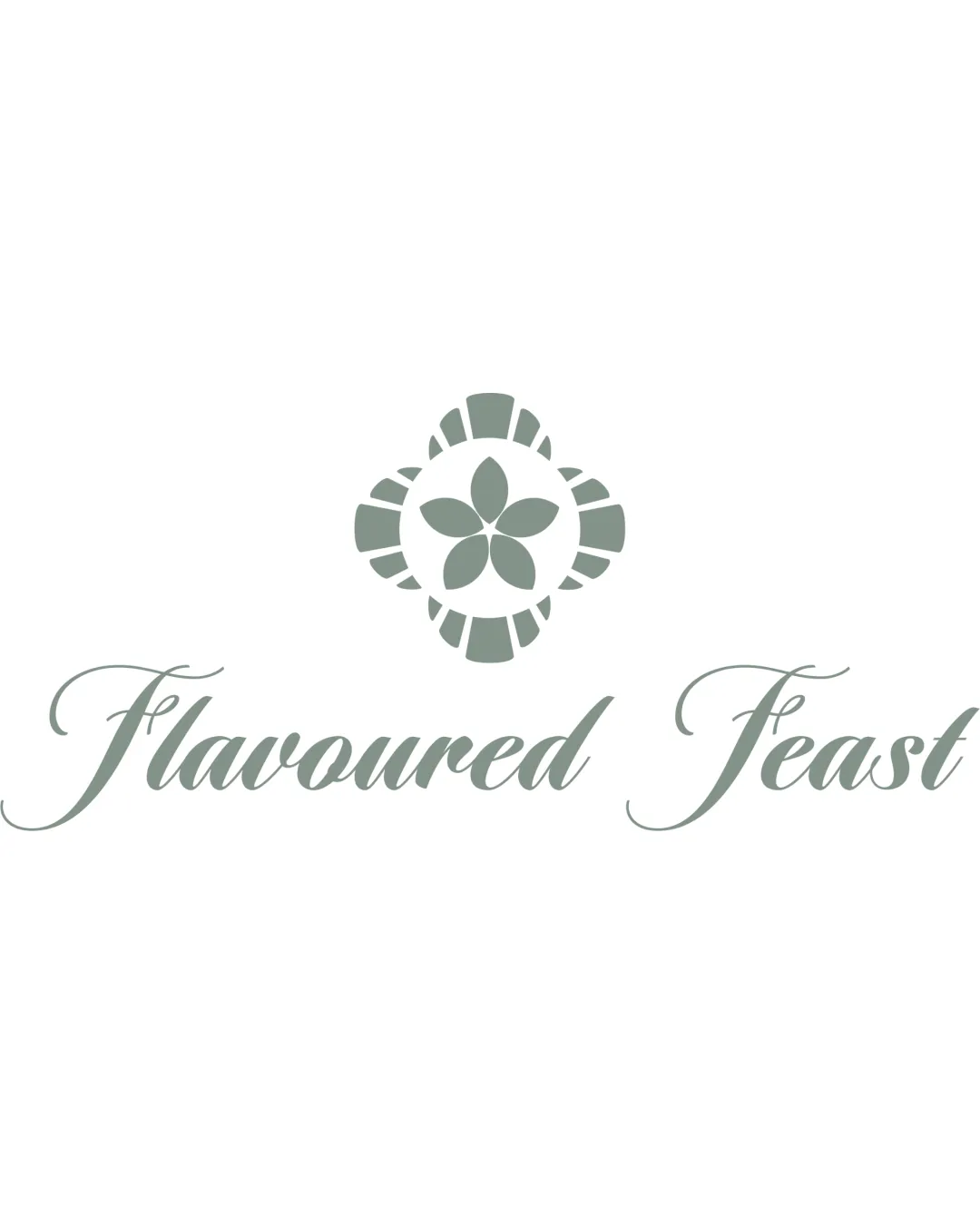
An elegant script wordmark reading 'Flavoured Feast' sits below a decorative, symmetrical abstract emblem.

Wordmark

The wordmark 'Flavoured Feast' uses an ornate, connected script style for a refined effect.

Logomark

The logomark consists of a symmetrical floral or abstract emblem with petal-like shapes inside a round, segmented border.

Explain the direction

The story and thinking behind the design.

Positioning statement

An elegant, upscale identity for a bakery that values sophistication and distinctive experiences.

Design rationale

  1. The script typeface sets a refined, premium tone.
  2. The decorative emblem suggests craft and detail, aligning with artisanal baked goods.

Tips for the logo presentation

Mockup ideas

  • Bakery box or bread sleeve featuring the logo with added wheat or rolling pin element integration.
  • Business card mockup with both emblem and script, plus bold tagline variation for readability.
  • Signage example with emblem above simpler sans-serif variant for distance clarity.

Possible objections

  • Does not clearly communicate 'bakery' or yeast focus at a glance.
  • Ornate script may be difficult to read on signage or smaller formats.

Presentation tips

  • Reference competitor bakery logos to support need for category cues.
  • Show legibility tests at various sizes and proposed simplified script alternates.
Try your own review

Wondering how your logo performs?

Get a clear logo score, key risks, and priority fix ideas before your client or audience sees it.

Review my logo