Wondering how your logo performs? 🧐
Get professional logo reviews in seconds and catch design issues in time.
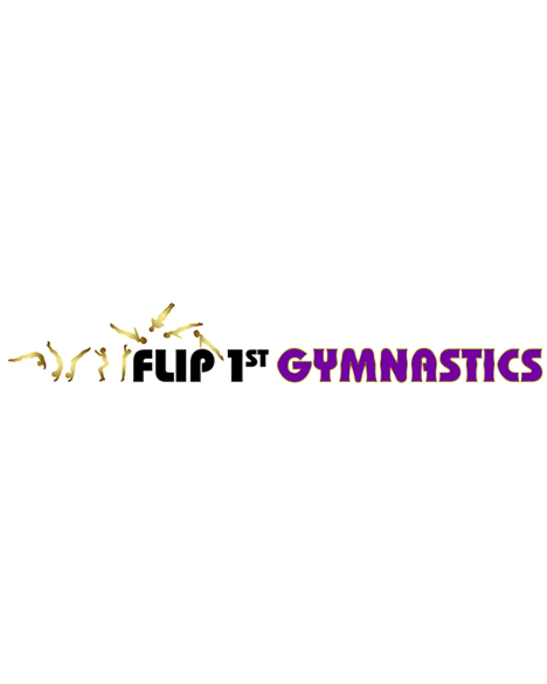
Try it Now!Logo review of FLIP 1ST GYMNASTICS
 Logo analysis by AI
Logo type:
Style:
Detected symbol:
Detected text:
Business industry:
Review requested by The_dinzin
**If AI can recognize or misinterpret it, so can people.
Structured logo review
Legibility
![]() The wordmark 'FLIP 1ST' is highly readable due to bold, clear typography.
The wordmark 'FLIP 1ST' is highly readable due to bold, clear typography.![]() 'GYMNASTICS' stands out in purple, drawing attention to the primary service.
'GYMNASTICS' stands out in purple, drawing attention to the primary service.
![]() The gold silhouettes above 'FLIP 1ST' are small and could obscure the text at smaller sizes.
The gold silhouettes above 'FLIP 1ST' are small and could obscure the text at smaller sizes.![]() Contrast between the two text sections could be improved for easier at-a-glance reading.
Contrast between the two text sections could be improved for easier at-a-glance reading.
Scalability versatility
![]() Simplicity in the primary text ensures basic scalability for large formats like signage and banners.
Simplicity in the primary text ensures basic scalability for large formats like signage and banners.
![]() The intricate gold gymnast figures lose definition and clarity at small sizes like business cards or embroidery.
The intricate gold gymnast figures lose definition and clarity at small sizes like business cards or embroidery.![]() The thin detailing of figures makes the logo unsuitable for favicons, social profile images, or monochrome applications without simplification.
The thin detailing of figures makes the logo unsuitable for favicons, social profile images, or monochrome applications without simplification.![]() Horizontal layout limits reusability in square spaces commonly used for app icons or profile pictures.
Horizontal layout limits reusability in square spaces commonly used for app icons or profile pictures.
200x250 px
100×125 px
50×62 px
Balance alignment
![]() Text is horizontally aligned, and figure placements mirror the flipping motion appropriately.
Text is horizontally aligned, and figure placements mirror the flipping motion appropriately.
![]() Excessive space above the left side due to silhouettes disrupts overall vertical balance.
Excessive space above the left side due to silhouettes disrupts overall vertical balance.![]() The cluster of figures causes the left side to feel visually heavier compared to the right.
The cluster of figures causes the left side to feel visually heavier compared to the right.

Originality
![]() Use of flipping human figures gives a direct visual tie-in with the name and industry.
Use of flipping human figures gives a direct visual tie-in with the name and industry.
![]() Depicting gymnasts in action is somewhat common for gymnastics-related logos.
Depicting gymnasts in action is somewhat common for gymnastics-related logos.![]() The execution lacks a unique twist or highly stylized approach, bordering on generic for sports branding.
The execution lacks a unique twist or highly stylized approach, bordering on generic for sports branding.
Logomark wordmark fit
![]() The concept of gymnasts flipping above the wordmark is contextually relevant.
The concept of gymnasts flipping above the wordmark is contextually relevant.
![]() Stylistic mismatch between flat, bold type and realistic, detailed silhouettes.
Stylistic mismatch between flat, bold type and realistic, detailed silhouettes.![]() Visual weight of figures is imbalanced versus the wordmark, making them feel disconnected.
Visual weight of figures is imbalanced versus the wordmark, making them feel disconnected.
Aesthetic look
![]() Clear energy and movement expressed through the gold figures.
Clear energy and movement expressed through the gold figures.![]() Vibrant purple gives a fun, approachable feel.
Vibrant purple gives a fun, approachable feel.
![]() Logo feels visually busy with multiple detailed figures.
Logo feels visually busy with multiple detailed figures.![]() Typefaces between the name sections seem mismatched rather than cohesive.
Typefaces between the name sections seem mismatched rather than cohesive.
Dual meaning and misinterpretations
![]() There are no inappropriate or misleading shapes; the gymnast silhouettes are recognizable and appropriate.
There are no inappropriate or misleading shapes; the gymnast silhouettes are recognizable and appropriate.
Color harmony
![]() The gold and purple palette stands out and matches the energetic sports theme.
The gold and purple palette stands out and matches the energetic sports theme.![]() Color contrast between key brand terms is effective.
Color contrast between key brand terms is effective.
![]() Gradient or shiny finish on the figures could make reproduction tricky across all mediums.
Gradient or shiny finish on the figures could make reproduction tricky across all mediums.![]() Three main colors plus gradients push the upper limits of color harmony and could be simplified for broader use.
Three main colors plus gradients push the upper limits of color harmony and could be simplified for broader use.
Black
#000000
Gold
#FFD700
Purple
#800080
White
#FFFFFF


