Flowinner logo review
3.5/5
Logo score
Logo review of

Flowinner

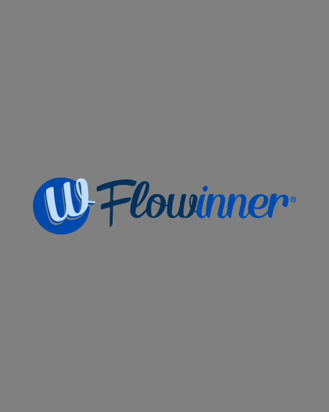
A visually appealing and appropriately themed logo for a CRM, with minor legibility and scalability improvements suggested before production use.

Combination Modern Script Wordmark With Monogram Icon Software/technology
3.5/5
Legibility
3/5
Originality
5/5
Misread
4/5
Balance
3/5
Scale
Your next steps

What to fix first

Focus on the changes that matter. Keep what makes the logo work.

1

Standalone mark

Test monogram visibility and consider boldening or simplifying for small use.

Worth testing High priority Low effort
Area to inspectApproximate location

The thin strokes of the 'W' monogram may lose definition at small sizes or on busy backgrounds.

How to check

Confirm icon clarity at favicon, app icon, and embroidery scale.
See the category review
2

wordmark

Streamline or slightly simplify letter connections for improved clarity at small sizes.

Visible issue Medium priority Medium effort

The handwritten script style is visually attractive but poses minor legibility issues at smaller sizes, especially with 'F' and 'w'.

How to check

Verify text remains clear and readable at reduced sizes.

See the category review
Detailed review

Logo performance breakdown

4/5

Brief & logo match

Based on your brief
Compared with

CRM System

The logo effectively evokes software and CRM attributes, though distinction could be further enhanced for stronger category differentiation.

  • CRM System Theme

    The flowing script and blue color evoke connection and reliability, aligning with CRM software attributes.

  • Distinctiveness In Tech/software Vertical

    Script styling provides some differentiation, but monogram format is familiar in this field.

3.5/5

Legibility

  • Distinctive script style
  • Sufficient contrast against background
  • The handwritten script style is visually attractive but poses minor legibility issues at smaller sizes, especially with 'F' and 'w'.

    Visible issue wordmark

    Try: Streamline or slightly simplify letter connections for improved clarity at small sizes.

    Check: Verify text remains clear and readable at reduced sizes.

3/5

Originality

  • Custom script adds personality
  • The monogram-in-circle approach is familiar for software brands, though the script styling adds some uniqueness.

    Optional refinement Standalone mark

    Try: Explore moderate alterations to the monogram or negative space to enhance distinction.

    Check: Compare against standard CRM/software logos for memorability.

4/5

Color harmony

  • Consistent blue palette suitable for tech context
Blue#1562AD
Blue#1178D8
White#FFFFFF

Estimated colors. Use the original design file for exact values.

Create a full color palette using these colors

Create new palette
4/5

Balance alignment

  • Good alignment between icon and wordmark
  • Wordmark and icon visually cohesive
Uploaded logoAlignment guide overlay

Inspect spacing with the guide. Optical balance may differ from geometric centering.

3/5

Scalability

  • Simple composition
  • The thin strokes of the 'W' monogram may lose definition at small sizes or on busy backgrounds.

    Worth testing Standalone mark

    Try: Test monogram visibility and consider boldening or simplifying for small use.

    Check: Confirm icon clarity at favicon, app icon, and embroidery scale.

    Area to inspectApproximate location
Uploaded logo at 200 pixels wide
200 × 250 px
Uploaded logo at 100 pixels wide
100 × 125 px
Uploaded logo at 50 pixels wide
50 × 63 px

Compare the detail at different sizes. Labels show the full image dimensions.

5/5

Misinterpretations

  • No apparent misreadings or negative associations
4/5

Symbol & text fit

  • Monogram style ties into the 'w' in 'Flowinner'

Black & white

Does the shape still work without color?

Preparing artwork...

Background contrast

Find the surfaces where your logo stays clear.

Compare the mark and lettering on each surface.

Blur & silhouette

A 3px blur softens fine details so you can check whether the overall shape stays recognizable. If key gaps close or elements merge, the logo may rely too heavily on detail.

Original
3px blur

Look for clear separation between shapes and a distinctive outline.

Try your own review

Wondering how your logo performs?

Get a clear logo score, key risks, and priority fix ideas before your client or audience sees it.

Review my logo