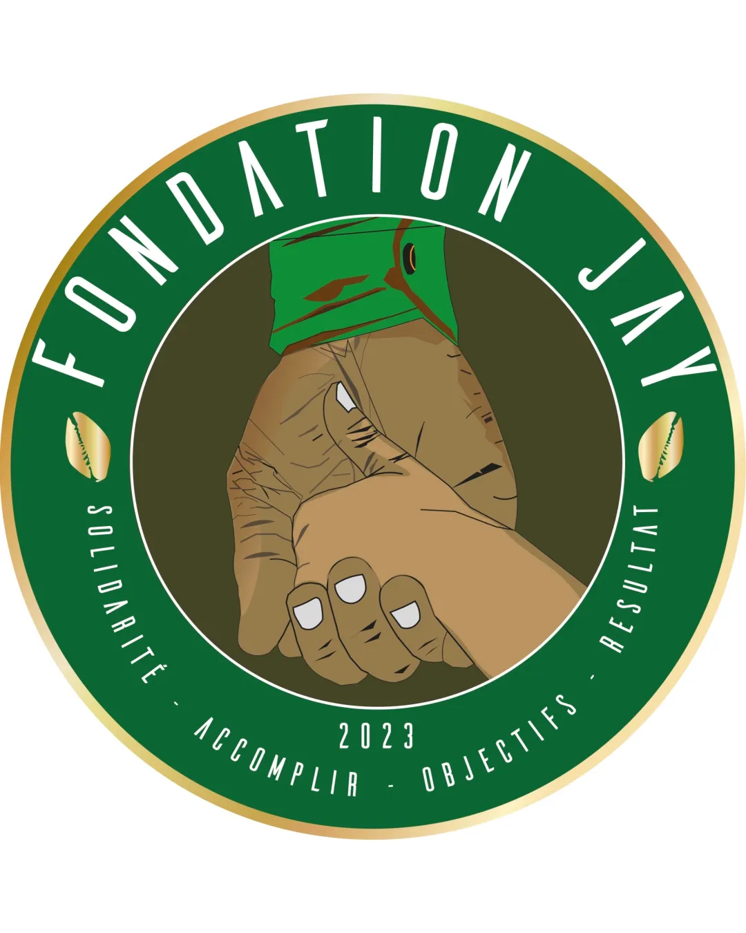
FONDATION JAY SOLIDARITÉ ACCOMPLIR OBJECTIFS RÉS.. logo review
3.2/5
Logo score
Logo review of

Fondation Jay Solidarité Accomplir Objectifs Rés..

A meaningful and on-message emblem that would benefit from simplification for broader, multi-scale use.

Emblem Badge With Illustrative Handshake And Circular Text Charity/nonprofit
3.5/5
Legibility
3/5
Originality
5/5
Misread
3/5
Balance
2.5/5
Scale
Your next steps

What to fix first

Focus on the changes that matter. Keep what makes the logo work.

1

central handshake illustration

Simplify handshake illustration and consider enlarging/substituting smaller text for clarity at reduced sizes.

Visible issue High priority Medium effort
Area to inspectApproximate location

Fine detail in the hands and small text may be lost or illegible at smaller scales.

How to check

Test legibility at business card and favicon scale.

See the category review
2

outer text and elements

Adjust spacing/alignment of shells and text for improved compositional balance and visual flow.

Optional refinement Medium priority Low effort

Text around the circle is well-spaced, but outer elements may appear crowded, and the cowrie shells' alignment does not fully visually balance the composition.

How to check

Review spacing around outer rim components at various sizes.

See the category review
Detailed review

Logo performance breakdown

4/5

Brief & logo match

Based on an inferred industry
Compared with

Charity/social foundation with values of solidarity and goal achievement; French-speaking audience.

Strong fit on solidarity and foundation cues, but stylistic distinctiveness is moderate.

  • Theme Of Solidarity

    The handshake directly illustrates unity, suiting a foundation focused on social good.

  • Clarity Of Mission And Values

    Tagline and founded year succinctly communicate goals and timeline.

3.5/5

Legibility

  • Main name and tagline are readable.
3/5

Originality

  • Cowrie shells and handshake personalize the mark.
  • The handshake and circular badge approach are common in charitable/solidarity logos, reducing distinctiveness; color and symbol use add some own character.

    Optional refinement overall concept

    Try: Introduce a subtle, distinctive stylistic element or modern abstraction to differentiate further from similar badge-style non-profit marks.

    Check: Benchmark symbol/style against prominent foundation emblems.

4/5

Color harmony

  • Earthy green, brown, and gold palette conveys a trustworthy, organic feel.
Green#276640
Gold#E1CA89
Brown#A67858
White#FFFFFF
Dark Brown#1C2018

Estimated colors. Use the original design file for exact values.

Create a full color palette using these colors

Create new palette
3/5

Balance alignment

  • Text largely follows the circular form.
  • Text around the circle is well-spaced, but outer elements may appear crowded, and the cowrie shells' alignment does not fully visually balance the composition.

    Optional refinement outer text and elements

    Try: Adjust spacing/alignment of shells and text for improved compositional balance and visual flow.

    Check: Review spacing around outer rim components at various sizes.

Uploaded logoAlignment guide overlay

Inspect spacing with the guide. Optical balance may differ from geometric centering.

2.5/5

Scalability

  • Clear circular structure.
  • Fine detail in the hands and small text may be lost or illegible at smaller scales.

    Visible issue central handshake illustration

    Try: Simplify handshake illustration and consider enlarging/substituting smaller text for clarity at reduced sizes.

    Check: Test legibility at business card and favicon scale.
    Area to inspectApproximate location
Uploaded logo at 200 pixels wide
200 × 250 px
Uploaded logo at 100 pixels wide
100 × 125 px
Uploaded logo at 50 pixels wide
50 × 63 px

Compare the detail at different sizes. Labels show the full image dimensions.

5/5

Misinterpretations

  • No plausible negative readings.
4/5

Symbol & text fit

  • Symbol and text have a unified thematic connection.

Black & white

Does the shape still work without color?

These tests are available only for logos uploaded in vector (SVG) format.

Background contrast

Find the surfaces where your logo stays clear.

These tests are available only for logos uploaded in vector (SVG) format.

Blur & silhouette

A 3px blur softens fine details so you can check whether the overall shape stays recognizable. If key gaps close or elements merge, the logo may rely too heavily on detail.

These tests are available only for logos uploaded in vector (SVG) format.

Try your own review

Wondering how your logo performs?

Get a clear logo score, key risks, and priority fix ideas before your client or audience sees it.

Review my logo