Wondering how your logo performs? 🧐
Get professional logo reviews in seconds and catch design issues in time.
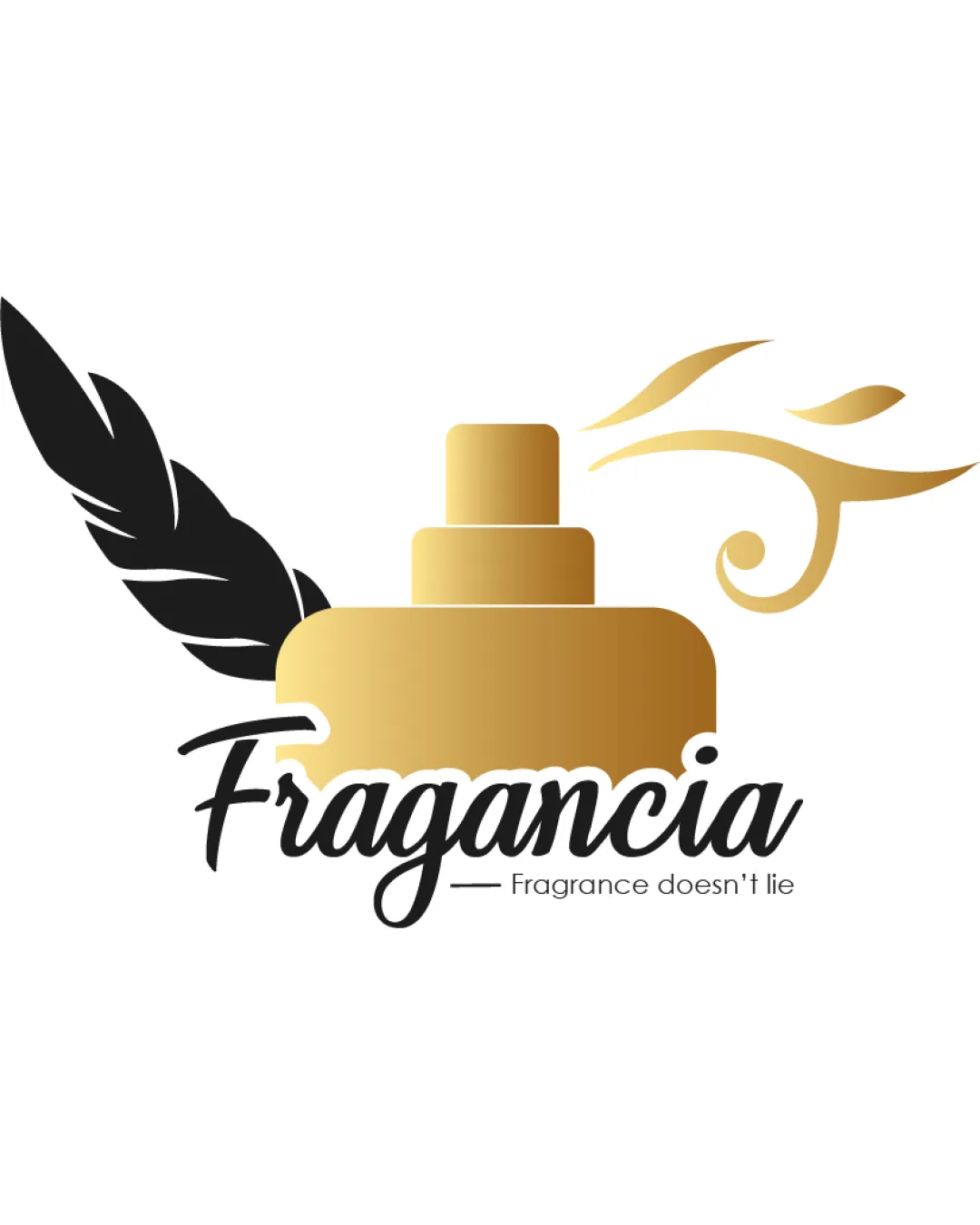
Try it Now!Logo review of Fragancia, Fragrance doesn't lie
 Logo analysis by AI
Logo type:
Style:
Detected symbol:
Detected text:
Business industry:
Review requested by Muteeb_Shaikh
**If AI can recognize or misinterpret it, so can people.
Structured logo review
Legibility
![]() Primary word 'Fragancia' is in a clean, legible script font.
Primary word 'Fragancia' is in a clean, legible script font.![]() Supporting tagline 'Fragrance doesn't lie' uses a lightweight, readable sans-serif.
Supporting tagline 'Fragrance doesn't lie' uses a lightweight, readable sans-serif.
![]() Contrast between the outline of the bottle and overlapping text could be improved for better clarity, especially in small sizes.
Contrast between the outline of the bottle and overlapping text could be improved for better clarity, especially in small sizes.![]() The script font for 'Fragancia' can get lost on small-scale applications, potentially reducing readability.
The script font for 'Fragancia' can get lost on small-scale applications, potentially reducing readability.
Scalability versatility
![]() Logo visually works for larger applications such as storefronts, packaging, or web banners.
Logo visually works for larger applications such as storefronts, packaging, or web banners.
![]() Thin swirls and feather details are likely to be lost or muddied when scaled to smaller uses (business cards, embossing, small labels).
Thin swirls and feather details are likely to be lost or muddied when scaled to smaller uses (business cards, embossing, small labels).![]() Gradients in the bottle and scent effect hurt visibility in monochrome and small-scale reproduction.
Gradients in the bottle and scent effect hurt visibility in monochrome and small-scale reproduction.
200x250 px
100×125 px
50×62 px
Balance alignment
![]() Visual weight is distributed on both sides with feather and scent swirl balancing the bottle.
Visual weight is distributed on both sides with feather and scent swirl balancing the bottle.
![]() Feather on left side overpowers the composition, pulling the balance off from the center.
Feather on left side overpowers the composition, pulling the balance off from the center.![]() Text interacts awkwardly with the bottle silhouette, causing some visual tension and crowding at the bottom.
Text interacts awkwardly with the bottle silhouette, causing some visual tension and crowding at the bottom.

Originality
![]() Combines scent and writing motifs (feather/quill) for a dual metaphor.
Combines scent and writing motifs (feather/quill) for a dual metaphor.
![]() Perfume bottle with swirling lines is a common motif in the beauty industry.
Perfume bottle with swirling lines is a common motif in the beauty industry.![]() Feather does not strongly connect to fragrance, causing the mark to feel less unique and possibly confusing.
Feather does not strongly connect to fragrance, causing the mark to feel less unique and possibly confusing.
Logomark wordmark fit
![]() Both logomark and wordmark use curvilinear forms and similar color palette.
Both logomark and wordmark use curvilinear forms and similar color palette.
![]() Script font and illustrative mark do not fully align stylistically; the mark is bolder and more illustrative, the wordmark is more elegant.
Script font and illustrative mark do not fully align stylistically; the mark is bolder and more illustrative, the wordmark is more elegant.![]() Sizing is inconsistent; the mark is overly dominant compared to the brand name.
Sizing is inconsistent; the mark is overly dominant compared to the brand name.
Aesthetic look
![]() Elegant use of gold and black creates a premium appearance.
Elegant use of gold and black creates a premium appearance.![]() Curved lines suggest motion and scent effectively.
Curved lines suggest motion and scent effectively.
![]() Design is somewhat busy with feather, bottle, and swirls all competing for attention.
Design is somewhat busy with feather, bottle, and swirls all competing for attention.![]() Too many illustrative elements crowd the logo and reduce its visual sophistication.
Too many illustrative elements crowd the logo and reduce its visual sophistication.
Dual meaning and misinterpretations
![]() Mark generally communicates fragrance and premium quality as intended.
Mark generally communicates fragrance and premium quality as intended.
![]() Feather could be confused for other industries such as writing, luxury service, or stationery, causing potential misinterpretation.
Feather could be confused for other industries such as writing, luxury service, or stationery, causing potential misinterpretation.
Color harmony
![]() Simple, elegant palette of black and gold is luxurious and on-brand for beauty industry.
Simple, elegant palette of black and gold is luxurious and on-brand for beauty industry.
![]() Gradient may not reproduce well across all mediums and lacks a truly flat, versatile version.
Gradient may not reproduce well across all mediums and lacks a truly flat, versatile version.
Teak
#B7996E
Black
#000000
White
#FFFFFF


