Wondering how your logo performs? 🧐
Get professional logo reviews in seconds and catch design issues in time.
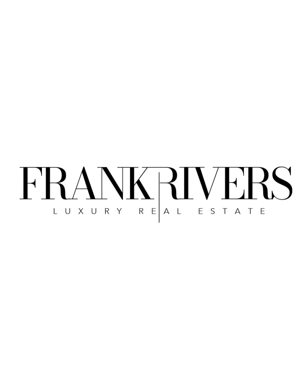
Try it Now!Logo review of FRANK RIVERS, LUXURY REAL ESTATE
 Logo analysis by AI
Logo type:
Style:
Detected symbol:
Detected text:
Business industry:
Review requested by Agentimage
**If AI can recognize or misinterpret it, so can people.
Structured logo review
Legibility
Luxurious and elegant serif font enhances high-end perception
Clear primary and secondary text separation
The extended vertical line in the 'K' slightly interrupts readability between FRANK and RIVERS, creating a visual split that may briefly confuse new viewers
Thin strokes in the tagline may be hard to read at very small sizes
Scalability versatility
Simple monochromatic color palette is versatile across different mediums
Minimalist design is suitable for print and digital use
Thin strokes and fine serif details may lose visibility at small scales, especially in embroidery or small signage
The extended 'K' line may blend or disappear in contexts where clarity or high contrast is lost (e.g., small packaging or favicons)

200x250 px

100×125 px

50×62 px
Balance alignment
Horizontal alignment of the wordmark is visually consistent
Tagline is well-centered beneath the main text
The elongated 'K' creates a slight imbalance between FRANK and RIVERS, drawing disproportionate attention to the midpoint
RIVERS feels a bit disconnected from FRANK due to the separating line


Originality
Elegant use of letter extension for branding distinguishes it from generic wordmarks
Sophisticated typographic approach suitable for luxury sector
Despite the typographic play with 'K', wordmark logos for real estate can be somewhat common, making overall approach less unique
No icon or symbol for brand mark versatility
Aesthetic look
Minimalist and elegantly luxurious feel ideal for the target market
Strong typographic emphasis gives a professional first impression
The split may be interpreted as a visual barrier rather than a smooth link, which could slightly disrupt the premium flow
Dual meaning and misinterpretations
No inappropriate shapes or ambiguous symbols detected
Design communicates formality and luxury clearly
Color harmony
Classic black and white palette exudes elegance and is highly versatile
Perfect color minimalism for upscale branding
Black
#000000
White
#FFFFFF

