Wondering how your logo performs? 🧐
Get professional logo reviews in seconds and catch design issues in time.
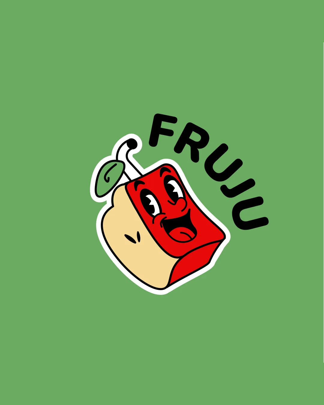
Try it Now!Logo review of FRUJU
 Logo analysis by AI
Logo type:
Style:
Detected symbol:
Detected text:
Business industry:
Review requested by Meloo123
**If AI can recognize or misinterpret it, so can people.
Structured logo review
Legibility
![]() Text 'FRUJU' is clear and readable
Text 'FRUJU' is clear and readable![]() High contrast between text and background
High contrast between text and background
![]() Curved alignment of the text may slightly impede quick legibility at small sizes
Curved alignment of the text may slightly impede quick legibility at small sizes
Scalability versatility
![]() Bold lines help maintain clarity at smaller sizes
Bold lines help maintain clarity at smaller sizes![]() Simple color blocking aids visibility
Simple color blocking aids visibility
![]() Facial details and outline may become muddy at favicon or small merchandise scale
Facial details and outline may become muddy at favicon or small merchandise scale![]() Complexity of the juice box character could be lost in embroidery or tiny labels
Complexity of the juice box character could be lost in embroidery or tiny labels
200x250 px
100×125 px
50×62 px
Balance alignment
![]() Logo feels visually grounded with text arching over the illustration
Logo feels visually grounded with text arching over the illustration![]() White outline creates separation from background
White outline creates separation from background
![]() Text arching does not perfectly echo the shape or angle of the juice box, creating some minor disconnect
Text arching does not perfectly echo the shape or angle of the juice box, creating some minor disconnect

Originality
![]() Personified juice box is engaging and unique for the category
Personified juice box is engaging and unique for the category![]() Playful execution stands out from generic food/beverage marks
Playful execution stands out from generic food/beverage marks
![]() Cartoon face on packaging is a familiar trope, though well-rendered
Cartoon face on packaging is a familiar trope, though well-rendered
Logomark wordmark fit
![]() Wordmark style complements the playful vibe of the logomark
Wordmark style complements the playful vibe of the logomark![]() Both elements share the same bold line weight and energy
Both elements share the same bold line weight and energy
![]() Text curvature doesn’t perfectly align with juice box form, very slight mismatch
Text curvature doesn’t perfectly align with juice box form, very slight mismatch
Aesthetic look
![]() Cohesive, fun, and clean illustration
Cohesive, fun, and clean illustration![]() Colors and composition appear modern and inviting
Colors and composition appear modern and inviting
![]() Slightly busy with facial features and outline thickness on small scales
Slightly busy with facial features and outline thickness on small scales
Dual meaning and misinterpretations
![]() No inappropriate shapes or accidental meanings observed
No inappropriate shapes or accidental meanings observed
Color harmony
![]() Color palette is harmonious and lively
Color palette is harmonious and lively![]() Limited palette that matches target market and playful tone
Limited palette that matches target market and playful tone
![]() Contrast between cream and light green may be reduced on some screens
Contrast between cream and light green may be reduced on some screens
Olivine
#74B366
Flame Red
#D62D1F
Blanched Almond
#F5E1B9
White
#FFFFFF
Black
#000000


