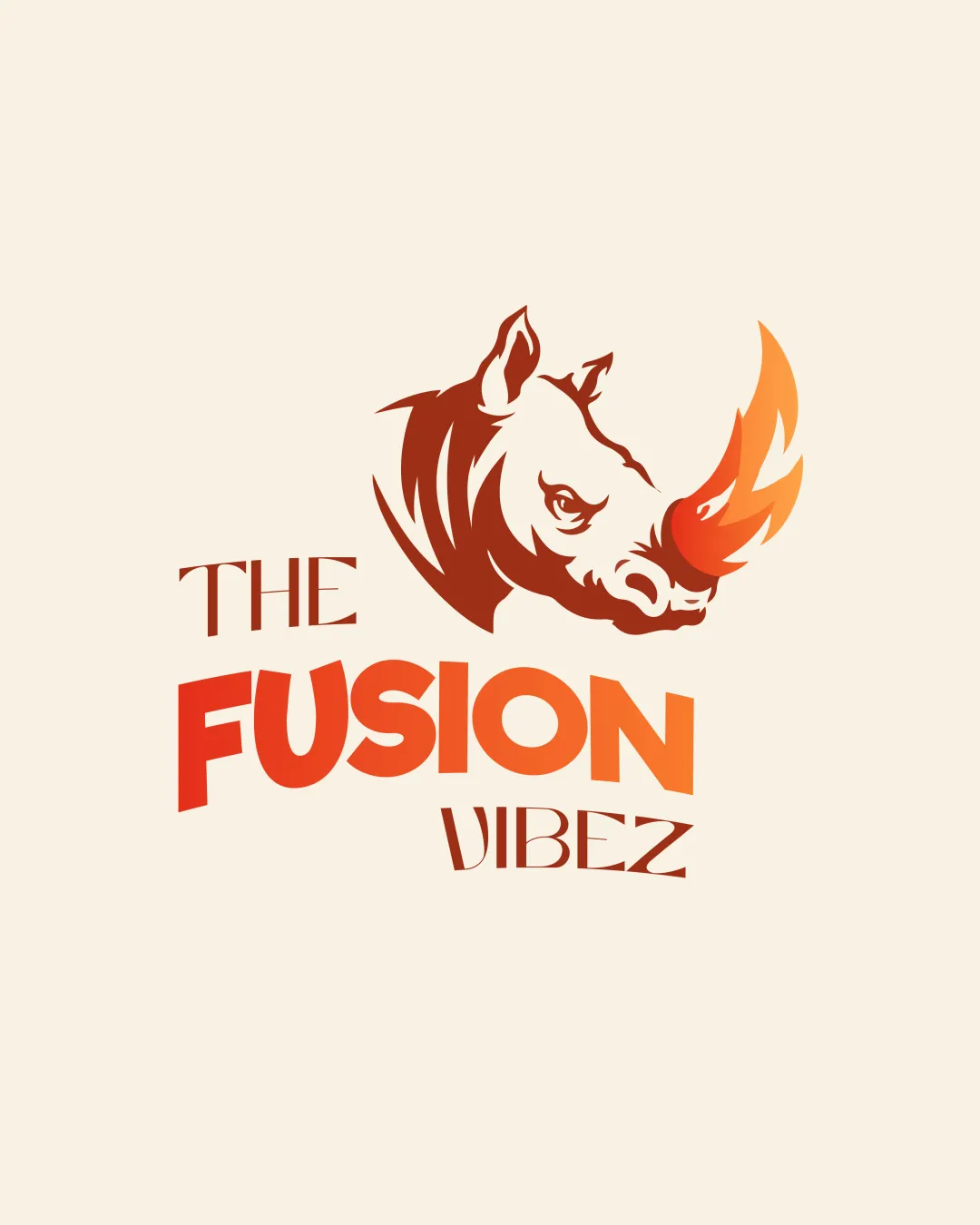
THE FUSION VIBEZ logo review
4/5
Logo score
Logo review of

The Fusion Vibez

A distinctive, vibrant mascot logo with great fit for a modern fusion eatery; only small refinements to readability and spacing are needed.

Combination Mark Bold Modern Illustrative Restaurant/food
3/5
Legibility
4/5
Originality
5/5
Misread
3/5
Balance
3/5
Scale
Your next steps

What to fix first

Focus on the changes that matter. Keep what makes the logo work.

1

wordmark: 'VIBEZ'

Improve the clarity of the 'E' and 'Z' while maintaining style.

Visible issue High priority Low effort
Area to inspectApproximate location

The 'VIBEZ' uses unconventional letterforms, with the 'Z' and 'E' especially stylized, making it slightly less immediately readable.

How to check

Compare recognition speed and feedback on wordmark readability among first-time viewers.

See the category review
2

mark and wordmark composition

Adjust spacing or alignment between the rhino and text to achieve stronger optical cohesion.

Optional refinement Medium priority Low effort
Area to inspectApproximate location

The rhino mark and wordmark are visually adjacent but slightly disconnected, with the mark feeling heavier on the left, causing mild imbalance.

How to check

Test with mockup placements to see if visual flow improves.

See the category review
Detailed review

Logo performance breakdown

5/5

Brief & logo match

Based on your brief
Compared with

Energetic, bold, flavor-driven, culturally proud fast-casual restaurant hoping to stand out with locals, tourists, and families.

The logo sharply embodies the brand's friendly, bold, and modern fusion food positioning while avoiding generic or overly traditional clichés.

  • Mascot Mark

    The rhino delivers energy and an inviting personality, fitting the brief's desire for friendly boldness and cultural pride.

  • Fusion/cultural Visual

    The flame horn subtly references both flavor (spice/heat) and fusion, effectively uniting Turkish-Nepali cuisine without clichés.

3/5

Legibility

  • Bold 'FUSION' word highly readable
  • The 'VIBEZ' uses unconventional letterforms, with the 'Z' and 'E' especially stylized, making it slightly less immediately readable.

    Visible issue wordmark: 'VIBEZ'

    Try: Improve the clarity of the 'E' and 'Z' while maintaining style.

    Check: Compare recognition speed and feedback on wordmark readability among first-time viewers.
    Area to inspectApproximate location
4/5

Originality

  • Uncommon rhino-fire motif for fusion food
  • Custom wordmark styling
4/5

Color harmony

  • Warm, energetic palette matches culinary theme
  • Good contrast on light background
Brown#752915
Orange#F37021
Red-Orange#E74828
Light Beige#F9EBD4

Estimated colors. Use the original design file for exact values.

Create a full color palette using these colors

Create new palette
3/5

Balance alignment

  • Distinct sections for mark and wordmark
  • The rhino mark and wordmark are visually adjacent but slightly disconnected, with the mark feeling heavier on the left, causing mild imbalance.

    Optional refinement mark and wordmark composition

    Try: Adjust spacing or alignment between the rhino and text to achieve stronger optical cohesion.

    Check: Test with mockup placements to see if visual flow improves.

    Area to inspectApproximate location
Uploaded logoAlignment guide overlay

Inspect spacing with the guide. Optical balance may differ from geometric centering.

3/5

Scalability

  • Simple shapes used in rhino mark
  • The gradient flame horn and finer line details may lose clarity or contrast at very small sizes or on complex backgrounds.

    Worth testing flame-shaped horn in rhino mark

    Try: Verify mark reproduction at small scales and in single color.

    Check: Print or size down mark to app icon scale and review legibility.

Uploaded logo at 200 pixels wide
200 × 250 px
Uploaded logo at 100 pixels wide
100 × 125 px
Uploaded logo at 50 pixels wide
50 × 63 px

Compare the detail at different sizes. Labels show the full image dimensions.

5/5

Misinterpretations

  • No harmful or confusing double meanings identified
4/5

Symbol & text fit

  • Both bold and energetic
  • Color/graphic transitions match

Black & white

Does the shape still work without color?

These tests are available only for logos uploaded in vector (SVG) format.

Background contrast

Find the surfaces where your logo stays clear.

These tests are available only for logos uploaded in vector (SVG) format.

Blur & silhouette

A 3px blur softens fine details so you can check whether the overall shape stays recognizable. If key gaps close or elements merge, the logo may rely too heavily on detail.

These tests are available only for logos uploaded in vector (SVG) format.

Try your own review

Wondering how your logo performs?

Get a clear logo score, key risks, and priority fix ideas before your client or audience sees it.

Review my logo