Wondering how your logo performs? 🧐
Get professional logo reviews in seconds and catch design issues in time.
Try it Now!Logo review of GASIFY The Solution you Deserve!!
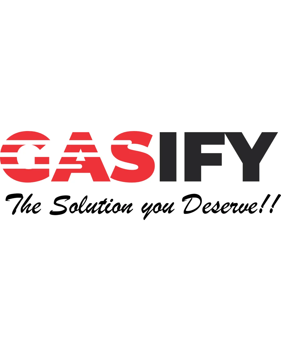
 Logo analysis by AI
Recognized style:
Logo type:
Detected text:
Business industry:
Review requested by Pacifccyber
**If AI can recognize or misinterpret it, so can people.
Structured logo review
Legibility
Clear and bold font, easy to read.
The striped effect on 'GAS' slightly reduces legibility.
Scalability versatility
Bold fonts ensure visibility on various scales.
The stripes might lose clarity when scaled down significantly.

200x250 px

100×125 px

50×62 px
Balance alignment
The text alignment is fairly balanced.
The small script font for the tagline creates slight imbalance.


Originality
Bold typography adds some character.
The design is somewhat generic with common elements.
Aesthetic look
Bold color choice creates strong impact.
Could be refined for a cleaner aesthetic.
Cultural sensitivity dual meaning
No cultural sensitivity issues detected.
Color harmony
Red and black create strong contrast.
Limited color palette may feel a bit harsh.


