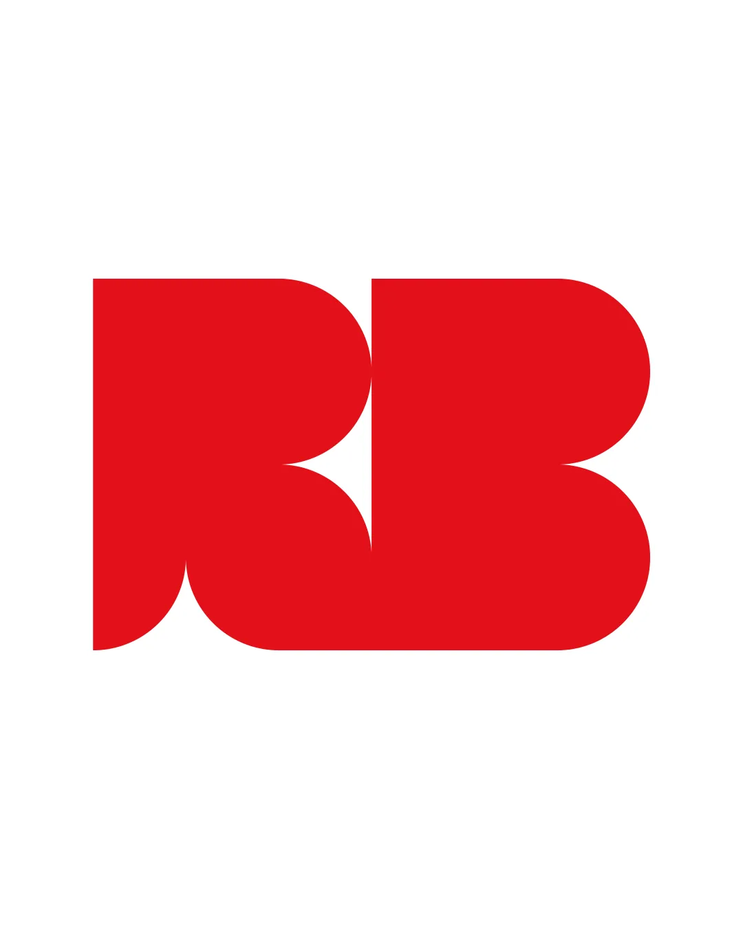
bold RB monogram logo review
4.0 / 5
Logo score
Logo review of

Bold Rb Monogram

A bold, memorable monogram with strong visual presence and refined construction that stands out among competitors. Minor tweaks will further elevate its clarity and versatility.

Monogram Geometric, Modern, Bold
3.5/5
Legibility
4/5
Originality
4.5/5
Misread
4.5/5
Balance
4/5
Scale
Action plan

What to fix first

The most important fixes to handle before polishing the full presentation.

1

Consider introducing slight separation or micro-spacing between the R and B for legibility at small sizes.

Medium priority

Current tightness may reduce distinction at very small scales.

Impact: Improves Clarity And Recognition In Miniature Or Digital Applications. · Effort: Low

2

Explore a monochrome variant or secondary color palette for more flexible brand applications.

Low priority

Single red limits usability in diverse contexts.

Impact: Increases Utility On Backgrounds And In Multi-color Branding. · Effort: Low

Detailed review

Logo performance breakdown

3.5/5

Legibility

Checkmark icon Forms are recognizable as R and B at medium-large sizes.

Warning icon At smaller sizes or quick glance, 'R' may become less legible due to stylization.

4/5

Originality

Checkmark icon Strong, unified approach to RB monogram.
Checkmark icon Distinct from generic monogram templates.

Warning icon Some geometric monograms tread similar territory, but this is above-average.

4/5

Color harmony

Checkmark icon Bold use of red on white creates high visibility.
Checkmark icon Color is energetic and grabs attention.

Warning icon Single color may limit subtle brand expression.

Red
#E10600

Your palette is close. Refine the color roles and combinations before updating the logo.

Build brand colors
4.5/5

Balance alignment

Checkmark icon Excellent weight distribution and optical balance.
Checkmark icon Geometric construction creates a cohesive block.

logo 200x250 pixels scalability test alignment grid overlay
4/5

Scalability

Checkmark icon Large, simple shapes scale down well; minimal detail.

Warning icon Some internal curves touch and could lose clarity at very small sizes.

logo 200x250 pixels scalability test

200x250 px

logo 100x125 pixels scalability test

100×125 px

logo 50x62 pixels scalability test

50×62 px

4.5/5

Misinterpretations

Checkmark icon No negative or ambiguous secondary readings.

Try your own review

Wondering how your logo performs?

Get a clear logo score, key risks, and priority fix ideas before your client or audience sees it.

Review my logo