Wondering how your logo performs? 🧐
Get professional logo reviews in seconds and catch design issues in time.
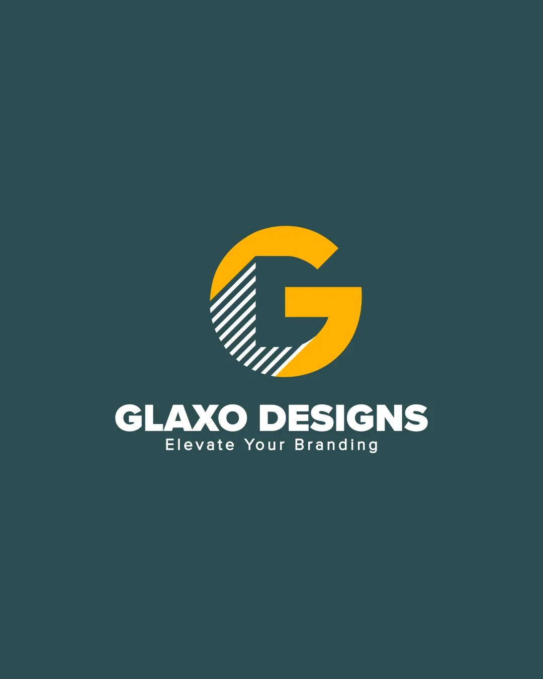
Try it Now!Logo review of Glaxo Designs, Elevate Your Branding
 Logo analysis by AI
Recognized style:
Logo type:
Detected symbol:
Detected text:
Business industry:
Review requested by GlaxoDesigns
**If AI can recognize or misinterpret it, so can people.
Structured logo review
Legibility
Text is clear and easy to read.
Scalability versatility
The bold design is versatile.
Diagonal lines might be less clear in very small sizes.

200x250 px

100×125 px

50×62 px
Balance alignment
Well-balanced between the symbol and text.


Originality
Stylized G with unique stripe design.
The use of a 'G' is somewhat common.
Aesthetic look
Professional and aesthetically pleasing.
Cultural sensitivity dual meaning
No cultural issues detected.
Color harmony
Strong contrast and effective color use.

