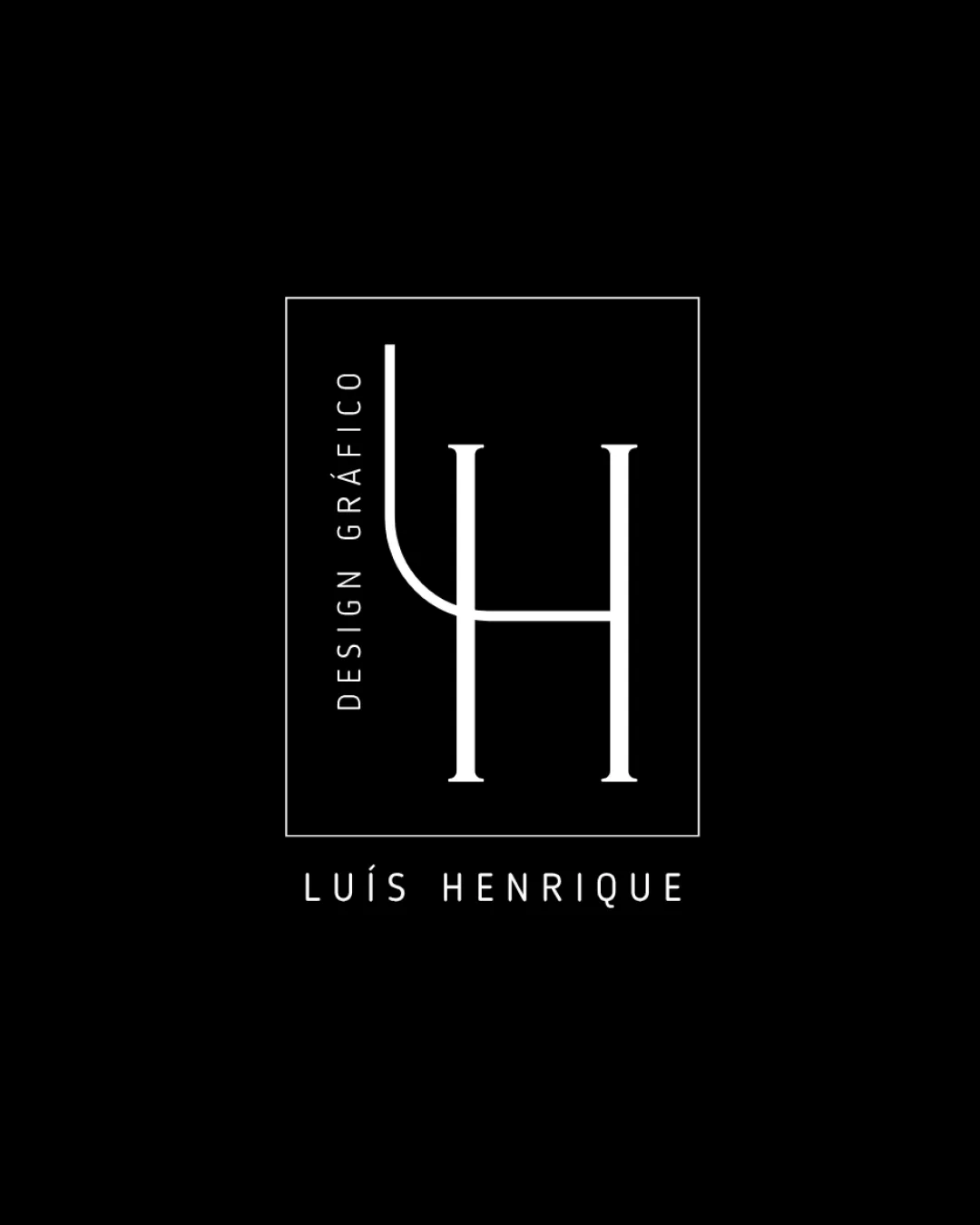
DESIGN GRÁFICO LUÍS HENRIQUE logo review
4/5
Logo score
Logo review of

Design Gráfico Luís Henrique

A strong and distinctive personal branding mark for a graphic designer, needing only minor adjustments for versatility.

Combination Minimalist Monogram With Geometric Structure Graphic Design
4/5
Legibility
4/5
Originality
5/5
Misread
4/5
Balance
3/5
Scale
Your next steps

What to fix first

Focus on the changes that matter. Keep what makes the logo work.

1

monogram (L/H intertwine)

Test legibility at reduced scales and/or consider slightly increasing stroke weight.

Visible issue High priority Low effort
Area to inspectApproximate location

Thin line weights in the monogram may risk disappearing or losing clarity at small sizes.

How to check

Confirm the lines remain visible and distinct in print and digital small formats.

See the category review
2

main rectangle

Increase internal margin to the left for better visual balance within the rectangle.

Optional refinement Medium priority Low effort
Area to inspectApproximate location

The vertical alignment of 'DESIGN GRÁFICO' feels a bit tight to the left edge compared to the internal spacing on other sides.

How to check

Assess if the left margin spacing matches the overall border/padding aesthetics.

See the category review
Detailed review

Logo performance breakdown

4/5

Brief & logo match

Based on an inferred industry
Compared with

Personal branding for a graphic designer, inferred from name and the phrase 'DESIGN GRÁFICO.'

The design clearly conveys a modern and personalized approach suitable for a graphic designer, with minor practical caveats.

  • Graphic Designer Identity

    Initials 'LH' integrated with the profession stated in both the logo and the main name.

  • Modern Minimalist Expression

    Single-color, geometric design and thin lines showcase contemporary aesthetic skills.

4/5

Legibility

  • Text and initials are highly readable.
  • Accent marks are visible.
4/5

Originality

  • Distinctive blend of 'L' and 'H' in a single mark.
  • Modern minimalist character.
4/5

Balance alignment

  • Monogram well-centered, harmonious spacing between major elements.
  • The vertical alignment of 'DESIGN GRÁFICO' feels a bit tight to the left edge compared to the internal spacing on other sides.

    Optional refinement main rectangle

    Try: Increase internal margin to the left for better visual balance within the rectangle.

    Check: Assess if the left margin spacing matches the overall border/padding aesthetics.

    Area to inspectApproximate location
Uploaded logoAlignment guide overlay

Inspect spacing with the guide. Optical balance may differ from geometric centering.

3/5

Scalability

  • Simple structure with no fine detail outside monogram.
  • Thin line weights in the monogram may risk disappearing or losing clarity at small sizes.

    Visible issue monogram (L/H intertwine)

    Try: Test legibility at reduced scales and/or consider slightly increasing stroke weight.

    Check: Confirm the lines remain visible and distinct in print and digital small formats.
    Area to inspectApproximate location
Uploaded logo at 200 pixels wide
200 × 250 px
Uploaded logo at 100 pixels wide
100 × 125 px
Uploaded logo at 50 pixels wide
50 × 63 px

Compare the detail at different sizes. Labels show the full image dimensions.

5/5

Misinterpretations

  • No plausible unintended readings or ambiguities.
4/5

Symbol & text fit

  • Monogram and name reinforce each other; both styled in modern, consistent lines.

Black & white

Does the shape still work without color?

These tests are available only for logos uploaded in vector (SVG) format.

Background contrast

Find the surfaces where your logo stays clear.

These tests are available only for logos uploaded in vector (SVG) format.

Blur & silhouette

A 3px blur softens fine details so you can check whether the overall shape stays recognizable. If key gaps close or elements merge, the logo may rely too heavily on detail.

These tests are available only for logos uploaded in vector (SVG) format.

Try your own review

Wondering how your logo performs?

Get a clear logo score, key risks, and priority fix ideas before your client or audience sees it.

Review my logo