letter G
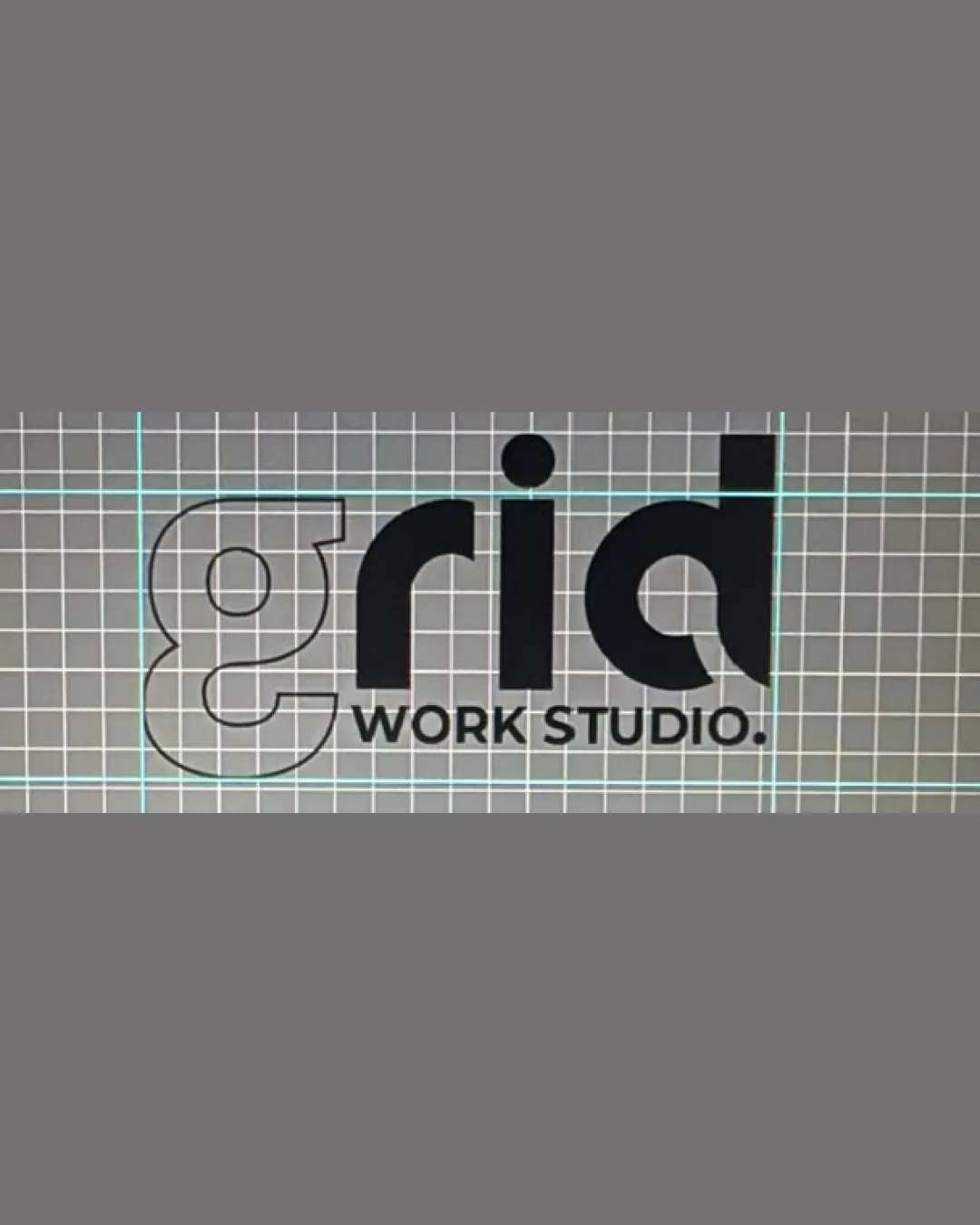
Enhance stroke weight or solidify the 'g' for consistency with other letters.
Logo preview unavailable. The written feedback is still available on this card.
The outlined 'g' has much lighter weight than the other letters, potentially reducing its prominence and affecting quick readability, especially at small sizes.
How to check
See the category review Test at small scales and in monochrome contexts.