Wondering how your logo performs? 🧐
Get professional logo reviews in seconds and catch design issues in time.
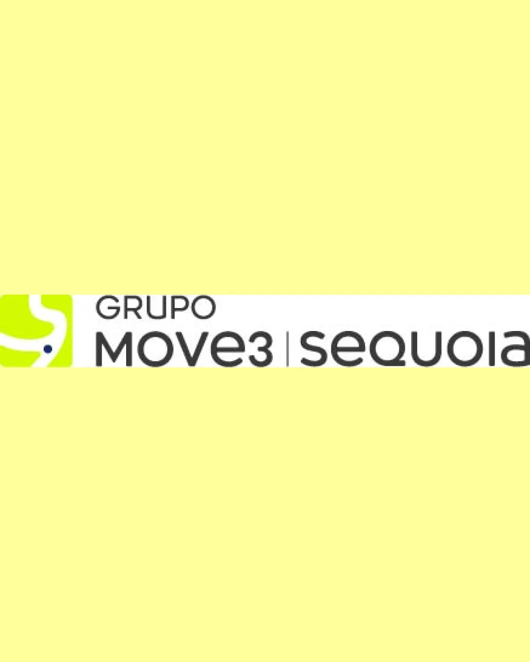
Try it Now!Logo review of GRUPO MOVE3 | sequoia
 Logo analysis by AI
Logo type:
Style:
Detected symbol:
Negative space:
Detected text:
Business industry:
Review requested by Titeefelix
**If AI can recognize or misinterpret it, so can people.
Structured logo review
Legibility
![]() Clear modern sans-serif font enhances readability.
Clear modern sans-serif font enhances readability.![]() Good spacing between the words and elements.
Good spacing between the words and elements.![]() Strong contrast between dark text and white background.
Strong contrast between dark text and white background.
Scalability versatility
![]() Clean, simple shapes on the symbol and text will scale well to medium and large applications (website header, signage, vehicle livery).
Clean, simple shapes on the symbol and text will scale well to medium and large applications (website header, signage, vehicle livery).![]() The logo maintains clarity on light backgrounds.
The logo maintains clarity on light backgrounds.
![]() The thin curved lines and dot in the symbol may lose definition at very small sizes (favicon, pen imprint, embroidery).
The thin curved lines and dot in the symbol may lose definition at very small sizes (favicon, pen imprint, embroidery).![]() The horizontal layout may not adapt well to square or stacked mockups without an alternate mark version.
The horizontal layout may not adapt well to square or stacked mockups without an alternate mark version.
200x250 px
100×125 px
50×62 px
Balance alignment
![]() Strong left alignment between the symbol and logotype.
Strong left alignment between the symbol and logotype.![]() Consistent vertical alignment within text lines.
Consistent vertical alignment within text lines.
![]() The heavy left-side symbol may visually outweigh the lighter 'GRUPO' text above the main brand names.
The heavy left-side symbol may visually outweigh the lighter 'GRUPO' text above the main brand names.![]() The dividing line between MOVE3 and sequoia is subtle, but could cause visual disconnection depending on application.
The dividing line between MOVE3 and sequoia is subtle, but could cause visual disconnection depending on application.

Originality
![]() Attempts unique abstraction within the symbol, providing some brand distinction.
Attempts unique abstraction within the symbol, providing some brand distinction.![]() Incorporates an abstract S/path form, which can reference movement/logistics.
Incorporates an abstract S/path form, which can reference movement/logistics.
![]() The symbol relates loosely to the industry and, while clean, feels generic enough to be interchangeable with other brands.
The symbol relates loosely to the industry and, while clean, feels generic enough to be interchangeable with other brands.![]() No unique customization in the wordmark/letterforms beyond the symbol.
No unique customization in the wordmark/letterforms beyond the symbol.
Logomark wordmark fit
![]() Symbol and type share a similar modern geometric style, supporting consistency.
Symbol and type share a similar modern geometric style, supporting consistency.![]() Color palette is repeated between logomark and logotype (lime and gray).
Color palette is repeated between logomark and logotype (lime and gray).
![]() The boldness/weight of the symbol is stronger than the relatively light wordmark, causing mild imbalance.
The boldness/weight of the symbol is stronger than the relatively light wordmark, causing mild imbalance.
Aesthetic look
![]() Clean, minimalistic look is appealing for modern industries.
Clean, minimalistic look is appealing for modern industries.![]() Color scheme feels fresh and contemporary.
Color scheme feels fresh and contemporary.
![]() Slightly generic look due to lack of distinctive custom elements or creative integration.
Slightly generic look due to lack of distinctive custom elements or creative integration.
Dual meaning and misinterpretations
![]() No inappropriate or confusing visual elements detected in the symbol or composition.
No inappropriate or confusing visual elements detected in the symbol or composition.
Color harmony
![]() Strong, simple palette with good contrast.
Strong, simple palette with good contrast.![]() Consistent use of lime, white, and dark gray across elements.
Consistent use of lime, white, and dark gray across elements.
![]() The lime green is very vibrant and can overpower softer applications.
The lime green is very vibrant and can overpower softer applications.
Lime
#D5F025
White
#FFFFFF
Dark Gray
#303030


