Wondering how your logo performs? 🧐
Get professional logo reviews in seconds and catch design issues in time.
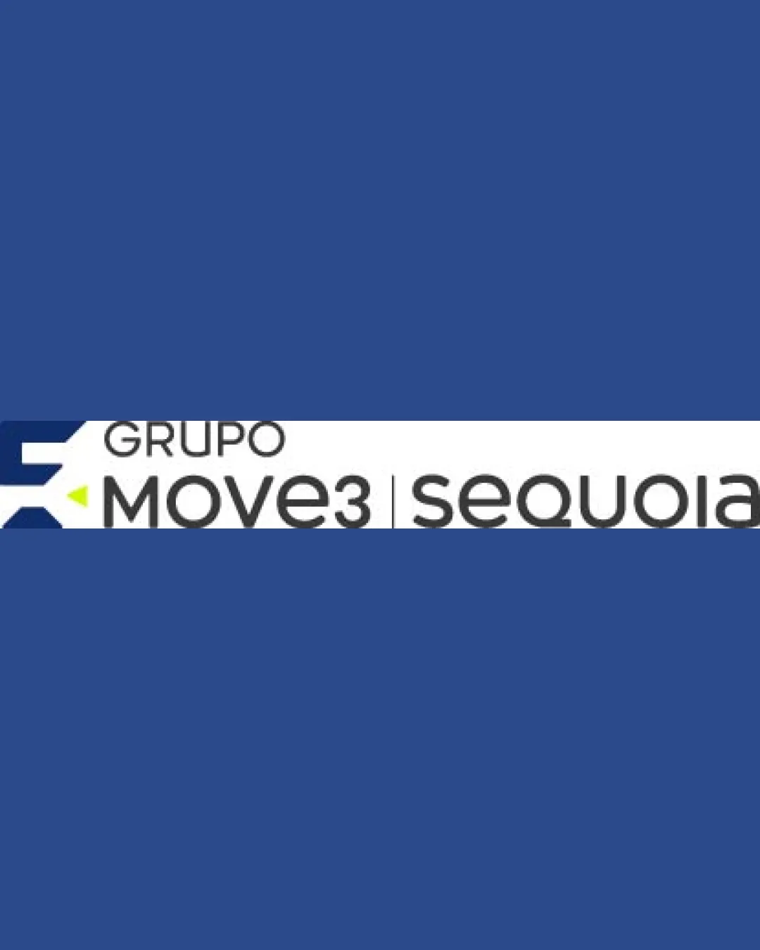
Try it Now!Logo review of GRUPO MOVE3 | sequoia
 Logo analysis by AI
Logo type:
Style:
Detected symbol:
Negative space:
Detected text:
Business industry:
Review requested by Titeefelix
**If AI can recognize or misinterpret it, so can people.
Structured logo review
Legibility
![]() All text is highly readable with clean sans-serif fonts
All text is highly readable with clean sans-serif fonts![]() Good contrast with background for major text elements
Good contrast with background for major text elements
![]() The word 'GRUPO' is slightly lighter and thinner compared to other text, which reduces its prominence and legibility at smaller sizes
The word 'GRUPO' is slightly lighter and thinner compared to other text, which reduces its prominence and legibility at smaller sizes![]() Light gray for 'GRUPO' could disappear against lighter backgrounds
Light gray for 'GRUPO' could disappear against lighter backgrounds
Scalability versatility
![]() The icon is simple and recognizable, suitable for digital use, business cards, and packaging
The icon is simple and recognizable, suitable for digital use, business cards, and packaging![]() Sans-serif typography aids clarity at medium-to-large sizes
Sans-serif typography aids clarity at medium-to-large sizes
![]() Long horizontal layout may not work well as a favicon or on square/circular applications
Long horizontal layout may not work well as a favicon or on square/circular applications![]() Thin text and fine spacing in 'GRUPO' and 'sequoia' could struggle in embroidery or small-format labels
Thin text and fine spacing in 'GRUPO' and 'sequoia' could struggle in embroidery or small-format labels![]() Very horizontal ratio limits signage options, especially in constrained spaces
Very horizontal ratio limits signage options, especially in constrained spaces
200x250 px
100×125 px
50×62 px
Balance alignment
![]() Horizontal alignment and spacing between elements is visually logical
Horizontal alignment and spacing between elements is visually logical![]() Dividing line helps create order between sub-brands
Dividing line helps create order between sub-brands
![]() The icon on the far left feels heavy and disconnected from the text block
The icon on the far left feels heavy and disconnected from the text block![]() 'GRUPO' feels misaligned vertically with 'MOVE3 | sequoia', introducing imbalance across the top
'GRUPO' feels misaligned vertically with 'MOVE3 | sequoia', introducing imbalance across the top

Originality
![]() Arrow design in negative space is functional and conveys motion
Arrow design in negative space is functional and conveys motion
![]() Chevron/arrow icon is fairly generic for logistics and not highly distinguishing
Chevron/arrow icon is fairly generic for logistics and not highly distinguishing![]() Little unique treatment in the typography or icon that sets it apart from other sector logos
Little unique treatment in the typography or icon that sets it apart from other sector logos
Logomark wordmark fit
![]() Both elements are geometric and modern
Both elements are geometric and modern
![]() Sizing between the large, bold icon and the light wordmarks is off, making the icon overpower the label
Sizing between the large, bold icon and the light wordmarks is off, making the icon overpower the label![]() Styles between logomark and typography feel mismatched in energy and visual weight
Styles between logomark and typography feel mismatched in energy and visual weight
Aesthetic look
![]() Modern minimalist feel with effective white space
Modern minimalist feel with effective white space
![]() Logo is a bit busy with three separate text elements and a dividing line
Logo is a bit busy with three separate text elements and a dividing line![]() Visual weight of the icon draws attention away from the brand names
Visual weight of the icon draws attention away from the brand names
Dual meaning and misinterpretations
![]() No inappropriate or misleading visual elements present
No inappropriate or misleading visual elements present
Color harmony
![]() Restrained color palette is professional and in line with industry standards
Restrained color palette is professional and in line with industry standards![]() Accent lime draws attention effectively
Accent lime draws attention effectively
![]() Subtle use of gray may reduce contrast in some environments
Subtle use of gray may reduce contrast in some environments
Dark Blue
#2D4C89
Charcoal
#231F20
White
#FFFFFF
Lime
#C9F000


