Wondering how your logo performs? 🧐
Get professional logo reviews in seconds and catch design issues in time.
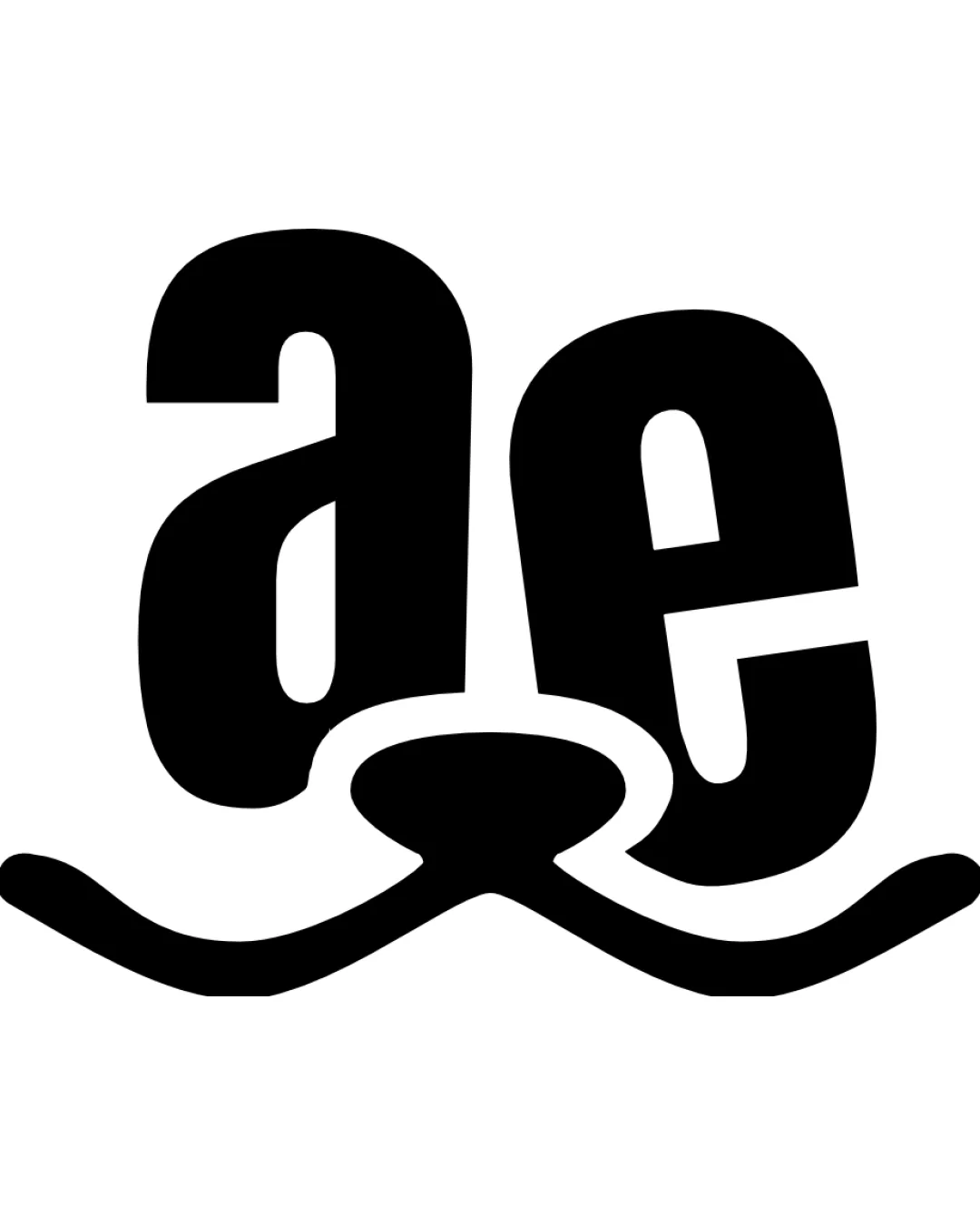
Try it Now!Logo review of GXC

 Logo analysis by AI
Logo type:
Style:
Detected symbol:
Negative space:
Detected text:
Business industry:
Review requested by Gab
**If AI can recognize or misinterpret it, so can people.
Structured logo review
Legibility
![]() Consistent line thickness across all letters
Consistent line thickness across all letters![]() Minimalist approach creates visual intrigue
Minimalist approach creates visual intrigue
![]() Very abstract design makes it hard to immediately read as GXC
Very abstract design makes it hard to immediately read as GXC![]() Letterforms are so deconstructed that viewers may misinterpret the text at first glance
Letterforms are so deconstructed that viewers may misinterpret the text at first glance
Scalability versatility
![]() Simple, thick lines ensure the logo remains visible at small sizes
Simple, thick lines ensure the logo remains visible at small sizes![]() Works well in both digital and print formats, suitable for app icons, web, and large signage
Works well in both digital and print formats, suitable for app icons, web, and large signage
![]() Light gray color reduces contrast on white backgrounds, risking invisibility in applications like business cards or letterheads unless background color is adjusted
Light gray color reduces contrast on white backgrounds, risking invisibility in applications like business cards or letterheads unless background color is adjusted
200x250 px
100×125 px
50×62 px
Balance alignment
![]() Good overall spatial distribution and harmony between elements
Good overall spatial distribution and harmony between elements![]() Corners and curves give a consistent flow
Corners and curves give a consistent flow
![]() The orange top-left corner draws more attention than the rest, creating a slight imbalance
The orange top-left corner draws more attention than the rest, creating a slight imbalance![]() Letter spacing feels irregular due to isolated elements
Letter spacing feels irregular due to isolated elements

Originality
![]() Creative use of geometry and negative space to construct both letters and implied visual framing
Creative use of geometry and negative space to construct both letters and implied visual framing
![]() Bracket-style framing is increasingly common in tech/creative industries
Bracket-style framing is increasingly common in tech/creative industries
Aesthetic look
![]() Crisp, modern silhouette creates a high-end, contemporary feel
Crisp, modern silhouette creates a high-end, contemporary feel![]() Color accent in orange adds visual interest and brand recall
Color accent in orange adds visual interest and brand recall
![]() The overall abstraction may alienate viewers seeking immediate clarity
The overall abstraction may alienate viewers seeking immediate clarity
Dual meaning and misinterpretations
![]() No vulgar or inappropriate secondary shapes detected
No vulgar or inappropriate secondary shapes detected![]() Abstract forms balance both legibility and style
Abstract forms balance both legibility and style
Color harmony
![]() Monochrome palette with a single accent color is visually balanced and sophisticated
Monochrome palette with a single accent color is visually balanced and sophisticated![]() Contrast between accent orange and neutral grays works well
Contrast between accent orange and neutral grays works well
Orange
#FFA500
LightGray
#D3D3D3
White
#FFFFFF