Wondering how your logo performs? 🧐
Get professional logo reviews in seconds and catch design issues in time.
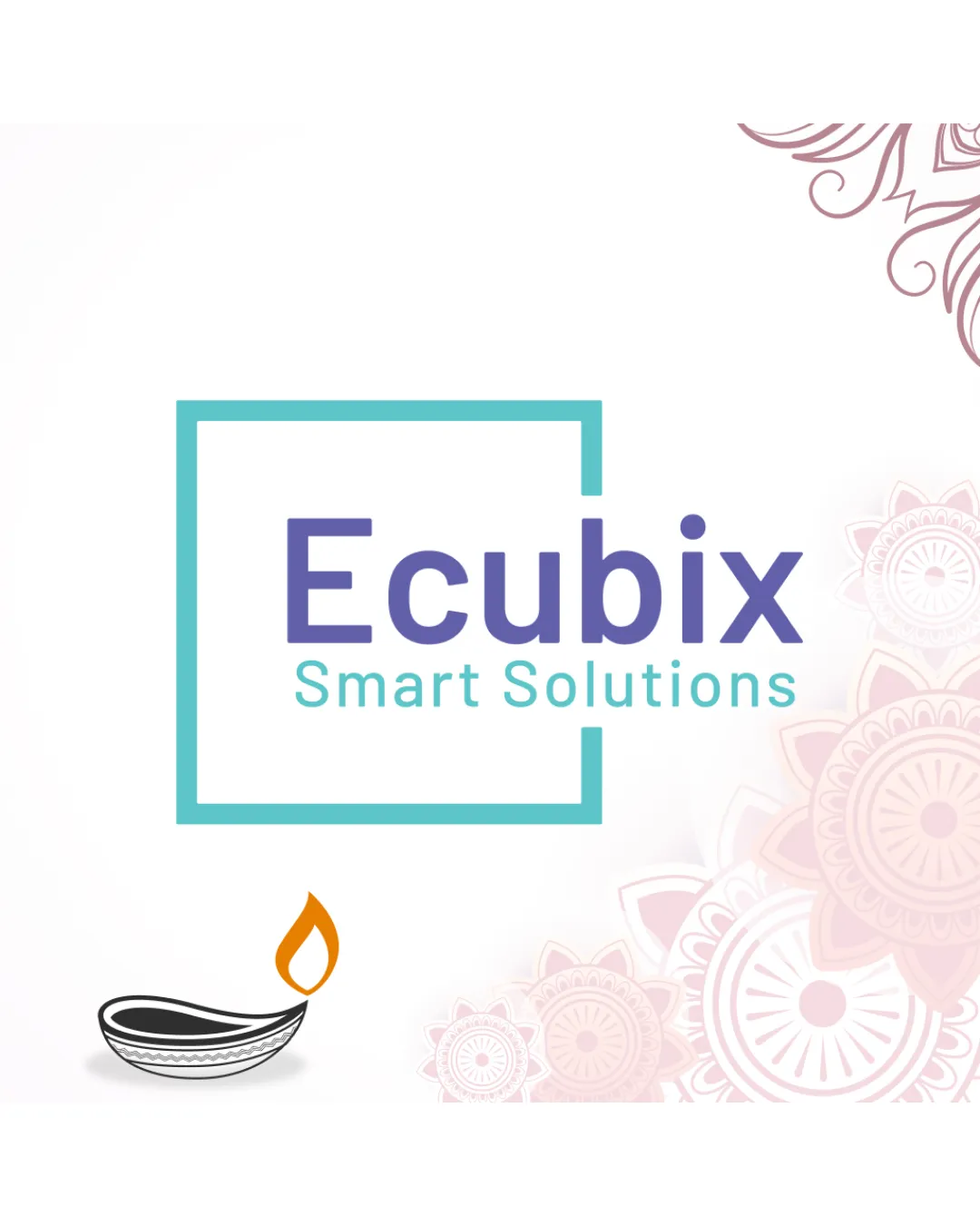
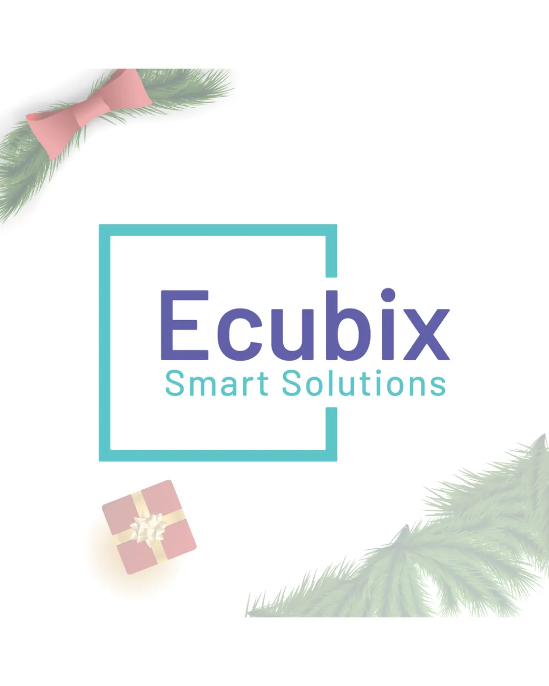
Try it Now!Logo review of Ecubix Smart Solutions
 Logo analysis by AI
Logo type:
Style:
Detected symbol:
Detected text:
Business industry:
Review requested by Mayank_1717
**If AI can recognize or misinterpret it, so can people.
Structured logo review
Legibility
![]() Both 'Ecubix' and 'Smart Solutions' are clear and highly legible at any scale.
Both 'Ecubix' and 'Smart Solutions' are clear and highly legible at any scale.![]() Font choice is clean and contemporary.
Font choice is clean and contemporary.
Scalability versatility
![]() Simple geometric mark and clear text ensure the logo works well in most sizes/applications.
Simple geometric mark and clear text ensure the logo works well in most sizes/applications.![]() Mark and text maintain clarity on business cards, websites, and small merchandise.
Mark and text maintain clarity on business cards, websites, and small merchandise.
![]() Thinness of the turquoise square may lose weight at very small scales (e.g., favicon, embroidery).
Thinness of the turquoise square may lose weight at very small scales (e.g., favicon, embroidery).
200x250 px
100×125 px
50×62 px
Balance alignment
![]() Text is well aligned horizontally with the geometric frame, offering a sturdy, contemporary look.
Text is well aligned horizontally with the geometric frame, offering a sturdy, contemporary look.
![]() The weight of the square and text could be slightly more harmonized; the frame is lighter compared to the boldness of 'Ecubix', causing a slight visual imbalance.
The weight of the square and text could be slightly more harmonized; the frame is lighter compared to the boldness of 'Ecubix', causing a slight visual imbalance.

Originality
![]() The partially open square adds a semi-unique geometric element.
The partially open square adds a semi-unique geometric element.
![]() Use of simple geometric squares is very common in technology branding; lacks a distinctive twist or memorable iconography.
Use of simple geometric squares is very common in technology branding; lacks a distinctive twist or memorable iconography.
Logomark wordmark fit
![]() Both elements share a modern and minimal style.
Both elements share a modern and minimal style.
![]() The visual weight of the square and the type do not feel fully integrated; feels more like two separate elements put together.
The visual weight of the square and the type do not feel fully integrated; feels more like two separate elements put together.
Aesthetic look
![]() Minimalist, modern look; uncluttered and professional.
Minimalist, modern look; uncluttered and professional.
![]() Feels slightly generic due to reliance on geometric minimalism without a stronger concept.
Feels slightly generic due to reliance on geometric minimalism without a stronger concept.
Dual meaning and misinterpretations
![]() No inappropriate or unintended visual interpretations detected.
No inappropriate or unintended visual interpretations detected.
Color harmony
![]() Cool palette; strong contrast between text, symbol, and background.
Cool palette; strong contrast between text, symbol, and background.![]() Color pairing is on-brand for a technology firm; avoids excess.
Color pairing is on-brand for a technology firm; avoids excess.
Turquoise
#38BEC6
Blue Violet
#575CBB
White
#FFFFFF