Wondering how your logo performs? 🧐
Get professional logo reviews in seconds and catch design issues in time.
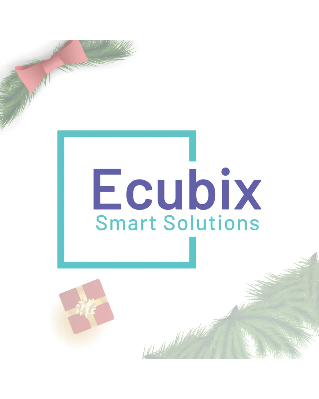
Try it Now!Logo review of Ecubix Smart Solutions

 Logo analysis by AI
Logo type:
Style:
Detected symbol:
Detected text:
Business industry:
Review requested by Mayank_1717
**If AI can recognize or misinterpret it, so can people.
Structured logo review
Legibility
![]() Both 'Ecubix' and 'Smart Solutions' are highly readable.
Both 'Ecubix' and 'Smart Solutions' are highly readable.![]() Font weight differentiates primary/secondary message well.
Font weight differentiates primary/secondary message well.
Scalability versatility
![]() Simplified geometric shapes (open square) scale well on most formats.
Simplified geometric shapes (open square) scale well on most formats.![]() Main text is clear and remains readable at small sizes.
Main text is clear and remains readable at small sizes.
![]() Secondary details (diya lamp, ornamental background) may lose clarity at small sizes or be unsuitable for embroidery or very tiny applications.
Secondary details (diya lamp, ornamental background) may lose clarity at small sizes or be unsuitable for embroidery or very tiny applications.![]() Colored text and frame could be difficult to reproduce in monochrome.
Colored text and frame could be difficult to reproduce in monochrome.
200x250 px
100×125 px
50×62 px
Balance alignment
![]() Geometric frame provides a strong sense of structure.
Geometric frame provides a strong sense of structure.![]() Text is visually centered inside the mark.
Text is visually centered inside the mark.
![]() Frame feels disconnected at the corners, lacking closure and visual unity.
Frame feels disconnected at the corners, lacking closure and visual unity.![]() Flame/lamp element in the bottom left pulls focus away from the main logo area and reduces balance.
Flame/lamp element in the bottom left pulls focus away from the main logo area and reduces balance.

Originality
![]() Open square frame is slightly distinctive.
Open square frame is slightly distinctive.![]() The diya (lamp) is relevant and adds cultural nuance.
The diya (lamp) is relevant and adds cultural nuance.
![]() Overall structure (framed sans-serif text) feels very common in tech and smart solutions industries.
Overall structure (framed sans-serif text) feels very common in tech and smart solutions industries.![]() Flame/lamp and mandala motifs are commonly used and do not create a unique identity individually.
Flame/lamp and mandala motifs are commonly used and do not create a unique identity individually.
Logomark wordmark fit
![]() Style of geometric frame generally matches the modern sans-serif typography.
Style of geometric frame generally matches the modern sans-serif typography.
![]() Lamp/flame style does not align with the geometric/contemporary feel of the main mark; feels visually out of place.
Lamp/flame style does not align with the geometric/contemporary feel of the main mark; feels visually out of place.![]() Mandala background further introduces stylistic inconsistency.
Mandala background further introduces stylistic inconsistency.
Aesthetic look
![]() Color palette is clean and modern.
Color palette is clean and modern.![]() Open frame and clear type enhance professionalism.
Open frame and clear type enhance professionalism.
![]() Decorative elements (lamp, mandalas) crowd the lower and right side, making the composition busy and conflicting with the minimalism of the main mark.
Decorative elements (lamp, mandalas) crowd the lower and right side, making the composition busy and conflicting with the minimalism of the main mark.![]() Inconsistent use of organic and geometric forms.
Inconsistent use of organic and geometric forms.
Dual meaning and misinterpretations
![]() No obvious inappropriate shapes or connotations.
No obvious inappropriate shapes or connotations.
Color harmony
![]() Color choices are contemporary and pleasant.
Color choices are contemporary and pleasant.![]() Primary text and frame colors have good contrast.
Primary text and frame colors have good contrast.
![]() Addition of orange/black lamp element feels slightly disconnected from main palette.
Addition of orange/black lamp element feels slightly disconnected from main palette.![]() Background elements introduce extra, potentially unnecessary, colors.
Background elements introduce extra, potentially unnecessary, colors.
Turquoise
#45C3C6
Blue Violet
#6F6FCB
Tiffany Blue
#57C3B9
Orange
#FBA018
Black
#000000
White
#FFFFFF