 View review
Logo score
Logo review ofAe
Review the detailed scores below to see what is working and what should be refined first.
Legibility
Originality
Misread
Balance
Scale
Detailed review
Logo performance breakdown
Legibility
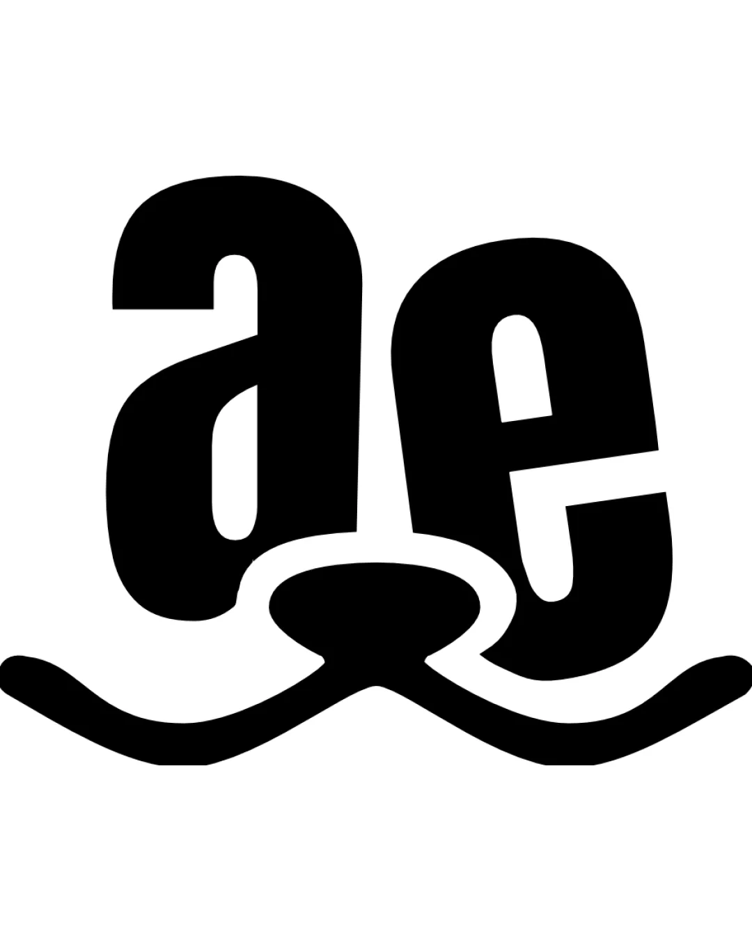
![]() The letters 'a' and 'e' are prominent and easy to identify.
The letters 'a' and 'e' are prominent and easy to identify.![]() High contrast between black text and white background aids readability.
High contrast between black text and white background aids readability.
![]() The heavy overlapping and distortion at the base due to the dog nose/whisker integration may confuse quick recognition of letters.
The heavy overlapping and distortion at the base due to the dog nose/whisker integration may confuse quick recognition of letters.
Originality
![]() Creative integration of letterforms with a stylized dog’s face.
Creative integration of letterforms with a stylized dog’s face.![]() Negative space usage is effective and distinctive.
Negative space usage is effective and distinctive.
![]() Use of lowercase sans serif forms is somewhat standard for playful pet brands.
Use of lowercase sans serif forms is somewhat standard for playful pet brands.
Color harmony
![]() Single color palette ensures classic versatility and strong contrast.
Single color palette ensures classic versatility and strong contrast.![]() Easy to invert for various applications.
Easy to invert for various applications.
Black
#000000
White
#FFFFFF
Balance alignment
![]() Overall centralized composition keeps logo visually anchored.
Overall centralized composition keeps logo visually anchored.![]() Balanced horizontally with symmetrical whiskers.
Balanced horizontally with symmetrical whiskers.
![]() The 'e' is tilted and feels heavier on the right, introducing slight visual imbalance.
The 'e' is tilted and feels heavier on the right, introducing slight visual imbalance.

Scalability
![]() Simple color scheme ensures high contrast when scaled down.
Simple color scheme ensures high contrast when scaled down.![]() Bold forms support clarity in various sizes.
Bold forms support clarity in various sizes.
![]() Small details in the nose and whiskers could be lost at favicon or embroidery size.
Small details in the nose and whiskers could be lost at favicon or embroidery size.![]() Heavy weight may make the mark blend together if reduced too much, especially for app icons or business cards.
Heavy weight may make the mark blend together if reduced too much, especially for app icons or business cards.
200x250 px
100×125 px
50×62 px
Misinterpretations
![]() Dog nose/whiskers motif is clear and aligns with the industry; no inappropriate associations detected.
Dog nose/whiskers motif is clear and aligns with the industry; no inappropriate associations detected.
Try your own review
Review my logo
Wondering how your logo performs?
Get a clear logo score, key risks, and priority fix ideas before your client or audience sees it.
Keep exploring


