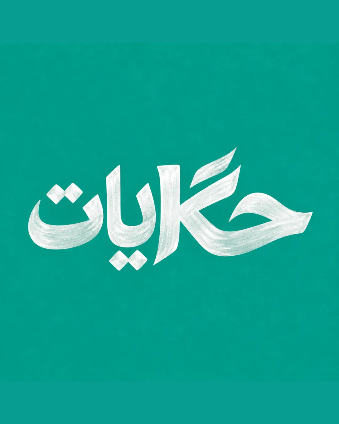
حكايات logo review
4/5
Logo score
Logo review of

حكايات

A strong, evocative wordmark that expresses the cafe's cultural vision; address scaling detail for broad application.

Wordmark Hand-rendered Arabic Calligraphy Cultural Cafe / Arts
4/5
Legibility
4/5
Originality
5/5
Misread
4/5
Balance
3/5
Scale
Your next steps

What to fix first

Focus on the changes that matter. Keep what makes the logo work.

1

wordmark

Test the logo at small sizes to identify any areas where the chalk texture or fine strokes become unclear or muddy.

Worth testing High priority Medium effort
Area to inspectApproximate location

The chalk-texture and delicate stroke variation may lose clarity or character at very small sizes, risking legibility on small merchandise or digital icons.

How to check

Print or export the logo at small icon sizes (e.g., 32px, 64px) and assess if all letterforms and style remain distinguishable.


See the category review
2

overall wordmark

Subtly adjust the proportions or negative space to achieve slightly more balanced weight distribution across the wordmark.

Optional refinement Medium priority Medium effort
Area to inspectApproximate location

The baseline and heights of certain letters (especially the 'ي' and 'ح') create strong vertical dynamics, causing a minor imbalance between the right and left sides.

How to check

Compare adjusted and current versions by mirroring and overlaying to ensure improved optical balance.

See the category review
Detailed review

Logo performance breakdown

5/5

Brief & logo match

Based on your brief
Compared with

مقهى ثقافي وأدبي يجمع بين الكلاسيكية والمعاصرة مع أجواء دافئة وأدبية.

The logo's calligraphic style and inviting presence suit the café's vintage-modern, literary, and artistic positioning.

  • Classical-modern Blend

    Traditional calligraphy with modern technique blends vintage warmth and contemporary clarity.

  • Cultural And Literary Identity

    Calligraphic wordmark makes a clear statement about Arabic literature and storytelling.

4/5

Legibility

  • Clear, expressive letterforms
  • Well-executed calligraphy
4/5

Originality

  • Personalized hand-lettered style
  • Expressive cultural resonance
4/5

Color harmony

  • Pleasant green/white pairing evokes freshness
Green#19B5A5
White#F8F8F6

Estimated colors. Use the original design file for exact values.

Create a full color palette using these colors

Create new palette
4/5

Balance alignment

  • Dynamic composition
  • Distinct presence
  • The baseline and heights of certain letters (especially the 'ي' and 'ح') create strong vertical dynamics, causing a minor imbalance between the right and left sides.

    Optional refinement overall wordmark

    Try: Subtly adjust the proportions or negative space to achieve slightly more balanced weight distribution across the wordmark.

    Check: Compare adjusted and current versions by mirroring and overlaying to ensure improved optical balance.

    Area to inspectApproximate location
Uploaded logoAlignment guide overlay

Inspect spacing with the guide. Optical balance may differ from geometric centering.

3/5

Scalability

  • Rich textural detail at medium/large size
  • The chalk-texture and delicate stroke variation may lose clarity or character at very small sizes, risking legibility on small merchandise or digital icons.

    Worth testing wordmark

    Try: Test the logo at small sizes to identify any areas where the chalk texture or fine strokes become unclear or muddy.

    Check: Print or export the logo at small icon sizes (e.g., 32px, 64px) and assess if all letterforms and style remain distinguishable.
    Area to inspectApproximate location
Uploaded logo at 200 pixels wide
200 × 250 px
Uploaded logo at 100 pixels wide
100 × 125 px
Uploaded logo at 50 pixels wide
50 × 63 px

Compare the detail at different sizes. Labels show the full image dimensions.

5/5

Misinterpretations

  • No unintended associations

Black & white

Does the shape still work without color?

These tests are available only for logos uploaded in vector (SVG) format.

Background contrast

Find the surfaces where your logo stays clear.

These tests are available only for logos uploaded in vector (SVG) format.

Blur & silhouette

A 3px blur softens fine details so you can check whether the overall shape stays recognizable. If key gaps close or elements merge, the logo may rely too heavily on detail.

These tests are available only for logos uploaded in vector (SVG) format.

Try your own review

Wondering how your logo performs?

Get a clear logo score, key risks, and priority fix ideas before your client or audience sees it.

Review my logo