Wondering how your logo performs? 🧐
Get professional logo reviews in seconds and catch design issues in time.
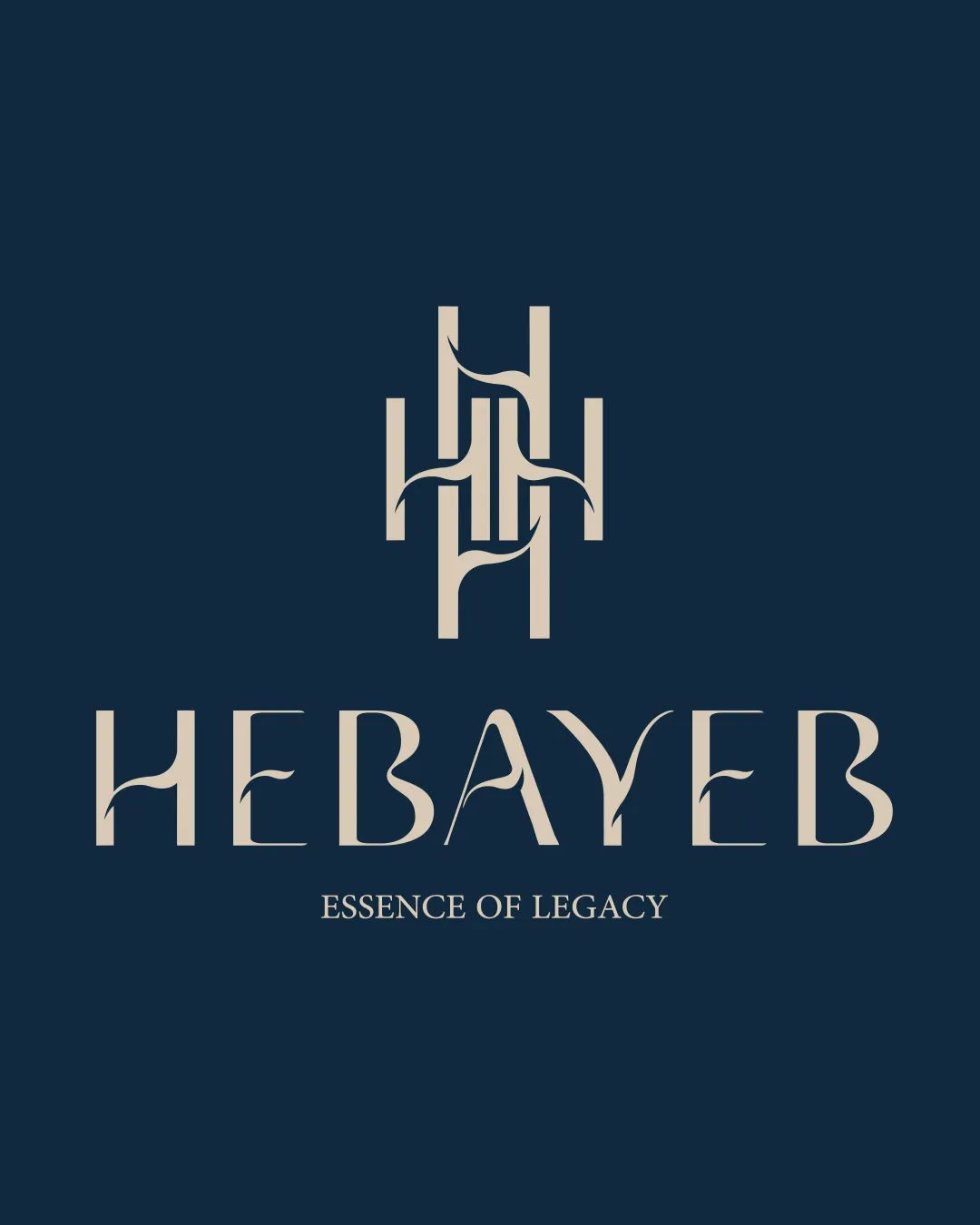
Try it Now!Logo review of HEBAYEB
 Logo analysis by AI
Logo type:
Style:
Detected symbol:
Detected text:
Business industry:
Review requested by Alizaid
**If AI can recognize or misinterpret it, so can people.
Structured logo review
Legibility
![]() Primary brand name 'HEBAYEB' is readable at most sizes.
Primary brand name 'HEBAYEB' is readable at most sizes.![]() Letterforms are unique and eye-catching, enhancing brand recall.
Letterforms are unique and eye-catching, enhancing brand recall.
![]() Decorative flourishes on some letters (notably 'B', 'Y', and 'E') reduce clarity, especially at small scale.
Decorative flourishes on some letters (notably 'B', 'Y', and 'E') reduce clarity, especially at small scale.
Scalability versatility
![]() Logo works reasonably well for print and digital media at medium-to-large sizes.
Logo works reasonably well for print and digital media at medium-to-large sizes.![]() Monogram could function independently when reduced for favicons or social profiles.
Monogram could function independently when reduced for favicons or social profiles.
![]() Thin flourishes and fine details in monogram risk loss of clarity on small applications (e.g., business cards, embroidery).
Thin flourishes and fine details in monogram risk loss of clarity on small applications (e.g., business cards, embroidery).![]() Slogan text will be illegible at small scale.
Slogan text will be illegible at small scale.
200x250 px
100×125 px
50×62 px
Balance alignment
![]() Central axis alignment with strong vertical balance.
Central axis alignment with strong vertical balance.![]() Logomark and wordmark are proportionally spaced and visually cohesive.
Logomark and wordmark are proportionally spaced and visually cohesive.
![]() Lower weight of slogan text creates minor imbalance below the wordmark.
Lower weight of slogan text creates minor imbalance below the wordmark.

Originality
![]() Distinctive custom monogram using 'H' as an interwoven motif.
Distinctive custom monogram using 'H' as an interwoven motif.![]() Unique serif letterforms with stylized extensions.
Unique serif letterforms with stylized extensions.
![]() H-motif monograms are common in luxury and fashion, so some risk of visual similarity exists.
H-motif monograms are common in luxury and fashion, so some risk of visual similarity exists.
Logomark wordmark fit
![]() Monogram's curves and verticals echo those in wordmark letterforms.
Monogram's curves and verticals echo those in wordmark letterforms.![]() Consistent style and color palette reinforce unity.
Consistent style and color palette reinforce unity.
Aesthetic look
![]() Elegant, minimalist color scheme communicates luxury.
Elegant, minimalist color scheme communicates luxury.![]() Stylized, geometric forms provide sophistication.
Stylized, geometric forms provide sophistication.
![]() Flourishes may feel slightly forced or overworked, potentially affecting timelessness.
Flourishes may feel slightly forced or overworked, potentially affecting timelessness.
Dual meaning and misinterpretations
![]() No inappropriate shapes or unintentional imagery detected.
No inappropriate shapes or unintentional imagery detected.
Color harmony
![]() Excellent two-color scheme offering strong contrast and legibility.
Excellent two-color scheme offering strong contrast and legibility.![]() Color palette enhances perception of quality and exclusivity.
Color palette enhances perception of quality and exclusivity.
Beige
#BEB6A7
Gunmetal
#152838


