HEUREUX VOYAGEURS logo review
3.5/5
Logo score
Logo review of

Heureux Voyageurs

A positive and legible design, but over-relies on generic visual language and could benefit from industry-related distinctiveness.

Combination Playful Mascot And Bold Wordmark Passenger Transport
5/5
Legibility
3/5
Originality
5/5
Misread
4/5
Balance
3/5
Scale
Your next steps

What to fix first

Focus on the changes that matter. Keep what makes the logo work.

1

Standalone mark

Explore more unique or industry-related mascot expressions or symbols.

Visible issue High priority Medium effort
Area to inspectApproximate location

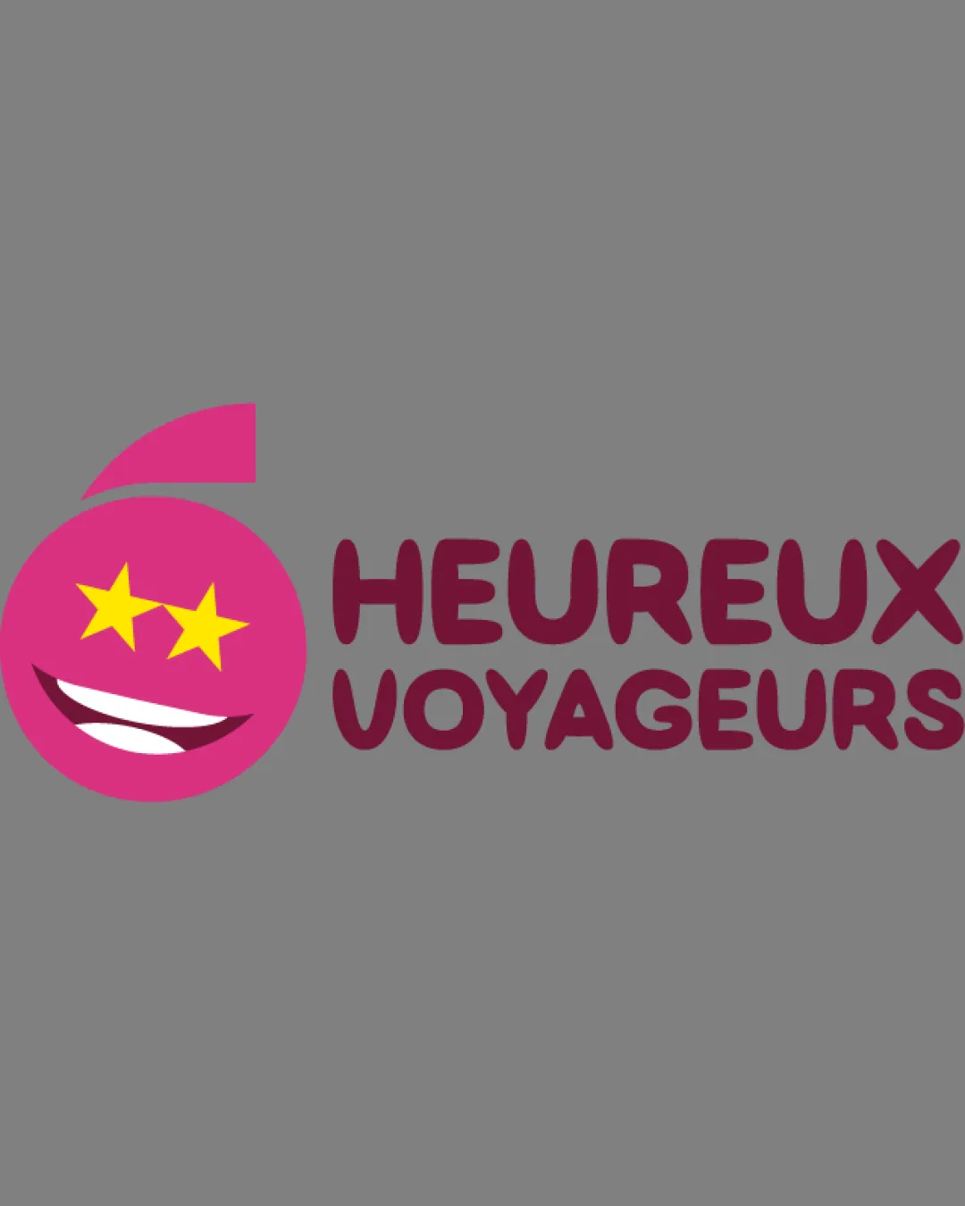
The smiley face mascot is playful but relies on a very common emoji-style expression, which feels generic for branding in passenger transport.

How to check

Test distinctiveness with target audience.

See the category review
2

Standalone mark

Simplify or bolden details to improve clarity at reduced sizes.

Visible issue Medium priority Low effort
Area to inspectApproximate location

Fine details in the mouth and star eyes may become unclear at small sizes, affecting logo recognition.

How to check

Reduce size to favicon or app icon scale and verify clarity.

See the category review
Detailed review

Logo performance breakdown

4/5

Brief & logo match

Based on your brief
Compared with

PASSENGER TRANSPORT COMPANY

Logo communicates happiness for travelers but lacks distinct transport iconography.

  • Positivity And Customer Experience

    The mascot's cheerful face with star eyes effectively communicates happiness and positive travel experiences, aligning with the name 'HEUREUX VOYAGEURS'.

  • Transport Industry Cues

    While playful and memorable, the design lacks direct visual reference to transport or movement except for the subtle swoosh, potentially limiting instant category recognition.

5/5

Legibility

  • Heavy, rounded type is highly readable.
  • Contrast ensures text stands out.
3/5

Originality

  • Friendly mascot adds approachability.
  • The smiley face mascot is playful but relies on a very common emoji-style expression, which feels generic for branding in passenger transport.

    Visible issue Standalone mark

    Try: Explore more unique or industry-related mascot expressions or symbols.

    Check: Test distinctiveness with target audience.

    Area to inspectApproximate location
4/5

Color harmony

  • Magenta and yellow convey warmth and energy.
Magenta#DE3A89
Burgundy#742433
Yellow#FFD600
White#FFFFFF

Estimated colors. Use the original design file for exact values.

Create a full color palette using these colors

Create new palette
4/5

Balance alignment

  • Bold headline balances logo weight.
  • The symbol's vertical alignment appears slightly top-heavy compared to the wordmark, creating visual imbalance.

    Optional refinement overall composition

    Try: Adjust vertical positioning of the mascot relative to the text.

    Check: Rebalance components for harmonious horizontal lockup.

Uploaded logoAlignment guide overlay

Inspect spacing with the guide. Optical balance may differ from geometric centering.

3/5

Scalability

  • Simple color palette aids clarity.
  • Fine details in the mouth and star eyes may become unclear at small sizes, affecting logo recognition.

    Visible issue Standalone mark

    Try: Simplify or bolden details to improve clarity at reduced sizes.

    Check: Reduce size to favicon or app icon scale and verify clarity.

    Area to inspectApproximate location
Uploaded logo at 200 pixels wide
200 × 250 px
Uploaded logo at 100 pixels wide
100 × 125 px
Uploaded logo at 50 pixels wide
50 × 63 px

Compare the detail at different sizes. Labels show the full image dimensions.

5/5

Misinterpretations

  • No misleading or negative interpretations.
4/5

Symbol & text fit

  • Mascot's optimistic expression echoes brand name.

Black & white

Does the shape still work without color?

These tests are available only for logos uploaded in vector (SVG) format.

Background contrast

Find the surfaces where your logo stays clear.

These tests are available only for logos uploaded in vector (SVG) format.

Blur & silhouette

A 3px blur softens fine details so you can check whether the overall shape stays recognizable. If key gaps close or elements merge, the logo may rely too heavily on detail.

These tests are available only for logos uploaded in vector (SVG) format.

Try your own review

Wondering how your logo performs?

Get a clear logo score, key risks, and priority fix ideas before your client or audience sees it.

Review my logo