Wondering how your logo performs? 🧐
Get professional logo reviews in seconds and catch design issues in time.
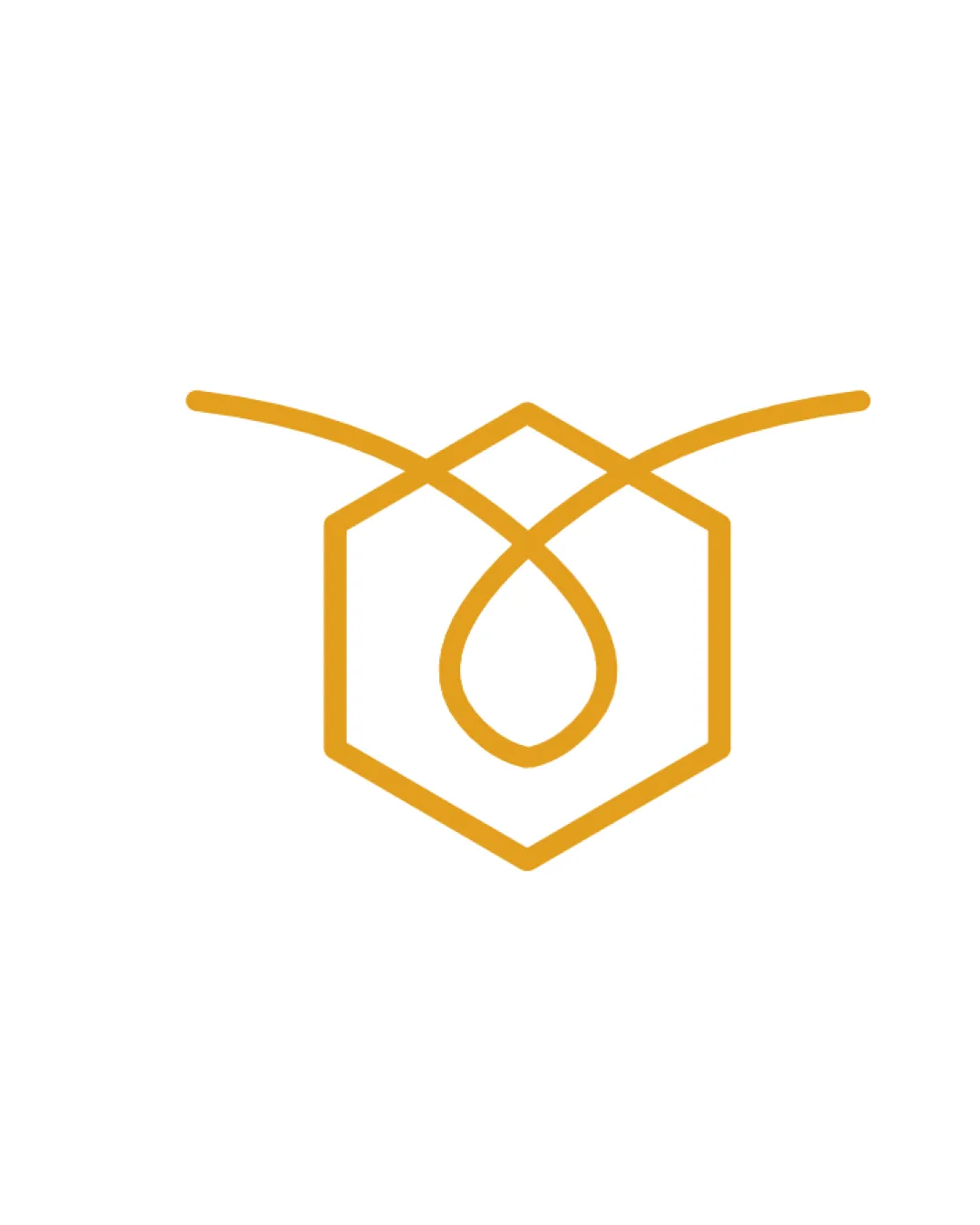
Try it Now!Logo review of hexagon, droplet, bee wings/antenna
 Logo analysis by AI
Logo type:
Style:
Detected symbol:
Business industry:
Review requested by SabrielleGrey
**If AI can recognize or misinterpret it, so can people.
Structured logo review
Scalability versatility
![]() Simple line work allows for strong clarity at most sizes.
Simple line work allows for strong clarity at most sizes.![]() Minimal detail translates well onto digital platforms, print packaging, and small-scale icons.
Minimal detail translates well onto digital platforms, print packaging, and small-scale icons.
![]() Very thin lines may lose definition in embroidery or when used as a favicon.
Very thin lines may lose definition in embroidery or when used as a favicon.![]() Color may not stand out against all backgrounds without an outline or fill.
Color may not stand out against all backgrounds without an outline or fill.
200x250 px
100×125 px
50×62 px
Balance alignment
![]() Symmetrical composition; hexagon is well-centered and balanced.
Symmetrical composition; hexagon is well-centered and balanced.![]() Curves and angles intersect cleanly; lines feel deliberate and intentional.
Curves and angles intersect cleanly; lines feel deliberate and intentional.

Originality
![]() Combines honeycomb (hexagon), droplet (honey), and bee wings/antenna in a single minimal mark.
Combines honeycomb (hexagon), droplet (honey), and bee wings/antenna in a single minimal mark.![]() Metaphoric layering elevates the icon beyond generic honeycomb symbols.
Metaphoric layering elevates the icon beyond generic honeycomb symbols.
![]() Hexagon and droplet shapes are common within the food and honey industry. Some symbolic choices may feel moderately familiar.
Hexagon and droplet shapes are common within the food and honey industry. Some symbolic choices may feel moderately familiar.
Aesthetic look
![]() Visuals are elegant, clean, and sophisticated. Minimal decoration enhances focus.
Visuals are elegant, clean, and sophisticated. Minimal decoration enhances focus.![]() Color choice is warm and inviting, referencing honey naturally.
Color choice is warm and inviting, referencing honey naturally.
Dual meaning and misinterpretations
![]() No inappropriate shapes or unintended symbolism detected. All symbolism is industry-appropriate.
No inappropriate shapes or unintended symbolism detected. All symbolism is industry-appropriate.
Color harmony
![]() Single-color palette is harmonious, clear, and visually linked to honey/bee themes.
Single-color palette is harmonious, clear, and visually linked to honey/bee themes.![]() Strong contrast against white, with no overwhelming variety.
Strong contrast against white, with no overwhelming variety.
Goldenrod
#E8AA1D
White
#FFFFFF


