Wondering how your logo performs? 🧐
Get professional logo reviews in seconds and catch design issues in time.
Try it Now!Logo review of HSES
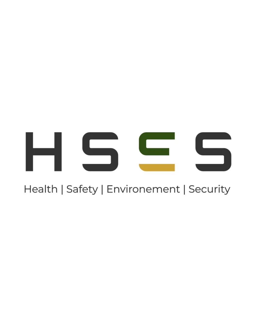
 Logo analysis by AI
Logo type:
Style:
Detected symbol:
Detected text:
Business industry:
Review requested by NourFatima
**If AI can recognize or misinterpret it, so can people.
Structured logo review
Legibility
Clear and bold typography.
Distinct separation between letters.
Color variation in 'S' could slightly affect readability.
Scalability versatility
Simple design that scales well to various sizes.
Effective for use in digital and print formats.
Color differentiation might not be visible in very small scales.

200x250 px

100×125 px

50×62 px
Balance alignment
Evenly spaced and aligned text.
Consistent weight across letters.


Originality
Unique color accent on the second 'S'.
Overall wordmark style is common in the industry.
Lack of unique symbols.
Aesthetic look
Modern and professional appearance.
Subtle color accents enhance design.
Minor inconsistency in color treatment of 'Environnement.'
Possible misinterpretations
No immediately apparent misinterpretations.
Color harmony
Limited use of colors creates a harmonious look.
Effective contrast between text and background.
The 'S' color differentiation could be seen as unnecessary.


