I.P.N.U logo review
3.2/5
Logo score
Logo review of

I.p.n.u

A functional emblem with academic cues, but crowded layout and fine details hold it back from strong professional readiness.

Emblem Institutional, Academic Badge Education
4/5
Legibility
3/5
Originality
5/5
Misread
3/5
Balance
3/5
Scale
Your next steps

What to fix first

Focus on the changes that matter. Keep what makes the logo work.

1

emblem entire

Increase negative space around central elements or reduce the number of stars.

Visible issue Medium priority Medium effort

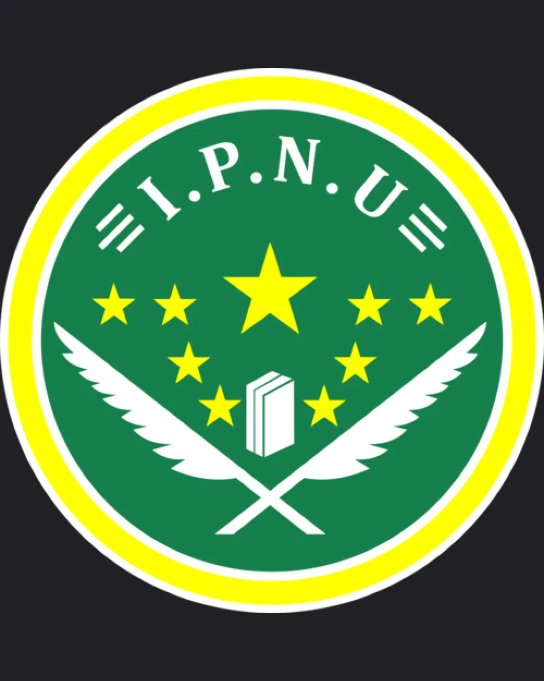
The stars and book/quills form a dense center, while the outer text and border give a heavy frame, making the design feel crowded.

How to check

Visually confirm more comfortable spacing after adjustment.

See the category review
2

book and small stars

Test logo at small sizes and consider simplifying or enlarging small details.

Worth testing Medium priority Low effort
Area to inspectApproximate location

Small book and stars may blur or lose definition at reduced sizes.

How to check

Check for detail loss at favicon/business card scale.

See the category review
Detailed review

Logo performance breakdown

3/5

Brief & logo match

Based on an inferred industry
Compared with

Educational or academic institution emblem inferred from books, quills, and badge structure.

Logo communicates education and tradition, but heavy symbolism and crowded layout limit distinctiveness and clarity.

  • Academic Symbolism

    Logo integrates books, stars, and quills signaling education and achievement.

  • Institutional Formality

    Emblem format conveys an official, badge-like identity fitting for organizations or institutions.

4/5

Legibility

  • Text is clear and readable.
3/5

Originality

  • Uses common academic symbols in traditional arrangement.
4/5

Color harmony

  • Green, yellow, and white create a vibrant and institutional palette.
Green#218943
White#FFFFFF
Yellow#F7EB25

Estimated colors. Use the original design file for exact values.

Create a full color palette using these colors

Create new palette
3/5

Balance alignment

  • Circular layout provides symmetry.
  • The stars and book/quills form a dense center, while the outer text and border give a heavy frame, making the design feel crowded.

    Visible issue emblem entire

    Try: Increase negative space around central elements or reduce the number of stars.

    Check: Visually confirm more comfortable spacing after adjustment.

Uploaded logoAlignment guide overlay

Inspect spacing with the guide. Optical balance may differ from geometric centering.

3/5

Scalability

  • Core shapes are discernible at moderate sizes.
  • Small book and stars may blur or lose definition at reduced sizes.

    Worth testing book and small stars

    Try: Test logo at small sizes and consider simplifying or enlarging small details.

    Check: Check for detail loss at favicon/business card scale.

    Area to inspectApproximate location
Uploaded logo at 200 pixels wide
200 × 250 px
Uploaded logo at 100 pixels wide
100 × 125 px
Uploaded logo at 50 pixels wide
50 × 63 px

Compare the detail at different sizes. Labels show the full image dimensions.

5/5

Misinterpretations

  • No unintended readings are apparent.
4/5

Symbol & text fit

  • Text and mark are cohesively combined within the emblem.

Black & white

Does the shape still work without color?

These tests are available only for logos uploaded in vector (SVG) format.

Background contrast

Find the surfaces where your logo stays clear.

These tests are available only for logos uploaded in vector (SVG) format.

Blur & silhouette

A 3px blur softens fine details so you can check whether the overall shape stays recognizable. If key gaps close or elements merge, the logo may rely too heavily on detail.

These tests are available only for logos uploaded in vector (SVG) format.

Try your own review

Wondering how your logo performs?

Get a clear logo score, key risks, and priority fix ideas before your client or audience sees it.

Review my logo