 View review
Logo score
Logo review of
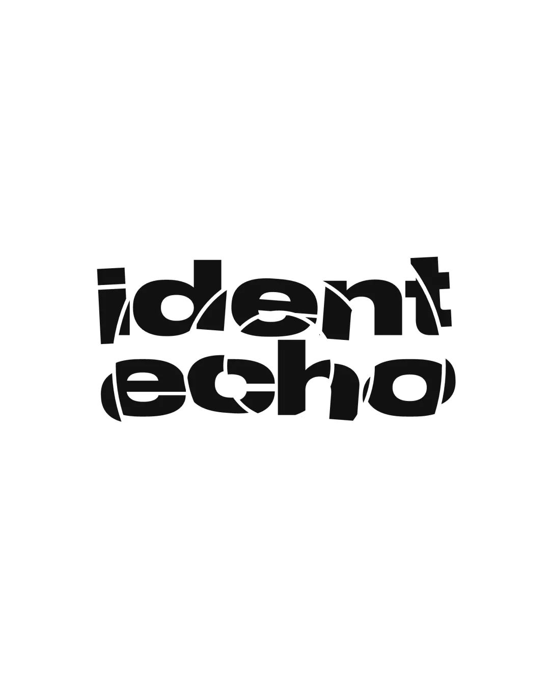
Ident Echo
An inventive concept with strong branding potential; refinement for clarity is necessary for optimal client acceptance.
Objective AI feedback. Your creative decision.
Legibility
Originality
Misread
Balance
Scale
Action plan
What to fix first
The most important fixes to handle before polishing the full presentation.
1
Increase legibility of fragmented characters without losing conceptual effect.
High priorityCurrent fragmentation is innovative but at the cost of clear communication.
Impact: Greater Readability Will Broaden Usability And Professional Appeal. · Effort: Medium
2
Test and refine at various sizes.
Medium prioritySmall size reproduction may compromise letter clarity due to thin gaps.
Impact: Improves Practicality And Ensures The Logo Remains Effective Across All Media. · Effort: Low
Detailed review
Logo performance breakdown
Legibility
 Letters are mostly decipherable with effort.
 Heavy fragmentation disrupts immediate word recognition. Some letters (especially 'c', 'h', 'o') are challenging to read.
Originality
Unconventional, memorable treatment connected to the concept of 'echo.'
Distortion technique could be seen as trendy, risking datedness.
Balance alignment
Consistent fragmentation and weight across all letters. Visual mass feels balanced across both lines.
Some irregular gaps diminish typographic rhythm.

Scalability
Bold, high-contrast construction supports scaling.
Fine cuts in the letterforms may clog or become unclear at small sizes.
200x250 px
100×125 px
50×62 px
Misinterpretations
No obvious unintended readings or problematic associations.
Brief match
Conceptual Fit: The visual echo concept aligns closely with the name and likely brand positioning.
Audience: Experimental design suits creative/tech or avant-garde audiences rather than traditional sectors.
Try your own review
Review my logo
Wondering how your logo performs?
Get a clear logo score, key risks, and priority fix ideas before your client or audience sees it.
Keep exploring