 View review
Logo score
Logo review of
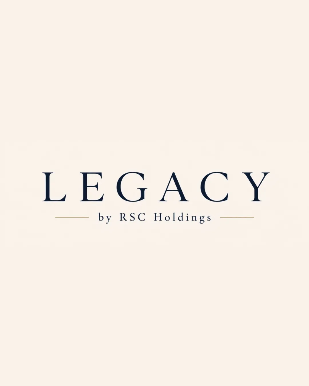
Legacy By Rsc Holdings
A well-crafted, professional wordmark appropriate for a premium or investment brand. It is visually balanced but lacks an ownable or distinctive symbolic mark.
Objective AI feedback. Your creative decision.
Legibility
Originality
Misread
Balance
Scale
Action plan
What to fix first
The most important fixes to handle before polishing the full presentation.
1
Increase tagline weight or tracking for small sizes
Medium priorityTagline currently risks disappearing in small print or digital use.
Impact: Improves Versatility In Various Formats · Effort: Low
Detailed review
Logo performance breakdown
Legibility
 Perfectly readable, high contrast between text and background
Originality
Elegantly executed classic style
 Very generic serif wordmark; no unique mark
Color harmony
Classic navy and cream create a premium feel
Color palette is minimal but fitting
Navy
#232933
Cream
#F8F1E9
Your palette is close. Refine the color roles and combinations before updating the logo.
Build brand colorsBalance alignment
Good horizontal centering and spacing Balanced line length with symmetry
Minor improvement possible in tagline kerning

Scalability
Simple structure scales well
Thin tagline could fade at small sizes
200x250 px
100×125 px
50×62 px
Misinterpretations
No confusing negative space or shapes
Try your own review
Review my logo
Wondering how your logo performs?
Get a clear logo score, key risks, and priority fix ideas before your client or audience sees it.
Keep exploring