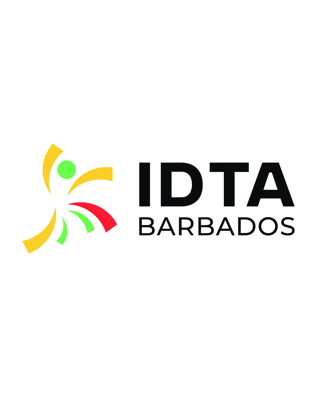
IDTA BARBADOS logo review
4.1 / 5
Logo score
Logo review of

Idta Barbados

Review the detailed scores below to see what is working and what should be refined first.

Combination Mark Modern, Abstract, Minimal Dance
5/5
Legibility
3/5
Originality
5/5
Misread
4/5
Balance
4/5
Scale
Detailed review

Logo performance breakdown

5/5

Legibility

Checkmark icon Text is clear and highly readable.
Checkmark icon Contrasting black type on a white background provides excellent legibility.
Checkmark icon Font choice is simple and bold.

3/5

Originality

Checkmark icon Abstract human figure and energy arcs differentiate it from purely generic marks.
Checkmark icon Colorful, dynamic shapes reinforce a sense of movement.

Warning icon The 'dancing human with arcs' motif is common in dance, sports, or cultural logos, reducing uniqueness.
Warning icon Shapes could be misinterpreted as generic swooshes from a distance.

4/5

Color harmony

Checkmark icon Color palette is lively and cohesive, echoing Caribbean vibrance.
Checkmark icon Colors are well separated and balanced.

Warning icon Three vivid colors plus black borders on being excessive for some applications.
Warning icon Red and green may clash slightly for those with color vision deficiencies.

Yellow
#F9D835

Green
#2ECC40

Red
#FF4136

Black
#000000

White
#FFFFFF

Your palette is close. Refine the color roles and combinations before updating the logo.

Build brand colors
4/5

Balance alignment

Checkmark icon Icon and wordmark placement is visually cohesive and horizontally balanced.
Checkmark icon Element spacing is adequate.

Warning icon The varying arc lengths and colors in the symbol create slight visual imbalance compared to the geometric regularity of the text.

logo 200x250 pixels scalability test alignment grid overlay
4/5

Scalability

Checkmark icon Icon and type are bold enough to scale well for most applications.
Checkmark icon Logo will be clear on signage, brochures, and web applications.

Warning icon Small intricate colored arcs may lose clarity on small merchandise like pens or embroidery.
Warning icon Multicolor palette could limit versatility in single-color or monochrome applications.

logo 200x250 pixels scalability test

200x250 px

logo 100x125 pixels scalability test

100×125 px

logo 50x62 pixels scalability test

50×62 px

5/5

Misinterpretations

Checkmark icon No inappropriate secondary imagery detected.
Checkmark icon Symbol conveys dynamism without negative connotations.

4 / 5

Symbol & text fit

Checkmark icon Modern style of the icon matches the sans-serif font.
Checkmark icon Both elements convey energy and clarity.

Warning icon Colorful, energetic symbol slightly contrasts with the rigid formality of the text.
Warning icon Text feels slightly heavy compared to the more open symbol.

Try your own review

Wondering how your logo performs?

Get a clear logo score, key risks, and priority fix ideas before your client or audience sees it.

Review my logo