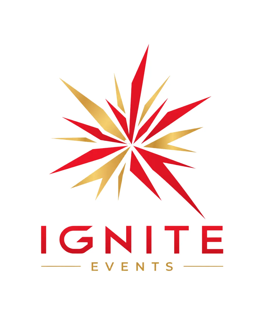
IGNITE EVENTS logo review
4.2/5
Logo score
Logo review of

Ignite Events

A polished, energetic logo that effectively conveys the brand concept. Minor adjustments to the burst mark and gradient usage will enhance practicality and professionalism.

Combination Mark Modern Geometric, Energetic Events
4.5/5
Legibility
4/5
Originality
5/5
Misread
4.5/5
Balance
4/5
Scale
Action plan

What to fix first

The most important fixes to handle before polishing the full presentation.

1

Simplify or reinforce the burst symbol for better clarity at small sizes

High priority

Thin spikes could get lost in reduced sizes or poor printing.

Impact: Logo Will Be More Practical For Small Formats And Broad Usage · Effort: Medium

2

Refine gold gradient or include a flat color alternative

Medium priority

Metallic gradients can appear inconsistent in print or low-res digital formats.

Impact: Ensures Color Consistency And Professional Appearance In All Uses · Effort: Low

Detailed review

Logo performance breakdown

4.5/5

Legibility

Checkmark icon IGNITE is clear and bold
Checkmark icon EVENTS is legible in a clean sans-serif

Warning icon Minor: Compressed spacing in 'EVENTS' at small sizes

4/5

Originality

Checkmark icon Distinctive geometric burst is memorable
Checkmark icon Good typographic customization in the wordmark

Warning icon Burst motif is common in 'ignition' themes; needs more uniqueness to score higher

4/5

Color harmony

Checkmark icon Red and gold palette evokes excitement, energy, and celebration
Checkmark icon Strong contrast for readability

Warning icon Gold gradient may not reproduce consistently across all applications

Red
#D32F2F

Gold
#C39237

White
#FFFFFF

Your palette is close. Refine the color roles and combinations before updating the logo.

Build brand colors
4.5/5

Balance alignment

Checkmark icon Vertical alignment between symbol and text is well handled
Checkmark icon Wordmark and tagline spacing is consistent

Warning icon Burst symbol's spikes add some asymmetrical visual tension

logo 200x250 pixels scalability test alignment grid overlay
4/5

Scalability

Checkmark icon Symbol and text remain identifiable down to moderate sizes
Checkmark icon Simple color scheme aids reproduction

Warning icon Thin points and fine details may lose clarity at very small sizes

logo 200x250 pixels scalability test

200x250 px

logo 100x125 pixels scalability test

100×125 px

logo 50x62 pixels scalability test

50×62 px

5/5

Misinterpretations

Checkmark icon No obvious unintended readings or negative shapes

4.5/5

Logo structure & brief match

Checkmark icon Burst mark and wordmark reinforce each other conceptually and visually

Warning icon Slightly abrupt transition between sharp symbol and rounded letterforms

Checkmark icon Industry: Highly relevant for the events sector—communicates energy and excitement.
Checkmark icon Brand Name: Visual ties are strong; 'Ignite' is supported by the dynamic burst.

Try your own review

Wondering how your logo performs?

Get a clear logo score, key risks, and priority fix ideas before your client or audience sees it.

Review my logo