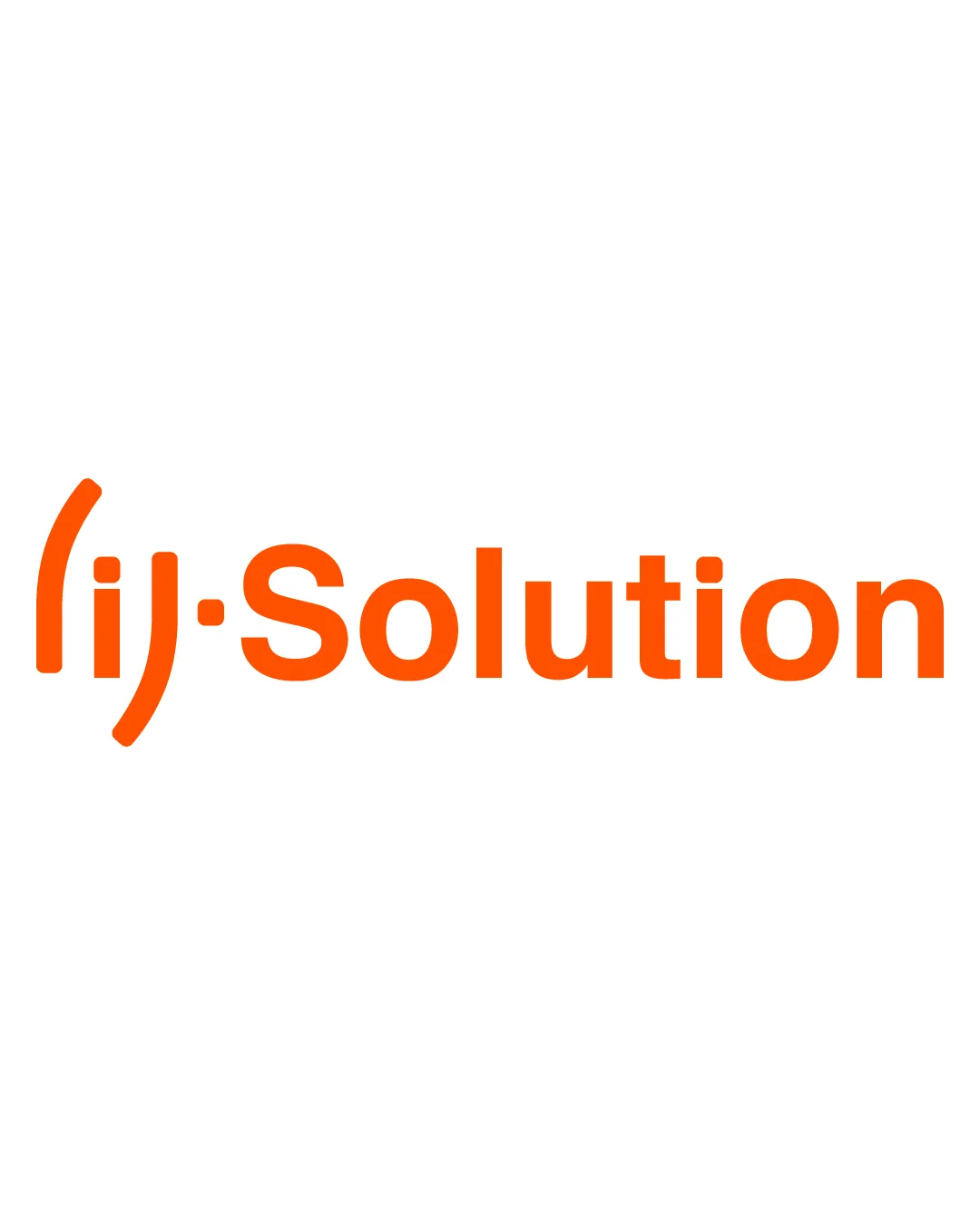
(ij·Solution logo review
3.2/5
Logo score
Logo review of

(ij·solution

Functional and modern but the abstract '(ij)' symbol needs clarification to maximize both recognition and distinctiveness.

Combination Modern Sans-serif Wordmark With Abstract Initial Symbol Creative/web/tech Agency
3/5
Legibility
3/5
Originality
4/5
Misread
3/5
Balance
4/5
Scale
Your next steps

What to fix first

Focus on the changes that matter. Keep what makes the logo work.

1

lettermark '(ij)'

Clarify the initial letterform design for instant recognition or add subtle cues.

Visible issue High priority Medium effort
Area to inspectApproximate location

The '(ij)' symbol uses abstracted shapes which may be misread as 'li', 'ij', or a smiley, risking confusion about the brand initials.

How to check

Test with users unfamiliar with the brand for immediate reading.

See the category review
2

lettermark '(ij)'

Explore a more distinctive lettermark or integrate a unique trait representing your agency.

Worth testing Medium priority Medium effort
Area to inspectApproximate location

Parenthesized or punctuated initials are common in tech and design; this construction feels familiar though cleanly executed.

How to check

Benchmark against peers to ensure recognizability.

See the category review
Detailed review

Logo performance breakdown

3.5/5

Brief & logo match

Based on your brief
Compared with

web agency, graphic design, web design

Good match for a web/graphic agency's visual needs, but the initial mark risks familiarity over originality.

  • Agency/Creative Sector Fit

    The bold sans-serif and orange color feel current and energetic, supporting creative/web credentials.

  • Distinctiveness For Agency Use

    Symbolic initial is familiar; risk of blending with similar agencies exists.

3/5

Legibility

  • Wordmark is clear and readable.
  • The '(ij)' symbol uses abstracted shapes which may be misread as 'li', 'ij', or a smiley, risking confusion about the brand initials.

    Visible issue lettermark '(ij)'

    Try: Clarify the initial letterform design for instant recognition or add subtle cues.

    Check: Test with users unfamiliar with the brand for immediate reading.
    Area to inspectApproximate location
3/5

Originality

  • Clean parenthesized initial adds some personality.
  • Parenthesized or punctuated initials are common in tech and design; this construction feels familiar though cleanly executed.

    Worth testing lettermark '(ij)'

    Try: Explore a more distinctive lettermark or integrate a unique trait representing your agency.

    Check: Benchmark against peers to ensure recognizability.

    Area to inspectApproximate location
3/5

Balance alignment

  • Modern, aligned construction.
  • The symbol's left-heavy placement creates slight imbalance with the following wordmark.

    Optional refinement whole logo

    Try: Assess horizontal spacing and consider a tighter vertical alignment between symbol and wordmark.

    Check: Review with adjusted spacing for overall harmony.

Uploaded logoAlignment guide overlay

Inspect spacing with the guide. Optical balance may differ from geometric centering.

4/5

Scalability

  • Simple shapes maintain clarity at reduced sizes.
Uploaded logo at 200 pixels wide
200 × 250 px
Uploaded logo at 100 pixels wide
100 × 125 px
Uploaded logo at 50 pixels wide
50 × 63 px

Compare the detail at different sizes. Labels show the full image dimensions.

4/5

Misinterpretations

  • No inappropriate misreadings.
4/5

Symbol & text fit

  • Unified style; mark and wordmark feel cohesive.

Black & white

Does the shape still work without color?

These tests are available only for logos uploaded in vector (SVG) format.

Background contrast

Find the surfaces where your logo stays clear.

These tests are available only for logos uploaded in vector (SVG) format.

Blur & silhouette

A 3px blur softens fine details so you can check whether the overall shape stays recognizable. If key gaps close or elements merge, the logo may rely too heavily on detail.

These tests are available only for logos uploaded in vector (SVG) format.

Try your own review

Wondering how your logo performs?

Get a clear logo score, key risks, and priority fix ideas before your client or audience sees it.

Review my logo