 View review
Logo score
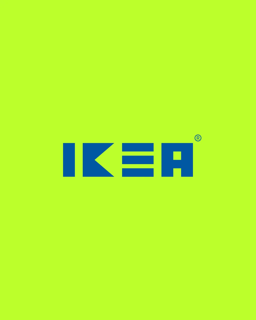
Logo review ofIkea
Review the detailed scores below to see what is working and what should be refined first.
Legibility
Originality
Misread
Balance
Scale
Detailed review
Logo performance breakdown
Legibility
![]() All letters are generally clear and recognizable.
All letters are generally clear and recognizable.![]() Bold typeface ensures readability at most sizes.
Bold typeface ensures readability at most sizes.
![]() The stylized 'E' composed of three horizontal bars may be slightly less intuitive at first glance and could pose legibility issues at small scales.
The stylized 'E' composed of three horizontal bars may be slightly less intuitive at first glance and could pose legibility issues at small scales.
Originality
![]() The stylized geometric approach, especially for 'E,' adds unique brand distinction.
The stylized geometric approach, especially for 'E,' adds unique brand distinction.![]() Bold, custom wordmark goes beyond generic fonts.
Bold, custom wordmark goes beyond generic fonts.
![]() The use of geometric sans-serif forms is trending and can feel somewhat generic without the brand association.
The use of geometric sans-serif forms is trending and can feel somewhat generic without the brand association.![]() 'E' treatment, while unique, is a common minimalist approach seen in many modern wordmarks.
'E' treatment, while unique, is a common minimalist approach seen in many modern wordmarks.
Color harmony
![]() Only two colors used with strong contrast.
Only two colors used with strong contrast.
![]() The neon green background is visually aggressive and can clash with other contexts.
The neon green background is visually aggressive and can clash with other contexts.![]() This color combination may not be accessible for users with color vision deficiencies.
This color combination may not be accessible for users with color vision deficiencies.
ScienceBlue
#012BB1
GreenYellow
#DBFF33
Color may be holding this logo back. Explore stronger palette options with Colorfly.design before updating the logo.
Explore palettesBalance alignment
![]() Letters are well-aligned and evenly spaced.
Letters are well-aligned and evenly spaced.![]() Logotype feels cohesive and horizontally balanced.
Logotype feels cohesive and horizontally balanced.
![]() The negative space created by the 'K' and the minimal 'E' disrupts a bit of optical balance, making the center portion lighter compared to the outer letters.
The negative space created by the 'K' and the minimal 'E' disrupts a bit of optical balance, making the center portion lighter compared to the outer letters.

Scalability
![]() Simple geometric forms scale well for most applications including signage, packaging, and web.
Simple geometric forms scale well for most applications including signage, packaging, and web.![]() High contrast between blue lettering and bright background preserves visibility.
High contrast between blue lettering and bright background preserves visibility.
![]() The thin spaces within the 'E' may get lost at very small sizes such as favicons or embroidery applications.
The thin spaces within the 'E' may get lost at very small sizes such as favicons or embroidery applications.
200x250 px
100×125 px
50×62 px
Misinterpretations
![]() No inappropriate or ambiguous symbolism detected.
No inappropriate or ambiguous symbolism detected.
Try your own review
Review my logo
Wondering how your logo performs?
Get a clear logo score, key risks, and priority fix ideas before your client or audience sees it.
Keep exploring


