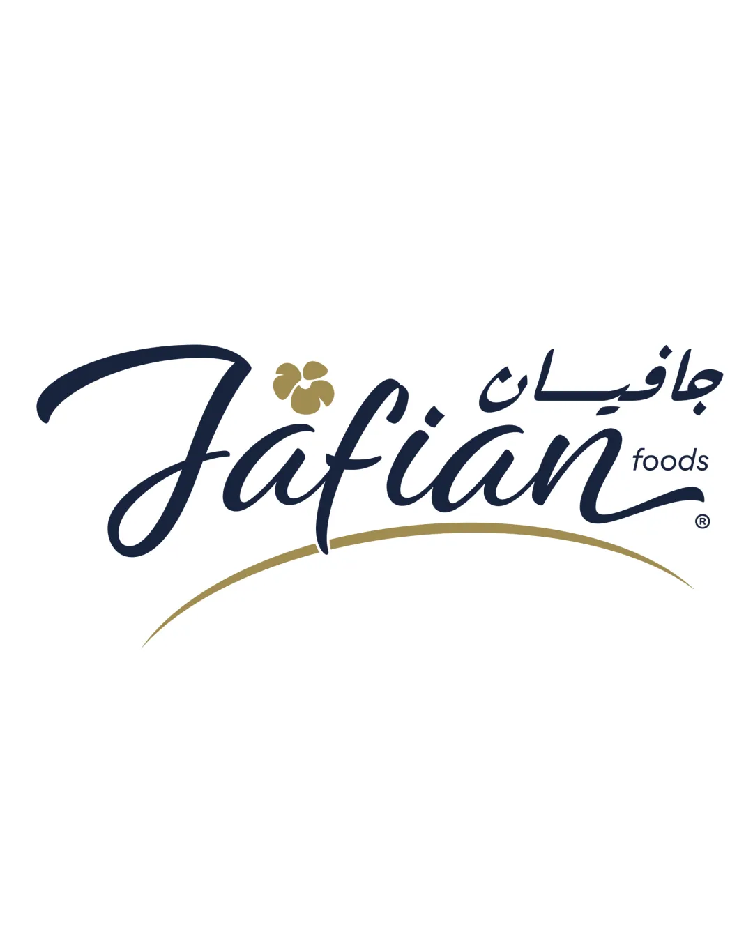
Jafian foods logo review
3.5/5
Logo score
Logo review of

Jafian Foods

Attractive and balanced logo with a unique script style and food-inspired accent, but clarity at small scale and stronger category linkage can be refined.

Combination Script Wordmark With Accent Symbol And Arc Food
3/5
Legibility
4/5
Originality
5/5
Misread
4/5
Balance
3/5
Scale
Your next steps

What to fix first

Focus on the changes that matter. Keep what makes the logo work.

1

'Jafian' wordmark

Test wordmark readability at various sizes and distances, especially for unfamiliar audiences.

Worth testing Medium priority Medium effort
Area to inspectApproximate location

The handwritten script style, while attractive, may present legibility challenges for new consumers or at a glance, especially with the flourishes on the 'J' and 'f'.

How to check

Conduct readability testing for print and web scenarios.

See the category review
2

gold symbol above 'i'

Test symbol legibility and consider a bolder shape or simplified form for small-scale use.

Visible issue Medium priority Medium effort
Area to inspectApproximate location

The gold symbol above the 'i' may lose detail or legibility at small sizes due to its subtle shape.

How to check

Verify the clarity and interpretability of the symbol in small digital and print applications.

See the category review
Detailed review

Logo performance breakdown

4/5

Brief & logo match

Based on your brief
Compared with

Food brand mainly selling dryfruits, nuts, and healthy products.

The logo expresses a healthy, food-oriented identity through its natural style, though the category connection could be clearer.

  • Target Audience (food, Healthy Products)

    The organic script and natural feeling of the gold accent communicate approachability and a health-oriented brand.

  • Category Clarity (dry Fruits/nuts)

    Symbol above the 'i' gestures toward a nut, but could benefit from further specificity to reinforce the product category.

3/5

Legibility

  • Distinctive wordmark style
  • Clear supporting text
  • The handwritten script style, while attractive, may present legibility challenges for new consumers or at a glance, especially with the flourishes on the 'J' and 'f'.

    Worth testing 'Jafian' wordmark

    Try: Test wordmark readability at various sizes and distances, especially for unfamiliar audiences.

    Check: Conduct readability testing for print and web scenarios.
    Area to inspectApproximate location
4/5

Originality

  • Handwritten style and gold symbol create uniqueness
4/5

Color harmony

  • Gold and navy palette feels elegant and appetizing
Navy#192238
Gold#AC9D67

Estimated colors. Use the original design file for exact values.

Create a full color palette using these colors

Create new palette
4/5

Balance alignment

  • Good optical balance between script and graphic accents
Uploaded logoAlignment guide overlay

Inspect spacing with the guide. Optical balance may differ from geometric centering.

3/5

Scalability

  • Simple arc and script treatments aid reproduction
  • The gold symbol above the 'i' may lose detail or legibility at small sizes due to its subtle shape.

    Visible issue gold symbol above 'i'

    Try: Test symbol legibility and consider a bolder shape or simplified form for small-scale use.

    Check: Verify the clarity and interpretability of the symbol in small digital and print applications.

    Area to inspectApproximate location
Uploaded logo at 200 pixels wide
200 × 250 px
Uploaded logo at 100 pixels wide
100 × 125 px
Uploaded logo at 50 pixels wide
50 × 63 px

Compare the detail at different sizes. Labels show the full image dimensions.

5/5

Misinterpretations

  • No obvious negative interpretations
3/5

Symbol & text fit

  • Symbol neatly incorporated above wordmark
  • The gold symbol above the 'i' integrates into the wordmark but its exact representation (nut, flower, or something else) is ambiguous.

    Optional refinement Wordmark and gold symbol

    Try: Assess if the symbol's form can be clarified or strengthened to support the food and health theme.

    Check: Compare consumer recognition of the symbol to brand intent.

Black & white

Does the shape still work without color?

These tests are available only for logos uploaded in vector (SVG) format.

Background contrast

Find the surfaces where your logo stays clear.

These tests are available only for logos uploaded in vector (SVG) format.

Blur & silhouette

A 3px blur softens fine details so you can check whether the overall shape stays recognizable. If key gaps close or elements merge, the logo may rely too heavily on detail.

These tests are available only for logos uploaded in vector (SVG) format.

Try your own review

Wondering how your logo performs?

Get a clear logo score, key risks, and priority fix ideas before your client or audience sees it.

Review my logo