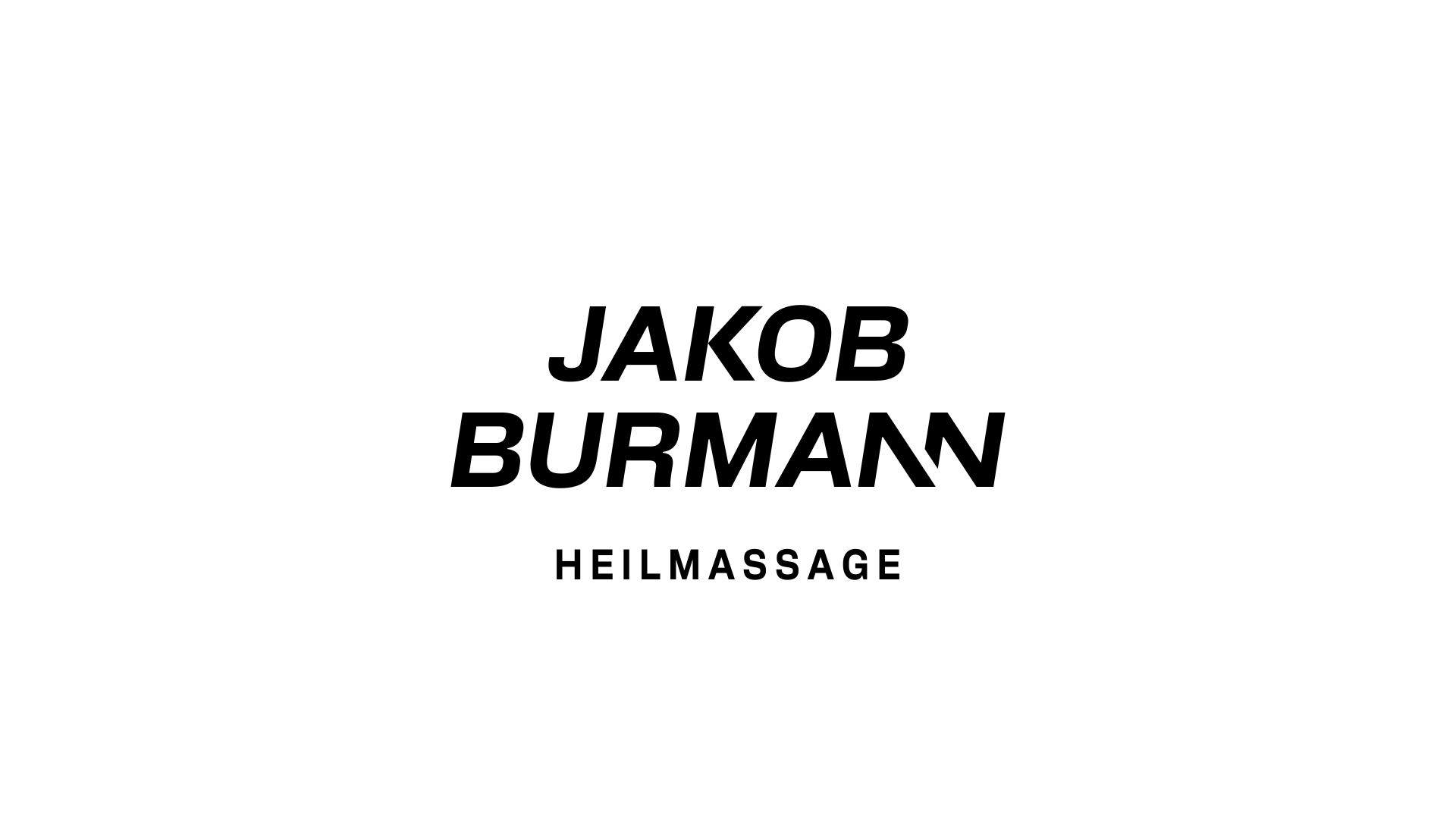
JAKOB BURMANN HEILMASSAGE logo logo review
3.7/5
Logo score Wordmark with descriptor category

JAKOB BURMANN HEILMASSAGE logo

creative668794 Advanced logo review

A professional, legible, sporty wordmark with minor cohesion refinements needed and moderate risk of generic visual overlap.

This logo lockup shows solid execution, supported by text readability and text hierarchy; improving distinctiveness is the clearest next step.

Wordmark With Descriptor Italic Geometric Sans-serif Massage/physical Therapy
4.7/5
Legibility
3/5
Originality
3/5
Balance
3.7/5
Scale
4/5
Style consistency
Your next steps

What to fix first

Focus on the changes that matter. Keep what makes the logo work.

1

tagline alignment

Refine tagline alignment and/or tracking to better visually center and harmonize.

Medium priority Visible issue Low effort

Tagline ('HEILMASSAGE') appears slightly off-balance in spacing beneath wider wordmark, reducing overall lockup cohesion.

See the category review
2

wordmark (BURMANN line)

Test for memorability versus similar stylistic competitors in the sports/fitness segment.

Medium priority Worth testing Medium effort

Angled 'N's add distinctiveness but are a familiar sporty typographic twist; could blend in with active industry type trends.

How to check

Familiar letter-slicing trend may limit ownability.

See the category review
Detailed review

Logo performance breakdown

4/5

Brief & logo match

The dynamic italic construction matches the active, specialist positioning but could use refinements and stronger distinctiveness for niche impact.

4.7/5

Legibility

Wordmark 5/5 · Layout 4/5

  • Name and tagline are fully clear at intended sizes.
3/5

Originality

  • Angled 'N' offers a distinct touch, but overall style is common in active professional logos.
  • Angled 'N's add distinctiveness but are a familiar sporty typographic twist; could blend in with active industry type trends.

    Worth testing wordmark (BURMANN line)

    Try: Test for memorability versus similar stylistic competitors in the sports/fitness segment.

    Check: Familiar letter-slicing trend may limit ownability.

3/5

Balance alignment

Wordmark 3/5 · Layout 3/5

  • Main lines well-weighted; tagline alignment and spacing could improve unity.
  • Tagline ('HEILMASSAGE') appears slightly off-balance in spacing beneath wider wordmark, reducing overall lockup cohesion.

    Visible issue tagline alignment

    Try: Refine tagline alignment and/or tracking to better visually center and harmonize.

Uploaded logoAlignment guide overlay

Inspect spacing with the guide. Optical balance may differ from geometric centering.

3.7/5

Scalability

Wordmark 4/5 · Layout 3/5

  • Simple bold construction maintains clarity in most uses; tagline could thin at very small sizes.
5/5

Misinterpretations

  • No visible risk of misinterpretation or negative associations.
4/5

Style consistency

This review includes a score but no supporting explanation for this category.

Black & white

Does the shape still work without color?

Preparing artwork...

Background contrast

Find the surfaces where your logo stays clear.

Compare the mark and lettering on each surface.

Blur & silhouette

A 3px blur softens fine details so you can check whether the overall shape stays recognizable. If key gaps close or elements merge, the logo may rely too heavily on detail.

Original
3px blur

Look for clear separation between shapes and a distinctive outline.

3/5
Market fit

Category positioning

Category fit is strong and professional, but stylistic similarity to common active/fitness brands limits differentiation.

1
Category Fit
Good fit

Clear athletic and professional cues ensure the logo is appropriate and signals expertise in the wellness/massage sector.

2
Differentiation Risk
Some overlap

Familiar italic type and sliced letters echo common sports/fitness design tropes, risking generic associations.

Brand impression

Logo personality

The impression your logo creates.

The logo feels active, confident, and professional, balancing sporty energy with trustworthiness and clarity.

AI interpretation of the visible design. These describe personality, not quality.

Presence

Leans bold

How strongly it attracts attention.

UnderstatedBold

The bold italic style gives the logo an energetic and prominent appearance on white.

Attitude

Leans serious

How serious or lighthearted it feels.

SeriousPlayful

Geometric sans-serif type and precise structure impart a serious and athletic-focused tone.

Formality

Leans formal

How relaxed or formal it appears.

CasualFormal

Even spacing and caps lock, plus tagline, give a professional and formal impression.

Style

Leans contemporary

Heritage cues versus a current look.

ClassicContemporary

Sliced 'N' and italics feel contemporary but use a familiar sports typography style.

Emotional tone

Mixed

Its emotional feel, beyond colour temperature.

WarmCool

Sharp black on white is neutral; confident but not cold or exclusively warm.

Positioning

Mixed

Everyday appeal versus luxury cues.

EverydayLuxury

No luxury cues, but quality professional clarity elevates the look above basic everyday marks.

From design file to real use

Use-case readiness

See your logo in context, then check what needs attention before production. Settings use the colors detected in your logo where available.

  • 6 look suitable
  • 2 need adjustment
  • 1 needs testing

Website header

Ready

Desktop

Mobile

Favicon

Adjust first
Before you use it

Wordmark may be illegible at favicon scale; create an initial or symbol variant for this use.

Google search

Adjust first
Before you use it

Wordmark may be illegible at favicon scale; create an initial or symbol variant for this use.

Social media avatar

Ready

Business card

Ready

Signs & signage

Ready

Packaging & labels

Ready

Embroidery

Needs testing
Before you use it

Test tagline clarity in embroidery; main name should hold up but may need simplified variant.

One-color printing

Ready
Preparing one-color previews…
Delivery checklist

Logo delivery checklist

Format templates · Included versions and delivery checklist
Uploaded logo
Reviewed upload

Wordmark

Included

The uploaded asset includes a wordmark.

Uploaded logo
Reviewed upload

One-color logo version

Included

A monochrome version is visible. Test its detail and contrast at the intended size before production.

Standalone wordmark

High priority Recommended

Export the wordmark separately, without the symbol or tagline, for narrow placements and smaller sizes.

Wordmark with tagline

Medium priority Recommended

Prepare a separate wordmark with the existing tagline for larger placements. Keep the tagline-free wordmark for small sizes.

Standalone logomark or monogram

High priority Recommended

Prepare a compact mark for avatars, favicons, and restricted spaces.

Brand color palette

Medium priority Recommended

Define the intended brand colors separately without changing this monochrome review score.

Presentation kit

Logo presentation copy and mockup ideas

Logo presentation ideas

Hover over or select a slide to highlight its notes.

Slide 1

Positioning statement

A dynamic, professional wordmark that cues expertise and movement for a sports-oriented therapeutic massage practice.

Slide 2

Primary lockup

A bold, italicized two-line wordmark 'JAKOB BURMANN' with a compact, mono-spaced tagline 'HEILMASSAGE' centered below, all in black.

Slide 3 · Application idea

Mockup idea 1

Show the wordmark with tagline on a white clinic wall to highlight professional atmosphere.

Slide 4 · Application idea

Mockup idea 2

Demonstrate logo placement on branded athletic apparel, emphasizing the energetic italic type.

Slide 5 · Application idea

Mockup idea 3

Display as a single-color mark on business card and appointment reminders for a cohesive print identity.

Slide 6

Design rationale

The italic, geometric sans-serif lettering conveys motion and athletic focus, reinforcing the brand's training partner position.
Distinct angled 'N' forms create a signature element while keeping overall clarity and approachability for wider professional appeal.
Try your own review

Wondering how your logo performs?

Get a clear logo score, key risks, and priority fix ideas before your client or audience sees it.

Review my logo