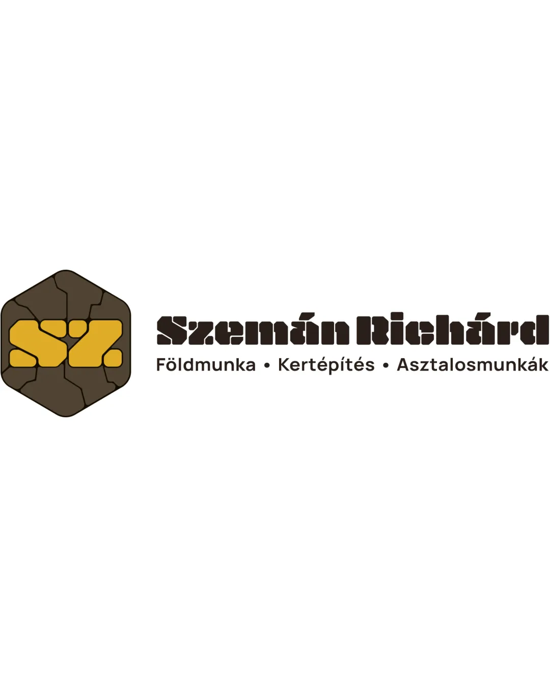
Szemán Richárd garden works logo logo review
3.7/5
Logo score Combination mark (symbol and wordmark) category

Szemán Richárd garden works logo

creative147300 Essential logo review

Strong conceptual link to construction and groundwork, though some familiar visual cues limit originality and minor type adjustments would improve clarity.

This logo lockup shows solid execution, supported by visual balance and text hierarchy; improving distinctiveness is the clearest next step.

Combination Mark (symbol And Wordmark) Blocky, Geometric, Construction-inspired Landscaping / Construction
3.9/5
Legibility
3/5
Originality
4/5
Balance
3.6/5
Scale
4/5
Color
4/5
Style consistency
Your next steps

What to fix first

Focus on the changes that matter. Keep what makes the logo work.

1

wordmark

Test the logo at smaller sizes and consider letterspacing adjustments or alternate cuts for improved clarity.

High priority Visible issue Low effort

The blocky typeface for 'Szemán Richárd' is thematically strong but may cause minor legibility issues, especially from a distance or at small sizes, due to dense letter spacing and similar geometric shapes.

See the category review

Detailed review

Logo performance breakdown

4/5

Brief & logo match

The geometric, stone-like monogram and earthy palette clearly represent garden/ground works, with only minor concerns about wordmark legibility at small sizes.

5/5

Misinterpretations

This review includes a score but no supporting explanation for this category.

4/5

Color harmony

Symbol 4/5 · Wordmark 4/5

  • Earthy brown and yellow tones reinforce the construction/garden theme and contrast well.
Brown#483C23
Yellow#E6B832

Estimated colors. Use the original design file for exact values.

Create a full color palette using these colors

Create new palette
4/5

Balance alignment

Symbol 4/5 · Wordmark 4/5 · Layout 4/5

  • Solid visual weight and clear left-right alignment between symbol and text.
Uploaded logoAlignment guide overlay

Inspect spacing with the guide. Optical balance may differ from geometric centering.

4/5

Style consistency

  • Blocky geometric theme coherently shared by both icon and typeface.
3.9/5

Legibility

Wordmark 3/5 · Layout 5/5

  • The blocky typeface for 'Szemán Richárd' is thematically strong but may cause minor legibility issues, especially from a distance or at small sizes, due to dense letter spacing and similar geometric shapes.

    Visible issue wordmark

    Try: Test the logo at smaller sizes and consider letterspacing adjustments or alternate cuts for improved clarity.

3.6/5

Scalability

Symbol 3/5 · Wordmark 4/5 · Layout 4/5

Available in Advanced logo reviews
3/5

Originality

Symbol 3/5 · Wordmark 3/5

Available in Advanced logo reviews
Try your own review

Wondering how your logo performs?

Get a clear logo score, key risks, and priority fix ideas before your client or audience sees it.

Review my logo