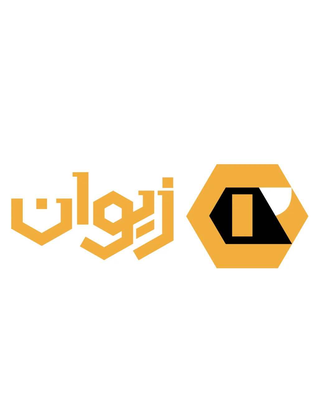
Ziwan logo logo review
3.6/5
Logo score Combination mark (custom wordmark + standalone mark) category

Ziwan logo

creative138944 Essential logo review

A distinctive, targeted identity for a honey/bee-based brand; moderate refinement in visual integration will yield a more unified and professional result.

This logo lockup shows solid execution, supported by distinctive construction and clarity at smaller sizes; improving visual balance is the clearest next step.

Combination Mark (custom Wordmark + Standalone Mark) Modern Geometric, Abstract Food/natural Products
3.4/5
Legibility
4/5
Originality
3.2/5
Balance
4/5
Scale
4/5
Color
3/5
Style consistency
Your next steps

What to fix first

Focus on the changes that matter. Keep what makes the logo work.

1

combination

Refine one or both elements for closer geometric or detail consistency—possibly echo a motif or curvature.

High priority Visible issue Medium effort

The wordmark's highly angular, custom geometric construction does not fully match the standalone mark's more simplified honeycomb form and partial curve, creating a slight disconnect in visual style.

How to check

Assess visual unity at medium-to-small sizes and in single-color applications.
See the category review
Detailed review

Logo performance breakdown

4/5

Brief & logo match

The hexagonal and honey-inspired design clearly matches the bee/honey theme; improved synergy between the geometric wordmark and simplified mark will fully realize the brand’s visual potential.

5/5

Misinterpretations

  • No visible risk of misinterpretation or harmful association.
4/5

Originality

Symbol 4/5 · Wordmark 4/5

  • Stylized approach with bee/honeycomb cues is distinctive for the category.
4/5

Color harmony

Symbol 4/5 · Wordmark 4/5

  • Palette reflects honey/bee concept and provides strong visual coherence.
Honey-Yellow#F1B83A
Black#000000
White#FFFFFF

Estimated colors. Use the original design file for exact values.

Create a full color palette using these colors

Create new palette
4/5

Scalability

Symbol 4/5 · Wordmark 4/5 · Layout 4/5

  • Both elements retain clarity at moderate size.
3.4/5

Legibility

Wordmark 3/5 · Layout 4/5

  • The wordmark adopts a geometric, stylized approach that may be challenging to immediately read as 'ziwan' for those unfamiliar with the brand or style.

    Worth testing wordmark
3.2/5

Balance alignment

Symbol 3/5 · Wordmark 3/5 · Layout 4/5

Available in Advanced logo reviews
3/5

Style consistency

Available in Advanced logo reviews
Try your own review

Wondering how your logo performs?

Get a clear logo score, key risks, and priority fix ideas before your client or audience sees it.

Review my logo