Wondering how your logo performs? 🧐
Get professional logo reviews in seconds and catch design issues in time.
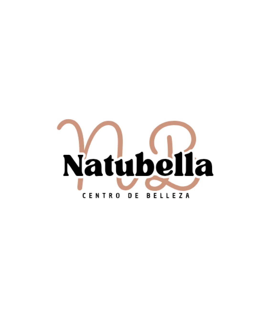
Try it Now!Logo review of Natubella, CENTRO DE BELLEZA
 Logo analysis by AI
Logo type:
Style:
Detected symbol:
Detected text:
Business industry:
Review requested by Dayana
**If AI can recognize or misinterpret it, so can people.
Structured logo review
Legibility
![]() Main wordmark 'Natubella' is bold and clear.
Main wordmark 'Natubella' is bold and clear.![]() 'CENTRO DE BELLEZA' is spaced and capitalized for easier reading.
'CENTRO DE BELLEZA' is spaced and capitalized for easier reading.
![]() The script 'NB' behind the wordmark creates visual clutter and distracts from the main name.
The script 'NB' behind the wordmark creates visual clutter and distracts from the main name.![]() Slight interference between the script and wordmark reduces overall clarity, especially at smaller sizes.
Slight interference between the script and wordmark reduces overall clarity, especially at smaller sizes.
Scalability versatility
![]() Bold serif font for 'Natubella' could reproduce well on larger signage and banners.
Bold serif font for 'Natubella' could reproduce well on larger signage and banners.
![]() Fine script lines of the 'NB' become illegible when scaled down (e.g., on business cards, favicons, small product labels).
Fine script lines of the 'NB' become illegible when scaled down (e.g., on business cards, favicons, small product labels).![]() Multiple elements may fuse together or become muddy at small sizes.
Multiple elements may fuse together or become muddy at small sizes.![]() 'CENTRO DE BELLEZA' is likely to disappear entirely at very small scales.
'CENTRO DE BELLEZA' is likely to disappear entirely at very small scales.
200x250 px
100×125 px
50×62 px
Balance alignment
![]() Elements are vertically stacked in a logical order.
Elements are vertically stacked in a logical order.
![]() The large script monogram behind creates a back-weighted feel, dominating the composition and creating imbalance.
The large script monogram behind creates a back-weighted feel, dominating the composition and creating imbalance.![]() The monogram's thickness and flow do not align harmoniously with the more rigid, blocky serif.
The monogram's thickness and flow do not align harmoniously with the more rigid, blocky serif.

Originality
![]() Handwritten monogram 'NB' introduces a personal, distinctive touch.
Handwritten monogram 'NB' introduces a personal, distinctive touch.![]() Avoids using cliché beauty industry icons (e.g., faces, flowers, lips).
Avoids using cliché beauty industry icons (e.g., faces, flowers, lips).
![]() Script monogram + serif wordmark is a familiar trope in the beauty sector, lacking strong innovation.
Script monogram + serif wordmark is a familiar trope in the beauty sector, lacking strong innovation.![]() The handwritten monogram is somewhat generic and not deeply integrated with the rest of the logo.
The handwritten monogram is somewhat generic and not deeply integrated with the rest of the logo.
Logomark wordmark fit
![]() Both components are clearly visible in full color.
Both components are clearly visible in full color.
![]() Divergence in style: The playful, loose script feels disconnected from the serious, formal serif.
Divergence in style: The playful, loose script feels disconnected from the serious, formal serif.![]() The size relationship is off: the script is too dominant, competing with the wordmark instead of complementing it.
The size relationship is off: the script is too dominant, competing with the wordmark instead of complementing it.
Aesthetic look
![]() Color palette is clean and minimal, with no overwhelming gradients.
Color palette is clean and minimal, with no overwhelming gradients.
![]() Logo feels busy, especially with the overlapping elements.
Logo feels busy, especially with the overlapping elements.![]() Script monogram visually competes with the main wordmark, leading to a cluttered look.
Script monogram visually competes with the main wordmark, leading to a cluttered look.
Dual meaning and misinterpretations
![]() No inappropriate imagery or confusing symbol implied in composition.
No inappropriate imagery or confusing symbol implied in composition.
Color harmony
![]() Simple, sophisticated palette that suits the beauty industry.
Simple, sophisticated palette that suits the beauty industry.![]() Good contrast between text and background.
Good contrast between text and background.
tan
#CFA085
black
#000000
white
#FFFFFF