Concept & direction
The logo combines stylized initials with a crown to convey a sense of professionalism and prestige relevant for a graphic design service.
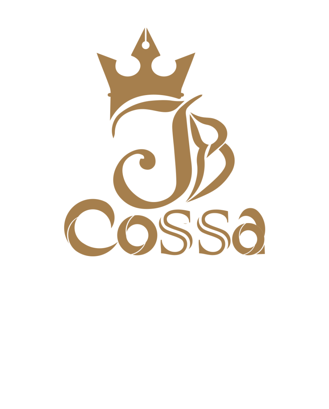
A functional, stylish logo that conveys creativity and prestige, but would benefit from adjustments to legibility and visual balance for optimal clarity and impact.
This logo lockup has a workable foundation; improving visual balance is the clearest next step.
Focus on the changes that matter. Keep what makes the logo work.
The logo combines stylized initials with a crown to convey a sense of professionalism and prestige relevant for a graphic design service.
Logo preview unavailable. The written feedback is still available on this card.
wordmark
Ornate, swirled lowercase type makes the 'Cossa' legible on close inspection, but at smaller sizes or quick glances, the flourishes (especially on 'C' and 'o') may reduce legibility.
See the category reviewThe ornate crown and custom initials immediately indicate creative graphic design services, with the main limitation being possible legibility loss at small sizes.
Wordmark 3/5 · Layout 3/5
Ornate, swirled lowercase type makes the 'Cossa' legible on close inspection, but at smaller sizes or quick glances, the flourishes (especially on 'C' and 'o') may reduce legibility.
Try: Test the 'Cossa' wordmark for clear recognition at small sizes and from a distance.
Logo preview unavailable. The written feedback is still available on this card.
Symbol 3/5 · Wordmark 3/5
The crown atop stylized initials is a familiar motif for conveying prestige; however, the custom JB flourish adds some unique character.
Symbol 3/5 · Wordmark 3/5 · Layout 3/5
The large decorative mark and differing type forms make the upper half (crown/initials) visually heavier than the wordmark, creating a top-heavy impression.
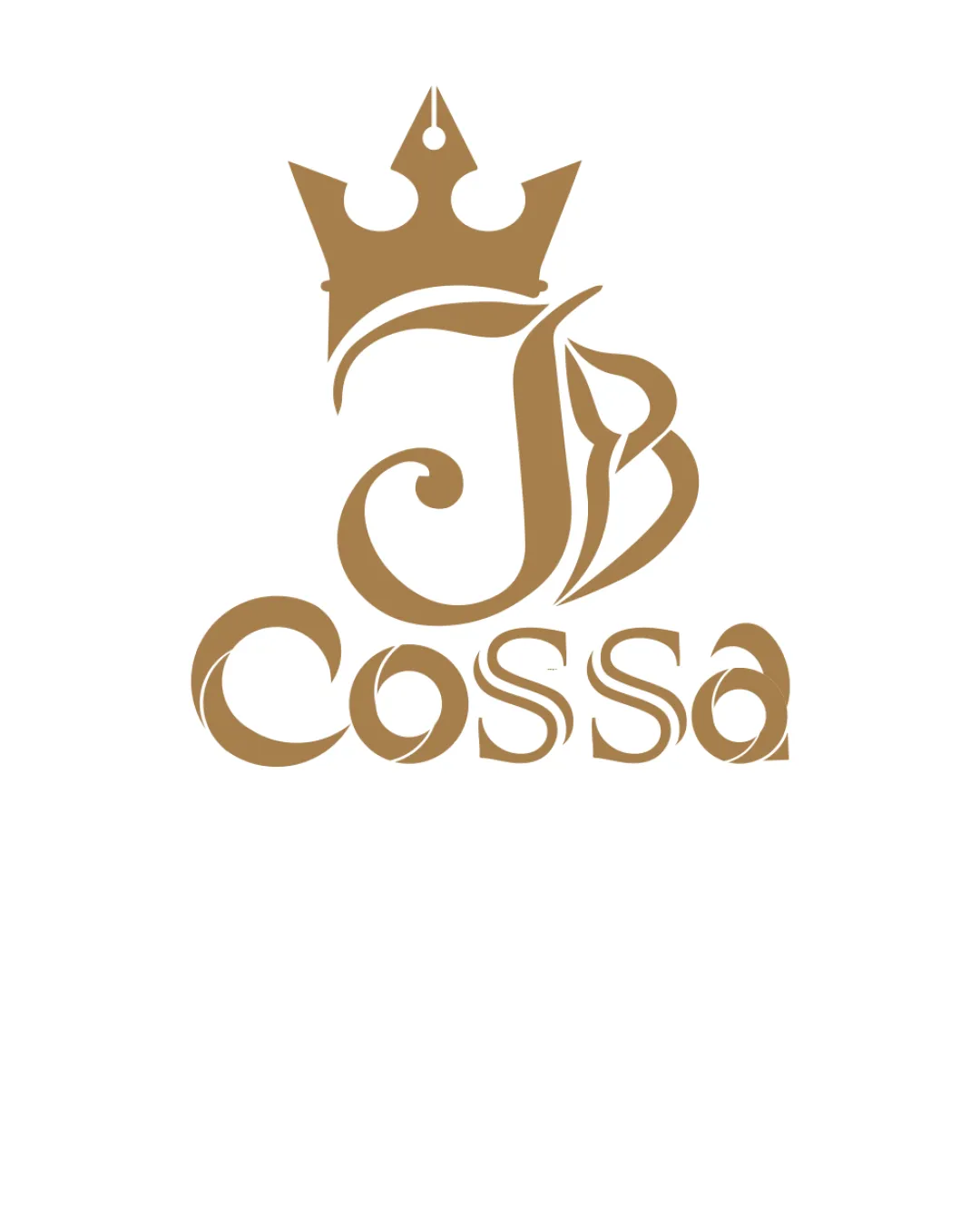

Inspect spacing with the guide. Optical balance may differ from geometric centering.
Symbol 3/5 · Wordmark 3/5 · Layout 3/5
Get a clear logo score, key risks, and priority fix ideas before your client or audience sees it.
More credits needed
Add credits to continue without losing your work.
Then $7/month. Cancel anytime.
Essential logo review with AI
Estimated progress