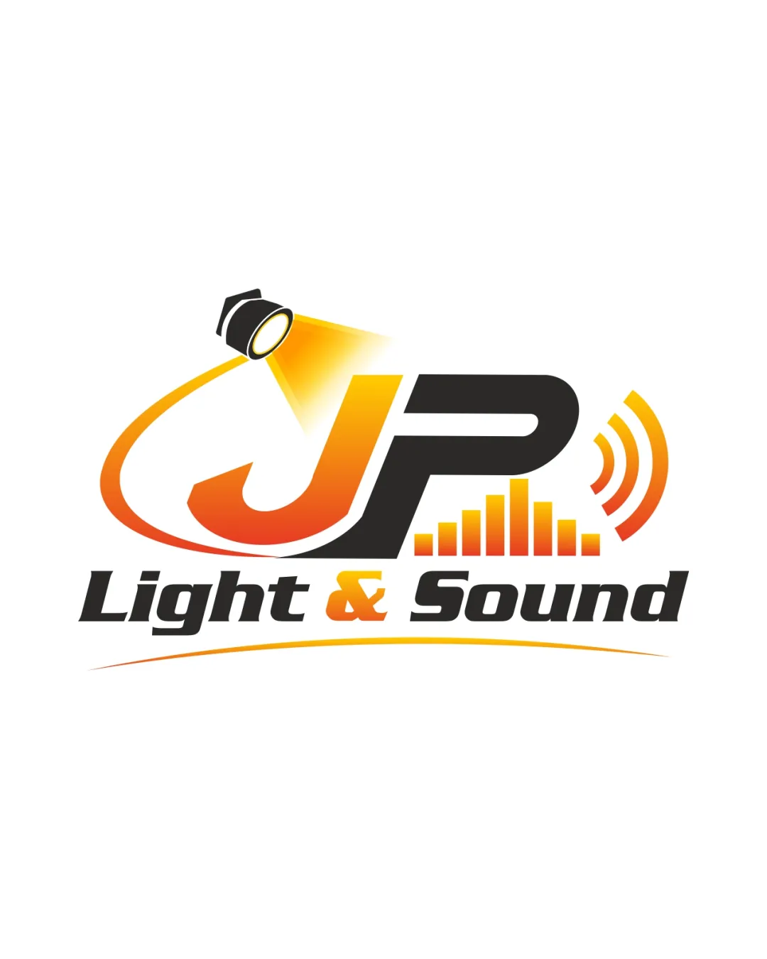
JP Light & Sound logo review
3.3/5
Logo score
Logo review of

Jp Light & Sound

A clear and functional logo that directly signals the AV/light & sound industry, but would benefit from improved compositional balance and a more unique iconographic approach.

Combination Modern, Illustrative, Gradient Accent Audio/visual Services
4.5/5
Legibility
3/5
Originality
5/5
Misread
3/5
Balance
3/5
Scale
Your next steps

What to fix first

Focus on the changes that matter. Keep what makes the logo work.

1

wordmark and symbol composition

Rebalance the wordmark and symbol to achieve a more harmonious distribution.

Visible issue High priority Medium effort

There is some imbalance between the heavy 'JP' symbol and the finer 'Light & Sound' wordmark, causing the visual weight to sit top-heavy.

How to check

Verify improved alignment and proportionality.

See the category review
2

symbol: spotlight and sound bars

Explore a more distinctive integration or twist on AV iconography.

Optional refinement Medium priority Medium effort
Area to inspectApproximate location

Spotlight and audio wave motif are common in the AV/event sector, making the concept somewhat generic despite good execution.

How to check

Assess uniqueness in the sector after adjustment.

See the category review
Detailed review

Logo performance breakdown

3/5

Brief & logo match

Based on an inferred industry
Compared with

Audio/visual event services based on the text and iconography.

The logo fits the core AV category but lacks distinctiveness to fully separate it from competitors.

  • AV Services Representation

    Spotlight beam and sound graphics directly communicate the category; initials provide a personal/business identity.

  • Readability

    The logo text remains easy to decipher against the white background.

4.5/5

Legibility

  • Text is highly readable.
  • Good contrast between type and background.
3/5

Originality

  • Effective integration of AV symbols with initials.
  • Spotlight and audio wave motif are common in the AV/event sector, making the concept somewhat generic despite good execution.

    Optional refinement symbol: spotlight and sound bars

    Try: Explore a more distinctive integration or twist on AV iconography.

    Check: Assess uniqueness in the sector after adjustment.

    Area to inspectApproximate location
4/5

Color harmony

  • Warm orange palette is energetic and consistent.
Orange#FF9900
Black#000000
White#FFFFFF
LightYellow#FFD966

Estimated colors. Use the original design file for exact values.

Create a full color palette using these colors

Create new palette
3/5

Balance alignment

  • Elements are clearly organized.
  • There is some imbalance between the heavy 'JP' symbol and the finer 'Light & Sound' wordmark, causing the visual weight to sit top-heavy.

    Visible issue wordmark and symbol composition

    Try: Rebalance the wordmark and symbol to achieve a more harmonious distribution.

    Check: Verify improved alignment and proportionality.
Uploaded logoAlignment guide overlay

Inspect spacing with the guide. Optical balance may differ from geometric centering.

3/5

Scalability

  • Simple text holds up at small scale.
  • Fine graphic details and gradient/light effects may lose clarity at smaller scales or monochrome reproduction.

    Worth testing spotlight beam gradient and sound waves

    Try: Test clarity and recognizability at reduced sizes and in single-color versions.

    Check: Confirm main elements remain identifiable when scaled down or used in monochrome.

Uploaded logo at 200 pixels wide
200 × 250 px
Uploaded logo at 100 pixels wide
100 × 125 px
Uploaded logo at 50 pixels wide
50 × 63 px

Compare the detail at different sizes. Labels show the full image dimensions.

5/5

Misinterpretations

  • No evident misreadings or negative shapes.
4/5

Symbol & text fit

  • Mark and wordmark relate well to each other.

Black & white

Does the shape still work without color?

These tests are available only for logos uploaded in vector (SVG) format.

Background contrast

Find the surfaces where your logo stays clear.

These tests are available only for logos uploaded in vector (SVG) format.

Blur & silhouette

A 3px blur softens fine details so you can check whether the overall shape stays recognizable. If key gaps close or elements merge, the logo may rely too heavily on detail.

These tests are available only for logos uploaded in vector (SVG) format.

Try your own review

Wondering how your logo performs?

Get a clear logo score, key risks, and priority fix ideas before your client or audience sees it.

Review my logo