KH logo review
4/5
Logo score
Logo review of

Kh

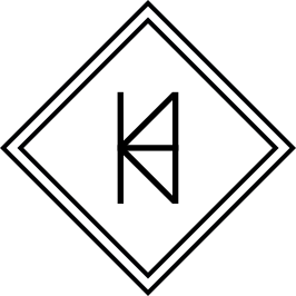
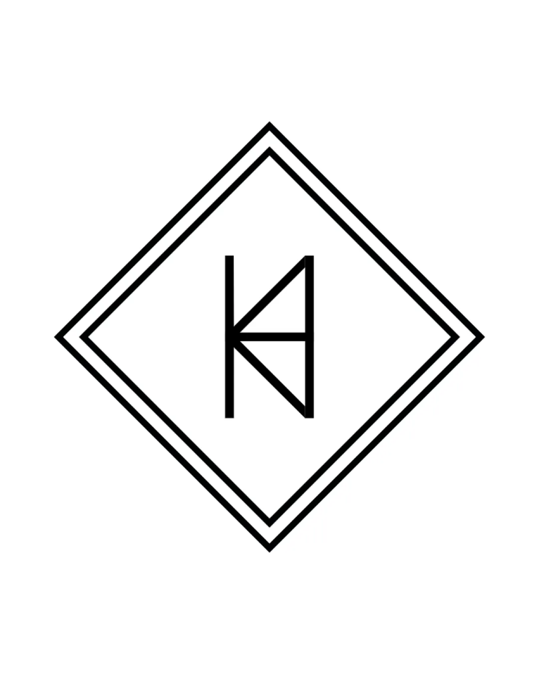
A premium, minimal monogram that is visually resolved, but could strengthen cultural specificity.

Monogram Minimalist Geometric Cultural Institution / Performing Arts
5/5
Legibility
3/5
Originality
5/5
Misread
5/5
Balance
4/5
Scale
Your next steps

What to fix first

Focus on the changes that matter. Keep what makes the logo work.

1

monogram

Explore integrating subtle visual cues or ornaments referencing Akan/Asante or cultural motifs.

Visible issue Medium priority Medium effort

The geometric monogram is distinctive but employs a common diamond frame often used in premium or institutional logos, risking some genericness.

How to check

Test audience association with Kete or Ghanaian culture.
See the category review
2

monogram

Evaluate line thickness for legibility in small formats.

Optional refinement Low priority Low effort

The thin lines may lose clarity or visual weight at very small sizes, particularly for the diamond frame.

How to check

Print and digital size reduction tests.

See the category review
Detailed review

Logo performance breakdown

4/5

Brief & logo match

Based on your brief
Compared with

Premium Ghanaian cultural performance brand centred on Kete dance tradition.

Sophisticated and premium, but cultural linkage could be more explicit.

  • Premium Cultural Positioning

    Monogram within diamond frame projects formality and exclusivity expected from a premium cultural brand.

  • Ghanaian/Akan/Asante Identity

    The logo lacks direct visual cues linking to Ghanaian or Akan/Asante heritage, relying solely on the initials.

5/5

Legibility

  • Clear, unambiguous KH initials.
3/5

Originality

  • Distinctive internal KH arrangement.
  • The geometric monogram is distinctive but employs a common diamond frame often used in premium or institutional logos, risking some genericness.

    Visible issue monogram

    Try: Explore integrating subtle visual cues or ornaments referencing Akan/Asante or cultural motifs.

    Check: Test audience association with Kete or Ghanaian culture.

5/5

Balance alignment

  • Symmetrical and visually balanced; harmonious proportions.
Uploaded logoAlignment guide overlay

Inspect spacing with the guide. Optical balance may differ from geometric centering.

4/5

Scalability

  • Simple, reduction-friendly geometry.
  • The thin lines may lose clarity or visual weight at very small sizes, particularly for the diamond frame.

    Optional refinement monogram

    Try: Evaluate line thickness for legibility in small formats.

    Check: Print and digital size reduction tests.

Uploaded logo at 200 pixels wide
200 × 250 px
Uploaded logo at 100 pixels wide
100 × 125 px
Uploaded logo at 50 pixels wide
50 × 63 px

Compare the detail at different sizes. Labels show the full image dimensions.

5/5

Misinterpretations

  • No plausible misreadings.

Black & white

Does the shape still work without color?

Preparing artwork...

Background contrast

Find the surfaces where your logo stays clear.

Compare the mark and lettering on each surface.

Blur & silhouette

A 3px blur softens fine details so you can check whether the overall shape stays recognizable. If key gaps close or elements merge, the logo may rely too heavily on detail.

Original
3px blur

Look for clear separation between shapes and a distinctive outline.

Try your own review

Wondering how your logo performs?

Get a clear logo score, key risks, and priority fix ideas before your client or audience sees it.

Review my logo