 View review
Logo score
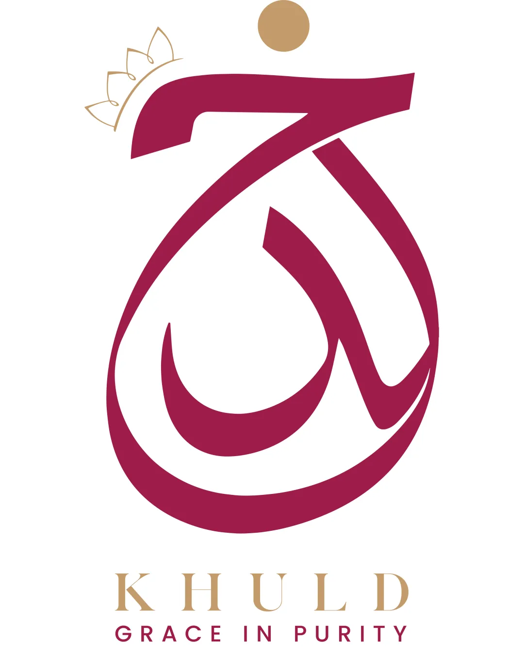
Logo review ofKhuld Grace In Purity
High quality, elegant logo with excellent typography and calligraphic integration; only minor tweaks for scalability recommended.
Legibility
Originality
Misread
Balance
Scale
Action plan
What to fix first
The most important fixes to handle before polishing the full presentation.
1
Thicken or simplify the crown lines on top for improved clarity at small sizes.
Medium priorityPrevents loss of detail in small format applications.
Impact: Enhances Scalability Without Losing Symbolic Intent. · Effort: Low
Detailed review
Logo performance breakdown
Legibility
 Primary and tagline text are clean and clear in both size and style.
Originality
Strong blend of Arabic calligraphy and contemporary minimalism.
 Crown element is a familiar motif, so less original compared to the rest.
Color harmony
Rose and gold have luxurious, elegant synergy and fit industry expectations.
Rose
#A11A4B
Gold
#C4A169
White
#FFFFFF
Balance alignment
Calligraphic mark and text are well balanced vertically. Symmetrical placement of typography.

Scalability
Simple forms, decent stroke weight for resizing.
Delicate crown lines at the top could get lost or break at very small sizes.
200x250 px
100×125 px
50×62 px
Misinterpretations
No overtly inappropriate or embarrassing visual misreads.
Logo structure & brief match
Calligraphic mark and wordmark style are mutually reinforcing; harmonious visual connection.
Luxury/beauty Industry: The refined color palette, sophisticated serif, and calligraphic emblem fit luxury/self-care/beauty themes.
Try your own review
Review my logo
Wondering how your logo performs?
Get a clear logo score, key risks, and priority fix ideas before your client or audience sees it.
Keep exploring