View review
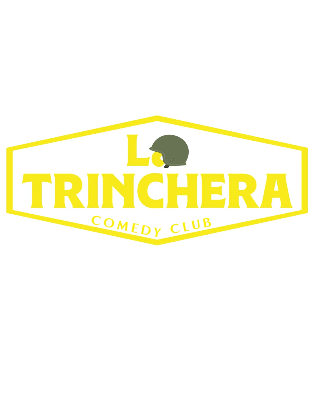
La Trinchera Comedy Club
Review the detailed scores below to see what is working and what should be refined first.
Logo performance breakdown
Legibility
Primary word 'TRINCHERA' is bold and highly legible.
Subtexts are adequately sized for most large-to-medium applications.
Yellow text on white background can reduce readability in smaller formats or low-contrast environments.
'La.' is partially overlapped by the helmet, slightly decreasing its clarity.

Originality
Military helmet references the name and concept (trench/war).
Use of a badge shape and helmet is fairly conventional.
Overall layout is similar to many retro club/badge logos.
Color harmony
Yellow and green provide a distinct pop and are relevant conceptually.
Yellow on white may cause legibility issues.
Palette lacks depth or complementary color balancing; feels flat.
Bright Yellow
#FFE44B
Military Green
#4B5433
White
#FFFFFF
Color may be holding this logo back. Build a stronger strategic palette before updating the logo.
Build brand colorsBalance alignment
'TRINCHERA' dominates the visual field and is centered.
Boundary shape centers the text content.
Helmet feels awkwardly placed, disrupting symmetry above 'TRINCHERA.'
'La.' and helmet are not visually balanced with the weight of main wordmark.
Bottom curved text 'COMEDY CLUB' is visually weaker.
Scalability
Simple shapes and thick outline should hold in larger formats like signs or posters.
Works on medium-scale digital assets (social banners, menus).
Thin yellow outline may disappear at small sizes or low resolution.
'COMEDY CLUB' text and helmet may lose detail at favicon or embroidery size.
Helmet detail could be lost in single-color renderings.
200x250 px
100×125 px
50×62 px
Misinterpretations
No inappropriate or controversial imagery detected.
Symbol & text fit
Color of helmet is differentiated from text.
Helmet and 'La.' are not proportioned to match the boldness of 'TRINCHERA.'
Helmet feels detached, does not stylistically match the retro type.
Wondering how your logo performs?
Get a clear logo score, key risks, and priority fix ideas before your client or audience sees it.