Concept & direction
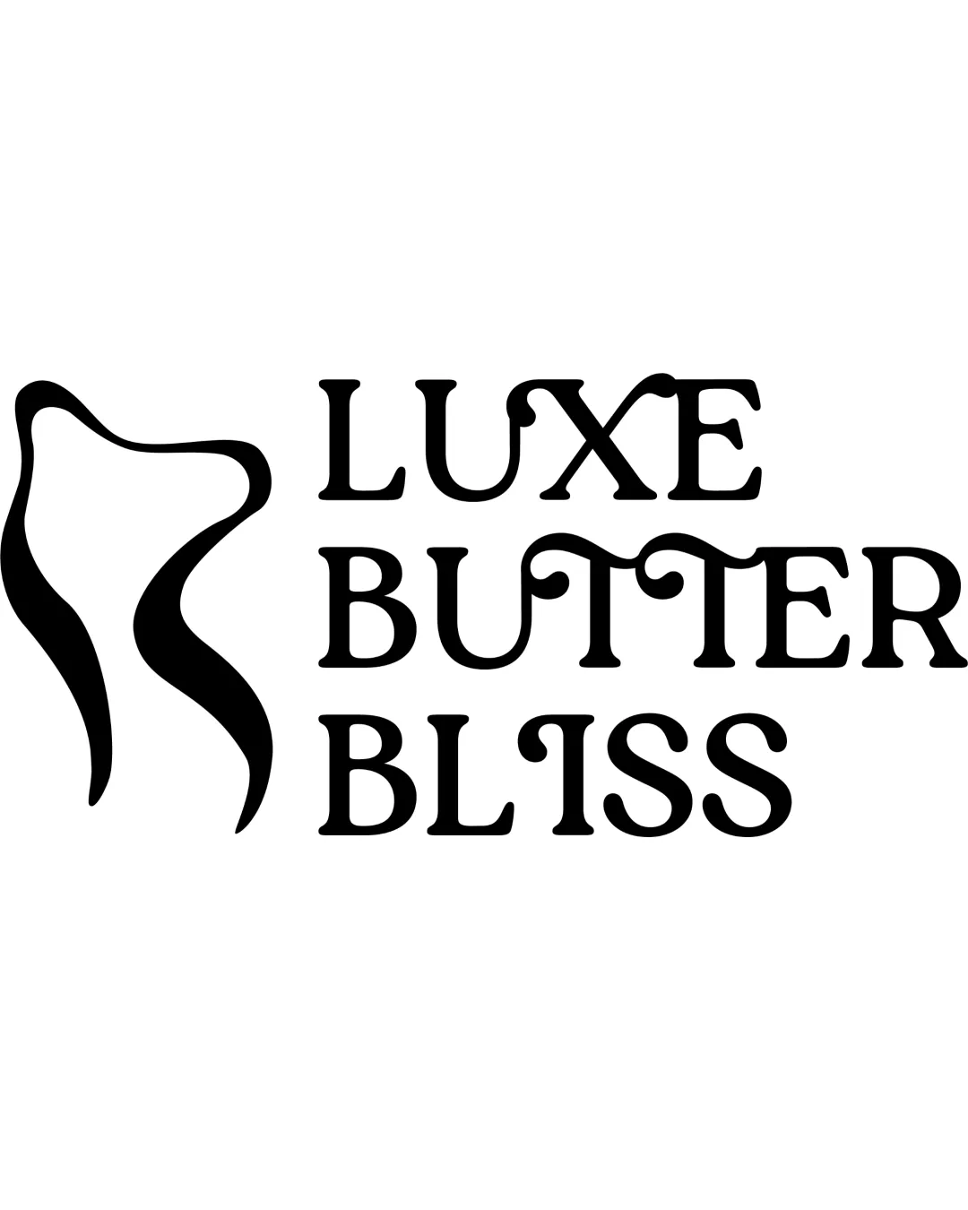
The swirling organic mark and curvy, playful type express softness and comfort suited to a luxury skincare brand, though the mark’s meaning may be ambiguous.
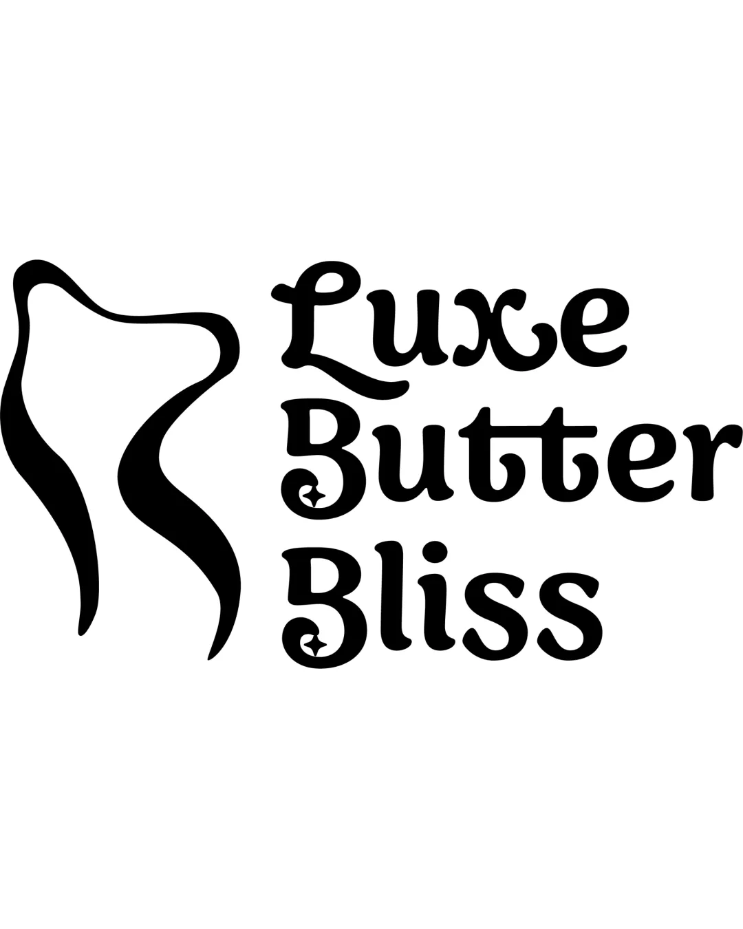
This logo successfully expresses a soft, comforting, and fun tone suitable for a luxury skincare brand with its playful typography and organic mark, though strengthening the mark's visual relation to skincare could further enhance brand clarity.
This logo lockup shows solid execution, supported by visual balance and distinctive construction; improving clarity at smaller sizes is the clearest next step.
Focus on the changes that matter. Keep what makes the logo work.
The swirling organic mark and curvy, playful type express softness and comfort suited to a luxury skincare brand, though the mark’s meaning may be ambiguous.
Standalone mark
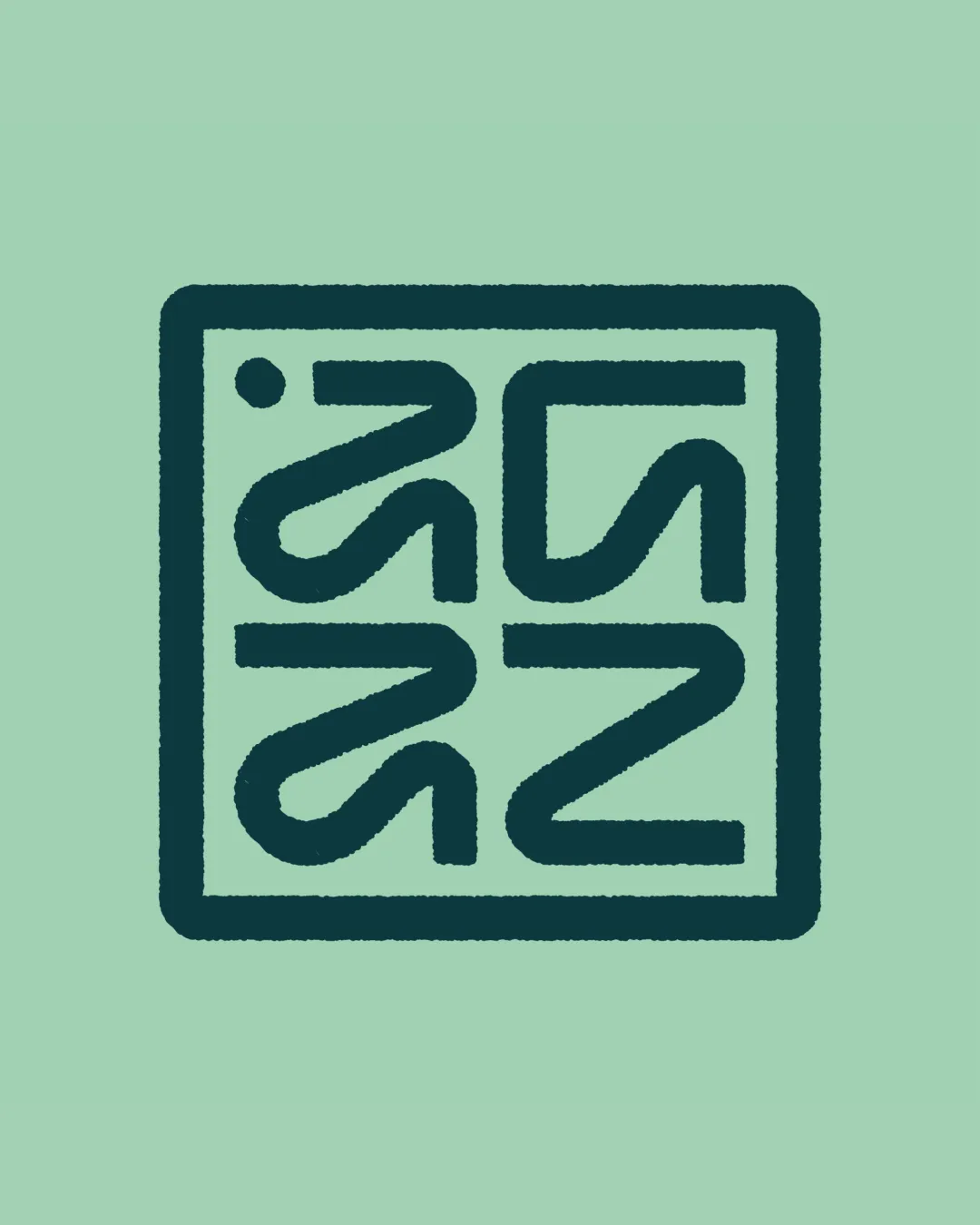
The abstract mark is visually appealing and organic, but its meaning is unclear—it could suggest a leaf, body part, or abstract butter, which may be ambiguous for some audiences.
Test with target users for recognition or confusion.
The soft forms and whimsical script effectively convey comfort and fun, but the mark’s ambiguous meaning slightly limits the sense of luxury or direct skincare association.
Wordmark 4/5 · Layout 4/5
The playful, whimsical letterforms are legible but some interior swirls (like in the letter B and capital L) may be less clear at small sizes or to those unfamiliar with decorative scripts.
Symbol 4/5 · Wordmark 4/5
The abstract mark is visually appealing and organic, but its meaning is unclear—it could suggest a leaf, body part, or abstract butter, which may be ambiguous for some audiences.
Try: Clarify or reinforce the visual connection to skincare or the product name if possible.
Check: Test with target users for recognition or confusion.
Symbol 4/5 · Wordmark 4/5 · Layout 4/5

Inspect spacing with the guide. Optical balance may differ from geometric centering.
Symbol 3/5 · Wordmark 3/5 · Layout 3/5
Get a clear logo score, key risks, and priority fix ideas before your client or audience sees it.
More credits needed
Add credits to continue without losing your work.
Then $7/month. Cancel anytime.
Essential logo review with AI
Estimated progress