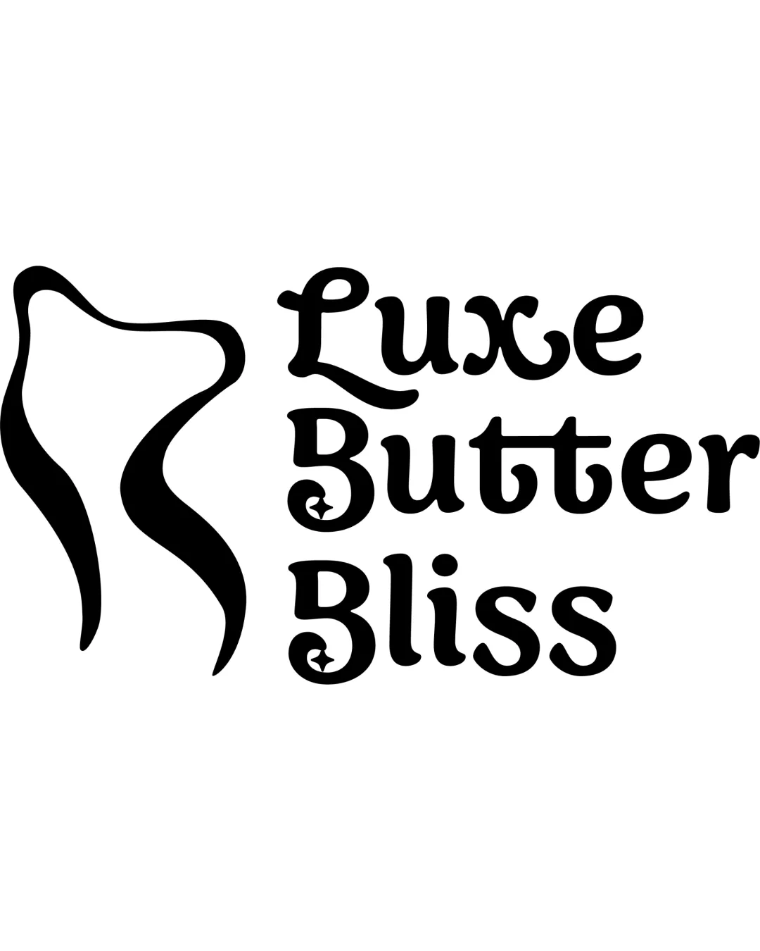
What to preserve
The abstract symbol harmonizes with the luxury skincare wordmark, suggesting softness and elegance appropriate for a comforting, upscale brand.
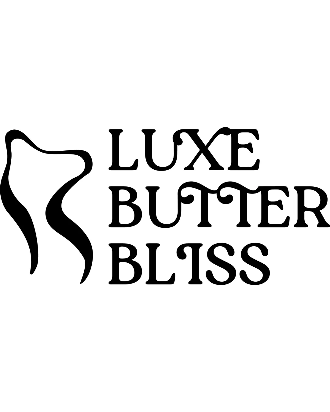
The logo is distinct and clear but the cohesion between the abstract symbol and serif wordmark must be improved to fully convey luxury and comfort.
This logo lockup shows solid execution, supported by text readability and clarity at smaller sizes; improving visual balance is the clearest next step.
Focus on the changes that matter. Keep what makes the logo work.
The abstract symbol harmonizes with the luxury skincare wordmark, suggesting softness and elegance appropriate for a comforting, upscale brand.
combination arrangement
The abstract body shape's fluid lines contrast with the rigid, serifed wordmark, resulting in visual tension that weakens cohesion.
Test wordmark with more organic or rounded details to improve unity.
The abstract body symbol and elegant monochrome wordmark are fitting for luxury skincare, but the style mismatch prevents a perfectly soft, comforting, and playful impression.
Wordmark 5/5 · Layout 4/5
Symbol 4/5 · Wordmark 4/5 · Layout 4/5
Symbol 4/5 · Wordmark 3/5
Symbol 3/5 · Wordmark 3/5 · Layout 3/5
The symbol's loose placement to the left and its negative space do not align tightly with the stacked text, creating imbalance and visual drift.

Inspect spacing with the guide. Optical balance may differ from geometric centering.
The abstract body shape's fluid lines contrast with the rigid, serifed wordmark, resulting in visual tension that weakens cohesion.
Try: Refine either the wordmark or symbol style to better match in softness or geometry.
Check: Test wordmark with more organic or rounded details to improve unity.
Get a clear logo score, key risks, and priority fix ideas before your client or audience sees it.
More credits needed
Add credits to continue without losing your work.
Then $7/month. Cancel anytime.
Essential logo review with AI
Estimated progress