Wondering how your logo performs? 🧐
Get professional logo reviews in seconds and catch design issues in time.
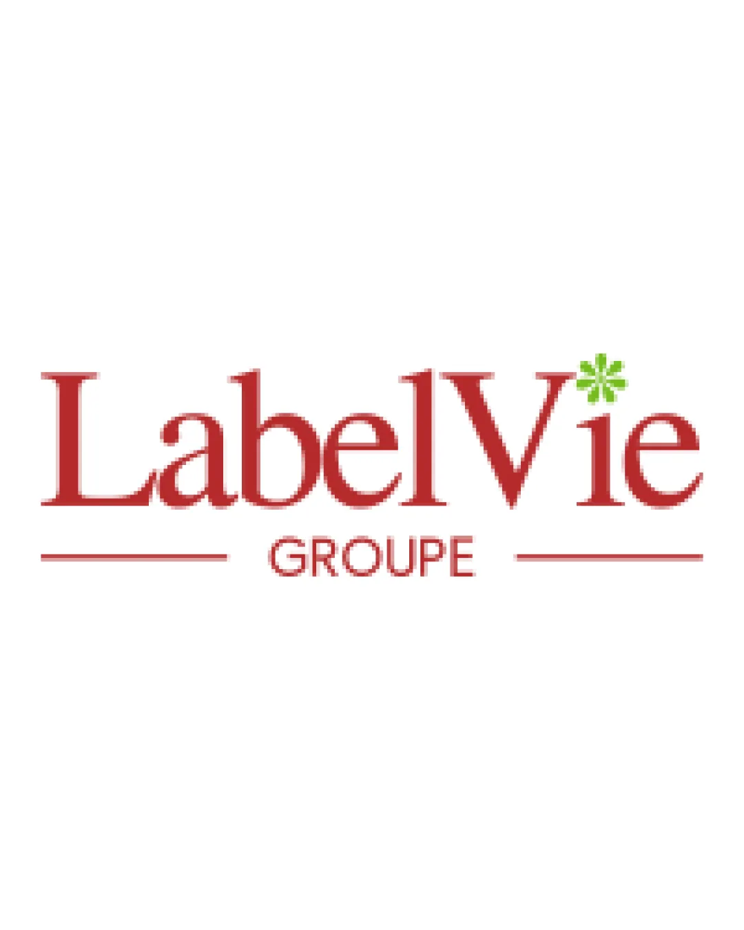
Try it Now!Logo review of LabelVie GROUPE
 Logo analysis by AI
Logo type:
Style:
Detected symbol:
Detected text:
Business industry:
Review requested by Bavono29
**If AI can recognize or misinterpret it, so can people.
Structured logo review
Legibility
Serif typeface is clear and easy to read even at smaller sizes.
Text is spaced appropriately for optimal readability.
Scalability versatility
Simple wordmark ensures good visibility on large formats like billboards and signage.
Limited use of color and detail supports adaptability for print and web.
Small green asterisk/symbol detail may not reproduce clearly at very small sizes or in embroidery applications.

200x250 px

100×125 px

50×62 px
Balance alignment
Horizontal lines help anchor the design, providing visual structure.
Main text and subtext (‘GROUPE’) are well-aligned vertically.
Green asterisk over the 'i' may slightly disrupt typographic balance.


Originality
Green asterisk detail gives a minimal unique touch.
Overall structure is generic for a corporate group, and the green asterisk is a widely used accent in branding.
Aesthetic look
Elegant color pairing and serif typeface offer a premium, trustworthy feel.
Overall design is clean and uncluttered.
Design is aesthetically pleasing but lacks distinctive brand personality due to its generic approach.
Dual meaning and misinterpretations
No inappropriate or ambiguous forms detected.
Color harmony
Color palette is limited and well-balanced.
Red and green are used tastefully for visual interest without overwhelming the design.
Rosewood
#B32627
Olive Green
#77A52C
White
#FFFFFF


