Wondering how your logo performs? 🧐
Get professional logo reviews in seconds and catch design issues in time.
Try it Now!Logo review of LACOFFEE
 Logo analysis by AI
Recognized style:
Logo type:
Detected symbol:
Detected text:
Business industry:
Review requested by Svirloch
**If AI can recognize or misinterpret it, so can people.
Structured logo review
Legibility
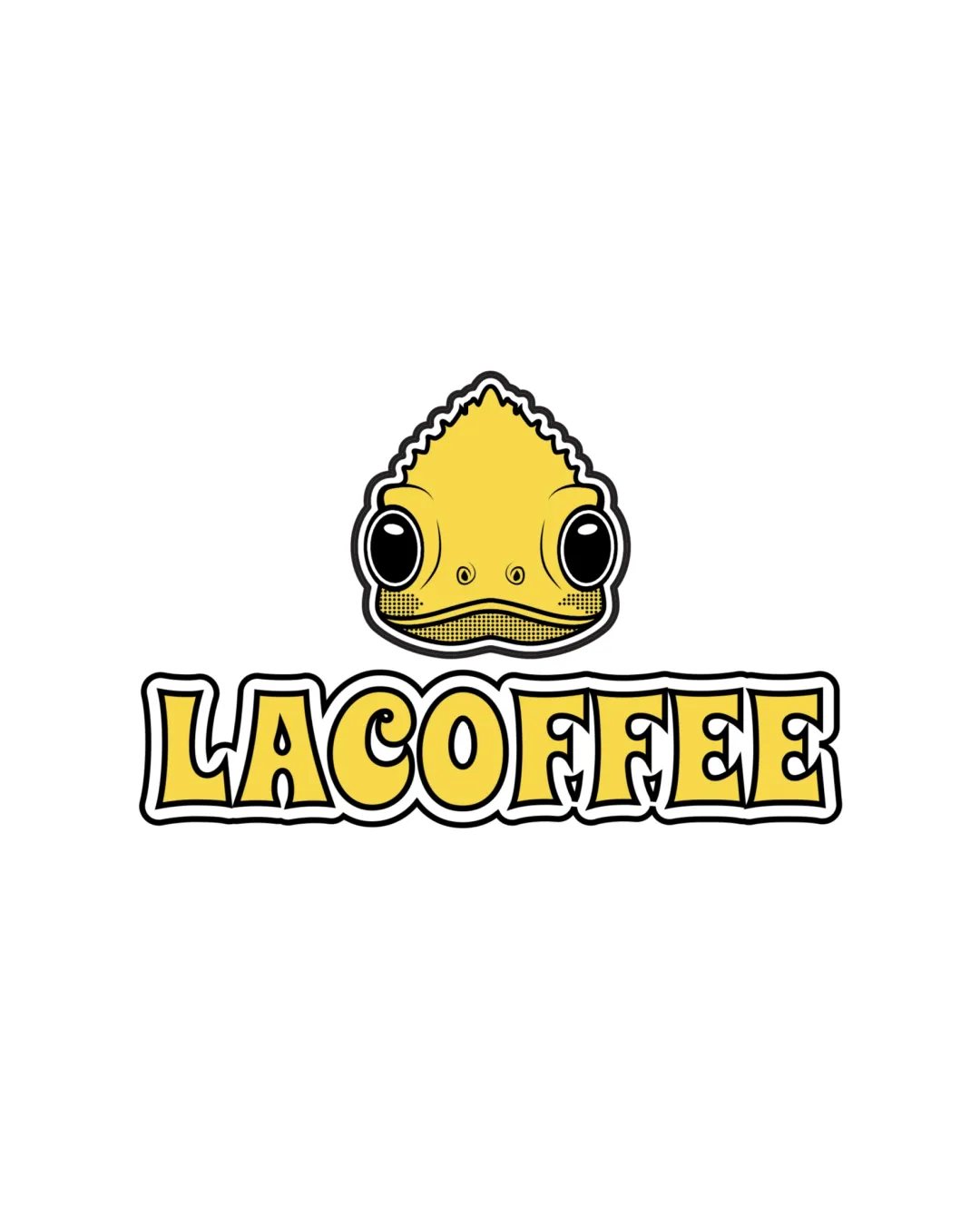
The text 'LACOFFEE' is very readable with a bold and fun font.
Scalability versatility
The bold symbol and text should scale well across various platforms.
Detailed features in the symbol might lose clarity at smaller sizes.

200x250 px

100×125 px

50×62 px
Balance alignment
The symbol is well-balanced with the text underneath.


Originality
The use of a cartoon fish or lizard head is unique for a coffee brand.
Might be confusing for the industry without context.
Logomark wordmark fit
The playful nature of both the symbol and text fit well together.
The symbol slightly overpowers the text in terms of visual weight.
Aesthetic look
The logo has an appealing and professional aesthetic with a playful twist.
Cultural sensitivity dual meaning
No cultural sensitivity issues detected.
Color harmony
The yellow color scheme is vibrant and adds to the playful nature of the brand.

